Wall Art for Therapy Offices: The Definitive Guide
Your client arrives six minutes early. They sit in the waiting area, or they stand near the window, or they study the wall across from where they will eventually settle. They haven't started the session yet. They are already inside your therapeutic frame.
The art on your walls is doing something in those first minutes. It is holding them, or reassuring them, or quietly unsettling them. It is telling them something about what type of space this is and whether they are safe inside it. This happens before you enter the room. It happens before anyone speaks.
This guide is for therapists who understand that a holding environment isn't built only through clinical skill. It's built through everything your office says, including the walls. Whether you're setting up a new practice, refreshing an existing space, or thinking carefully for the first time about what your office communicates, what follows is a thorough framework for making choices that serve your clients and honor the work you both do together.
Why Your Office Speaks Before You Do
The First 30 Seconds
Researchers studying patient experience in therapeutic settings have documented what many clinicians already sense intuitively: clients begin assessing safety before any verbal exchange begins. Environmental cues, including visual stimuli, lighting, and spatial arrangement, signal to the nervous system whether a space holds threat or rest. This assessment happens faster than conscious thought. It happens in the body before it registers in the mind.
A therapeutic environment is a physical space intentionally designed to support psychological safety, nervous system regulation, and the conditions for healing. Roger Ulrich's landmark 1984 study of hospital patients found that those in rooms with windows overlooking nature recovered an average of one full day faster and required 23% less pain medication than patients in identical rooms facing a brick wall. A 2020 study in the journal Health Environments Research and Design found that 78% of mental health professionals reported that their office environment directly influenced client outcomes, with visual elements ranked as the second most impactful factor after lighting.
The art in your waiting room is doing this work whether you've chosen it deliberately or not. A motivational poster with a soaring eagle communicates something. A blank wall communicates something else. A framed print that holds a quiet phrase, something like "you are held here," communicates something different still.
None of these is neutral.
What Clients Register Without Knowing It
Your clients bring their nervous systems into your office. Their bodies are scanning the room for cues about threat, care, and attunement before the first word is exchanged. They aren't consciously reading your art, but they are registering it. Visually complex or noisy art increases cognitive load at a moment when clients are already carrying significant emotional weight. Art that feels prescriptive, "Believe in yourself," "You can do hard things," creates subtle pressure rather than relief.
Art that holds space asks nothing. It is simply present.
The distinction matters most for clients who are highly attuned to relational cues. Trauma survivors, clients with attachment difficulties, and anyone in an acute state of distress are particularly sensitive to environmental signals. For these clients, the art on your walls is part of their experience of being received by your space.
The Holding Environment Extends to the Walls
Donald Winnicott's concept of the holding environment, which refers to the reliable, non-intrusive relational presence that allows a client to experience and process difficult material in safety, is most often discussed in terms of the therapist's own consistency and attunement. Most training focuses on that relational holding: your capacity to be present with difficult material without being destabilized by it. But the physical space holds its own weight in this equation.
Your office, its colors, its objects, and its art, is part of the therapeutic frame. When a client walks in and the walls feel considered, when the art doesn't shout or preach but simply settles, they have already received something before anyone has spoken. The session hasn't started and the space has already communicated: someone prepared this for you.
This is the foundation of therapeutic home design more broadly, and if you want to understand the psychological underpinnings of how environments shape wellbeing, the guide to therapeutic home design explores the research in depth.
What Therapy Office Art Should and Shouldn't Do
The easiest shortcut is the worst one. Therapy supply catalogs are full of art designed for clinical settings: certificates framed in institutional black, motivational slogans in sans-serif fonts, and abstract prints chosen because they are inoffensive. Inoffensive is not the same as holding. And holding is what your clients need.
Art That Supports the Frame
The best therapy office art does something specific: it supports the therapeutic frame without directing the clinical work. It holds space rather than prescribing it. A piece that says "You Are Not Alone" is doing therapy. A piece that is quietly present, that allows a client to notice it or not, to sit with it or look away, to project onto it or find it simply beautiful, is holding space.
This is the distinction experienced therapists feel but rarely have language for. When a client looks at a piece of art on your wall during a long pause in session, or when they mention at the end of a session that something in your office made them feel safe enough to say something difficult, the art has become part of the therapeutic relationship. Not because it directed anything, but because it was there, consistently and without demand.
Why Motivational Art Undermines Therapeutic Work
Motivational art in a therapy office creates a specific problem: it implies that the solution to the client's difficulty is attitude adjustment. Clients who are processing grief, trauma, chronic depression, or anxiety often already carry the weight of feeling like they should be doing better. Art that says "Keep Going" or "You Are Stronger Than You Know" adds to that weight. It subtly aligns you with the message that resilience is a matter of will.
It also creates a tonal inconsistency. If your practice is grounded in acceptance-based approaches, trauma-informed care, or relational therapy, the art that greets your clients communicates something before you've said a word. If that communication is at odds with your clinical stance, clients feel the gap even if they can't name it.
The Difference Between Decoration and Holding
Decoration fills space. Holding creates space. This is the distinction that matters when you're choosing art for your practice.
Art that decorates is chosen primarily for visual appeal. It is pleasant, even beautiful, and essentially passive. Art that holds is chosen with a different question: what will this space say to someone in their most difficult moments? What will my client see during a pause in session when they need somewhere for their eyes to rest?
If you want to explore how this same distinction applies to personal home spaces, the complete guide to minimalist wall art walks through the principles in depth.
If you'd like a practical framework for auditing and upgrading your office spaces, the Therapy Office Checklist gives you a room-by-room guide for assessing your current art, identifying gaps, and knowing where to begin.
The Three Spaces That Shape Client Experience
Most therapy practices have at least two distinct spaces that clients move through: the waiting area and the therapy room itself. Many have a third, a hallway or transitional passage between them. Each of these spaces holds a different emotional function, and each calls for different art.
The Waiting Area
This is the space where clients manage anticipation. They are about to do difficult work and their bodies know it. The waiting area's job is to begin the settling process, to communicate: this is a safe place, you were expected, and you belong here.
Art in this space should be calming without being saccharine. Botanical prints, abstract minimal forms, and pieces with quiet language tend to work well. Avoid anything visually complex or emotionally charged. A waiting room is not the space for your most personal pieces or your most demanding art. It is the threshold, the permission to exhale before the work begins.
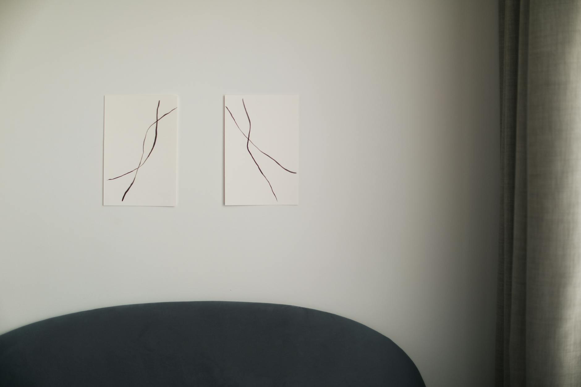
Single larger pieces or small two-print arrangements work better than gallery walls in waiting areas. Visual complexity increases cognitive load at exactly the moment when a client needs to begin lowering it.
The Therapy Room
This is where the work happens. Art here carries more weight and more complexity. Your clients will spend hours looking at these walls, returning to them session after session, noticing them in peripheral vision during difficult moments and long silences.
The therapy room calls for art that is consistent and containing. Pieces that a client can return to session after session without finding them demanding or intrusive. Art with quiet language, if any language at all, that creates room for projection without directing it.
Placement matters here in ways it doesn't everywhere else. A piece that sits in your client's natural sightline during session will be seen repeatedly, will become part of the felt texture of the work. Consider what you want them to hold as they look away from you, toward the wall, toward a thought they haven't yet found words for.
Group Rooms and Shared Spaces
Group therapy spaces and rooms shared by multiple practitioners present a different challenge: the art must hold for a range of clients, therapeutic approaches, and emotional states simultaneously. This calls for restraint. Minimal and abstract work, or prints with language open enough to receive different meanings without imposing any single one, tends to serve shared spaces best.
Pieces that are too specific to one experience, grief, anxiety, or transition, can feel alienating to clients who are there for different reasons. Art in shared spaces should be wide enough to hold many.
Art That Holds Without Directing
Imagery That Invites Rather Than Instructs
The most effective therapy office art uses imagery that opens rather than closes. Abstract botanical forms, geometric prints based on natural shapes like circles, triangles, and spirals, and typographic work with sparse and open language all invite the viewer's own meaning-making rather than presenting a fixed message.
This is distinct from being "neutral." Neutral art is boring. Open art is rich. The difference is whether the piece offers something to receive, a form, a mood, a resonance, without telling the viewer what to do with it. An enso circle, for instance, carries its meaning gently. It suggests completion and the space within wholeness without asserting anything. A client can sit with it for a hundred sessions and find something different in it each time.
Working with Minimal and Abstract Forms
Minimalism in therapy office art isn't about austerity. It's about removing visual noise so that what remains can actually be received. A piece with fifteen elements competes with itself for attention. A piece with three elements, arranged with intention, allows the eye to settle and the body to follow.
The three collections at Haven & Hold are designed around this principle. The Grounding Collection uses stable geometric forms, triangles and horizon lines, that speak to the nervous system's need for steadiness. The Wholeness Collection uses complete forms, circles and enso shapes, that suggest integration without prescribing it. The Growth Collection uses emerging forms, lotus shapes and spirals, for clients in the between: between who they were and who they're becoming.
Each collection was developed with the same question that good therapy art requires: what does this form say to a nervous system in need?
Color, Mood, and Nervous System Response
Color psychology in therapeutic spaces is well-documented. Research comparing muted blue-gray environments to high-contrast or saturated color fields has documented consistent differences in resting heart rate and self-reported calm among occupants, with the muted palette producing measurably lower physiological arousal. Cool and muted tones, soft blues, warm grays, and earthy neutrals, tend to reduce physiological arousal, which is what most clients in therapy need. High-contrast colors and saturated hues can increase alertness, which isn't the state most clients are trying to access.
This doesn't mean your office needs to be beige. It means the art you choose should support, and not undermine, the mood you're trying to hold. A print with warm sand tones and soft charcoal text will settle differently in a room than the same words printed in saturated primary colors. The emotional register of your art's palette is part of its therapeutic function.
The Three Emotional Territories Your Practice Needs
If you work across a range of client presentations, you may find that your office art is serving only one emotional territory when your clients need all three. A practice focused entirely on grounding work may have walls full of earthy stability, but clients in growth phases may not see themselves there. Likewise, a space built around becoming and emerging may not hold the clients who most need to feel stable and contained.
Grounding: Art for Stabilization Work
Clients doing grounding work, whether through trauma processing, DBT, anxiety-focused work, or crisis support, need their environment to consistently communicate: you are held, you are safe, and the floor is here. Art that says this without words, and sometimes with them, reinforces the stabilizing function of the therapeutic frame.
Geometric forms with horizontal lines and stable shapes are the visual language of grounding. Warm earthy tones carry this same message through color. The phrase "within these walls" speaks to the specific quality of containment that grounding work requires: the room itself as sanctuary. The Within These Walls print, with its minimal design on deep charcoal, has been placed in therapy offices focused on trauma and stabilization work for exactly this reason.
For offices where grounding is the primary territory, consider placing a piece on the natural sightline wall, somewhere a client's eyes can land when they need an anchor.
Wholeness: Art for Self-Compassion and Acceptance Work
Clients working on self-compassion, eating disorder recovery, identity exploration, or relationship with self need their environment to communicate: all of you belongs here, and nothing needs to be fixed or hidden. Art in this territory uses complete forms and language that accepts rather than aspires.
Phrases like "held gently, held wholly" or "space for all of you" are not motivational statements. They are permissions. The difference is felt by clients who have spent years receiving the message that they are not enough. An enso circle, with its suggestion of wholeness that includes the gap, is particularly powerful in spaces where self-compassion is the work.
Growth: Art for Transition and Becoming Work
Clients in major life transitions, grief, career change, the end of relationships, or postpartum periods need their environment to acknowledge that becoming is difficult and that it's worth it, without requiring them to perform optimism about it.
Art in the growth territory uses emerging forms and sits with the between. "Between chaos and calm." "Still becoming." "Held in transition." These are not declarations of triumph. They are acknowledgments of process. For clients who are tired of being told they're almost there, these phrases offer something different: the recognition that being in the middle of something hard is already enough.
Sizing, Placement, and What Clients Actually Notice
The Sightline Principle
Your client's natural sightline during session, the direction they tend to look when they're thinking, when they pause, when they're searching for words, is where your art will matter most. Most clients look slightly upward and to the side of the therapist during reflective moments. This is usually a wall that receives less deliberate attention in office design.
Consider placing one considered piece in that line of sight. Large enough to register, quiet enough not to distract. Something that can receive attention without demanding it. The piece in the natural sightline will be seen more often than anything else you hang. Choose it accordingly.
Single Statement Pieces vs. Small Groupings
In therapy spaces, the choice between a single statement piece and a small grouping carries functional weight. Single pieces are easier to manage and avoid visual competition. A single framed 16x20 or 18x24 print in a strong position can anchor an entire room without asking anything.
Small groupings of two or three prints work well in waiting areas and on walls adjacent to seating. They create a sense of intention and care without being overwhelming. The key is consistent framing, consistent spacing, and prints that come from the same emotional territory, even if not the same collection.
What to Reconsider
A few choices that can undermine the therapeutic frame through art, worth examining honestly:
Very personal art, family photos, travel images, and personal mementos, can create relational complexity for clients in certain presentations. This isn't a universal rule, and many therapists use personal objects thoughtfully, but each piece is worth asking: what does this communicate about me, and is that communication helpful in this therapeutic relationship?
Credentials and certificates displayed on the same walls as your chosen art create a mixed message. Credentials matter, and they reassure clients about qualifications. Consider a dedicated wall or a less prominent position so that the "holding" art and the "authority" signals don't compete for the same relational space.
Art with language that is too specific to the presenting concern of one population can alienate clients with different needs. A print that says "You Survived" speaks directly to one specific experience and may feel foreign, or even painful, to someone in a different place.
Ordering for a Multi-Room Practice
The Case for Collection Coherence
If you run a group practice with multiple therapists and multiple rooms, visual coherence across your space communicates something to every client who moves through it: this place was designed with care, and the care is consistent. Clients who transition between rooms, or practitioners who share spaces, experience the whole office as a unit.
This doesn't mean everything needs to match. But choosing from two or three emotional territories, using consistent framing, and maintaining a coherent color palette creates a practice environment that feels considered rather than assembled. The difference is felt even when it isn't named.
For Practices With Multiple Rooms
For practices ordering art across multiple spaces, individual prints from Grounding, Wholeness, and Growth can be selected for a waiting area, a primary therapy room, and a shared hallway or group space, with room to consider each room's specific emotional function.
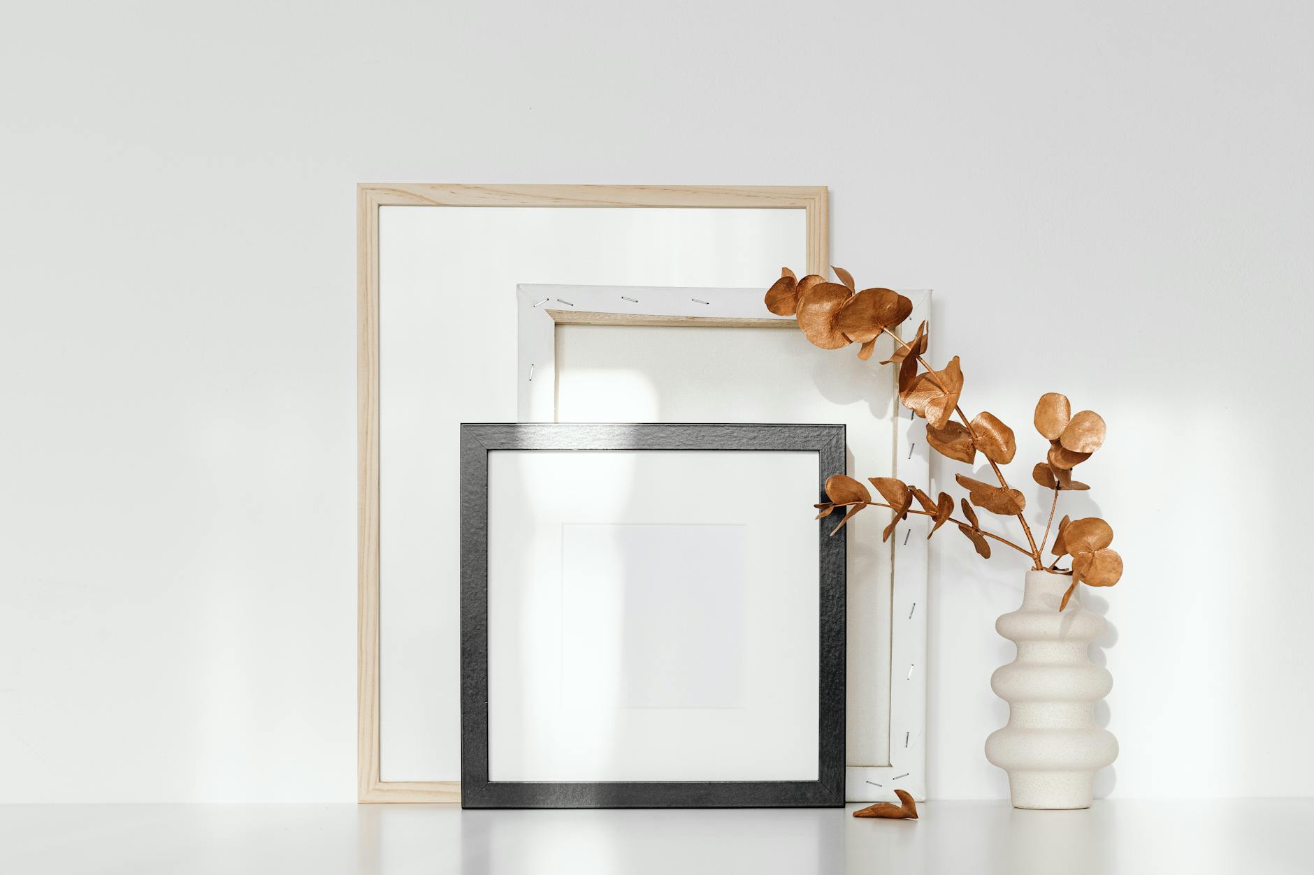
Each print is produced on enhanced matte paper and available framed in Black, White, or Natural frame finishes, with a clear front protector. The quality is professional and the presentation reflects the standard of care your practice holds in everything else.
The Sanctuary print, one of the most consistently requested pieces for therapy office use, is available as part of this collection or on its own. The single word, set simply against a warm sand background, communicates exactly what it says without explaining itself.
Thinking Through Your Order
If you're ordering for a new space or a refresh, mapping your rooms before you choose helps enormously. Which emotional territories does your client population most need? Where do the natural sightlines fall in each room? Does your waiting area need something different from your therapy room?
Most practices find they need at least one piece from each of the three territories to hold the range of presenting clients. Offices focused on a specific population, trauma practices, eating disorder centers, and adolescent services, may find they want to lean more heavily into one territory, while keeping one or two pieces from the others for the moments when a client's need doesn't fit the primary frame.
Frequently Asked Questions
Should therapy office art have text or be image-only?
Both can work, and the choice depends on your clinical approach and the specific space. Text-based art carries more specific meaning and can serve as an anchor for certain clients, something to return to, to question, or simply to hold. Abstract or image-only art is more projectively open: clients can bring their own meaning without a verbal frame being imposed. Many therapy offices use a combination, more abstract work in the therapy room where projection is valuable, and pieces with quiet language in the waiting area where reassurance is the primary need.
How do I choose art that won't accidentally trigger clients?
There is no completely trigger-neutral art, just as there is no completely trigger-neutral therapeutic relationship. What you can do is choose art that is not accidentally provocative. Avoid imagery associated with confinement, loss, violence, or mortality. Avoid art with text that makes assumptions about what the viewer is experiencing. Opt for forms and language that invite rather than declare, and that are open enough to receive different meanings without imposing any. When in doubt, simpler and quieter is safer.
Is it appropriate to display art I personally love in my therapy office?
Personal art is not inherently inappropriate, but it introduces relational material. A client may ask about a piece you chose, and that question carries meaning. Art that reflects your personal values, experiences, or aesthetic may be read as a statement about your worldview, which some clients welcome and others find complicated. This isn't a reason to have a sterile office. It's a reason to think about each piece through the lens of what it communicates about you, and whether that communication is something you want to invite into the therapeutic frame.
How often should I refresh the art in my office?
Consistency is generally more valuable than novelty in a therapy space. Clients benefit from an environment that remains predictable and stable, and returning to the same art across many sessions can make pieces meaningful over time. Some clients find that a piece they barely noticed in their first session becomes something they look at closely months later. A slow refresh, one new piece per year in a long-established practice, tends to work better than regular rotations. If a piece is generating consistent difficult attention or no longer serves your practice's work, replacing it is appropriate.
What size prints work best in a therapy room?
For the primary sightline wall in a standard therapy room, 16x20 or 18x24 (unframed) tends to read at the right scale. Large enough to feel intentional and present, contained enough not to dominate the room. In smaller offices or for secondary walls, 11x14 is often proportionally right. Very small prints, 8x10 and under, as standalone statement pieces can read as an afterthought rather than a considered choice. If budget is a consideration, one well-chosen medium-size piece carries more weight than several small ones.
Can I use the same art in multiple rooms of my practice?
Different spaces benefit from different art, even when chosen from the same collection. Using the same print in every room reduces its impact and makes the space feel assembled rather than considered. What does work well is choosing from the same collection or color palette across rooms, so that the practice feels cohesive without feeling repetitive. Each room can hold a piece from the same emotional territory while offering the client something distinct.
What should I do with the wall directly behind my client?
The wall behind your client is primarily in your sightline, not theirs. It holds something for you, something that centers you or holds the quality of attention you bring to session. Some therapists place their most personally resonant pieces here. Others keep this wall clear. Either choice is fine. What matters is being intentional about it.
The Space That Holds You Both
The work that happens in a therapy session asks something significant of the people who enter your office. Your clients bring the hardest parts of their lives into this room and sit with them. They need to feel that the space was prepared for them, that someone thought about what these walls would say before they arrived.
You already do this work through your training, your attunement, and your presence. The walls can hold some of that weight, too.
The right art for a therapy office doesn't ask anything of the person looking at it. It settles. It stays. It says, quietly and without insistence: you are allowed to be here, all of you, exactly as you are. That is the same thing you're offering every time a client sits down across from you.
If you're thinking about what your space needs and want to start with your own relationship to these three territories, the Sanctuary Style Quiz takes three minutes and identifies which emotional territory feels most pressing right now. Many therapists find it clarifying to take it as themselves before thinking about their clients.
Your walls already have the capacity to hold. Let them.
Related guide: For a broader room-by-room guide, read our therapy office wall art hub. therapy office wall art guide.
Related guide: For a printable version of the room-by-room choices, download the therapy office design checklist. therapy office wall art guide.
You might also enjoy
- How to Choose, Print, Frame, and Hang Wall Art
- 7 Minimalist Bedroom Wall Art Ideas That Help You Sleep
- The Grounding Collection: Why Triangles and Horizons Signal Safety
- What Size Art Print Do I Need? A Room-by-Room Guide
- Therapy Office Wall Art: 12 Ideas for a Holding Environment
- Why Your Apartment Doesn't Feel Like Home Yet
- Best Paper for Printing Art at Home: GSM, Matte, and Archival Explained
- The Wholeness Collection: What Circles Have Been Trying to Tell Us
- Where to Print Digital Art Near You: Local Options Beyond Your Home Printer
- What to Put on the Walls After Divorce
- Growth Wall Art: The Lotus Geometry of Becoming
- What Your Therapy Waiting Room Says Before You Do
- How to Hang Art Without Ruining Your Walls: Renter-Friendly Methods
- The Room You Come Home To After Therapy | Haven & Hold
- Small Apartment Decor Ideas for a Calm, Restful Space
- Digital vs Physical Art Prints: Which Should You Choose?
- How to Design a Trauma-Informed Therapy Office
- Neutral Tone Home Decor: Why Sand, Clay & Charcoal Work
- Guest Bedroom Wall Art: Making Visitors Feel Held
- Gifts for the Friend Going Through a Hard Season
- Therapy Waiting Room Design: Calm Before the Session Starts
- Mental Health Awareness Month 2026: Build a Home That Holds You
- Black and White Wall Art: When Simplicity Says Everything
- Safe Harbor Print: Grounding Wall Art for Hard Seasons
- mothers-day-gift-guide-for-the-mom-who-doesnt-want-more-stuff
- art-print-care-guide-how-to-keep-your-prints-looking-beautiful-for-years
- How to Choose Wall Art for a Quiet, Specific Taste
- Therapy Office Wall Art That Helps Clients Feel Safe
- What to Put Above the Bed for a Softer Room | Haven & Hold

Written by Haven & Hold