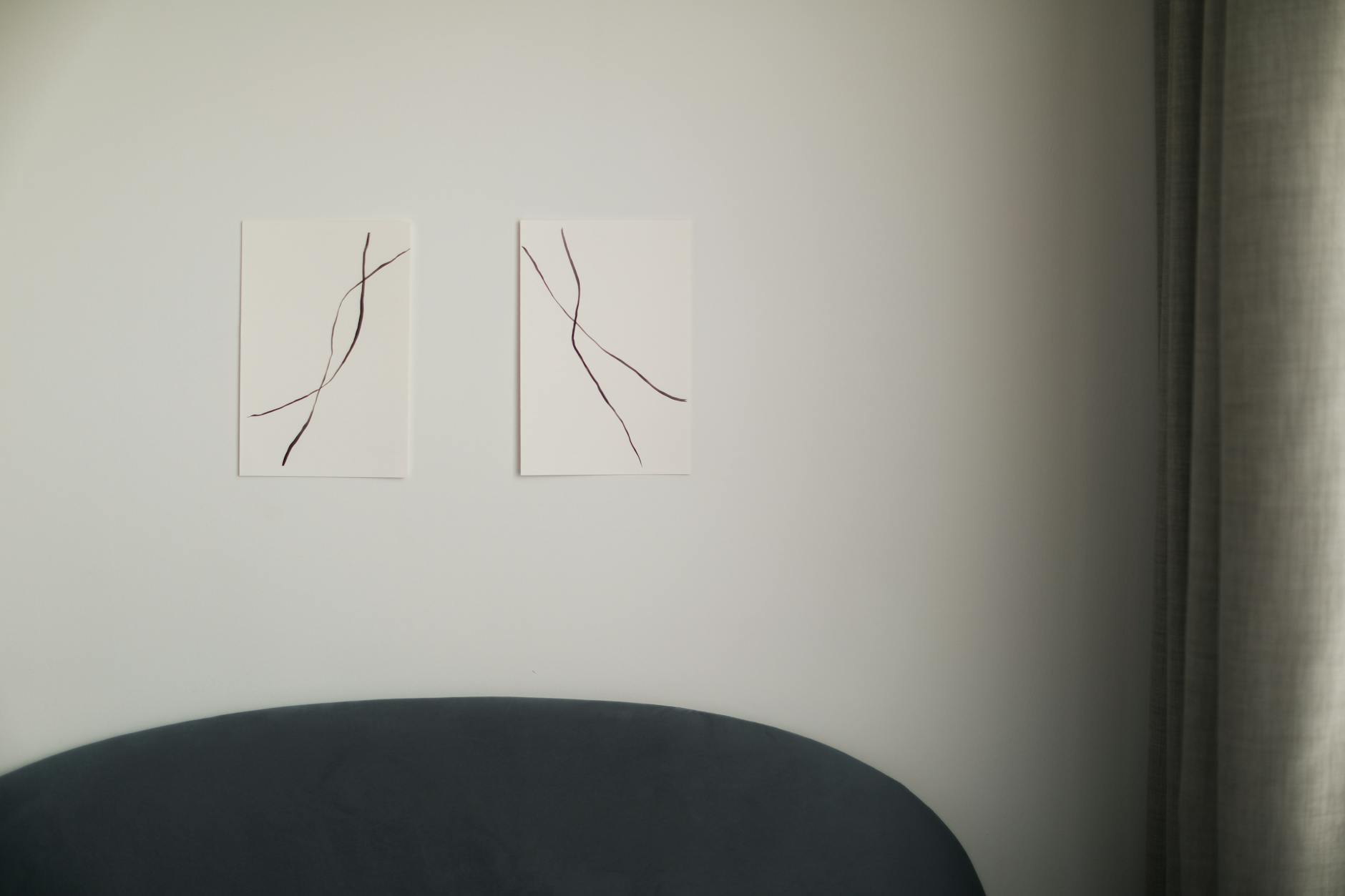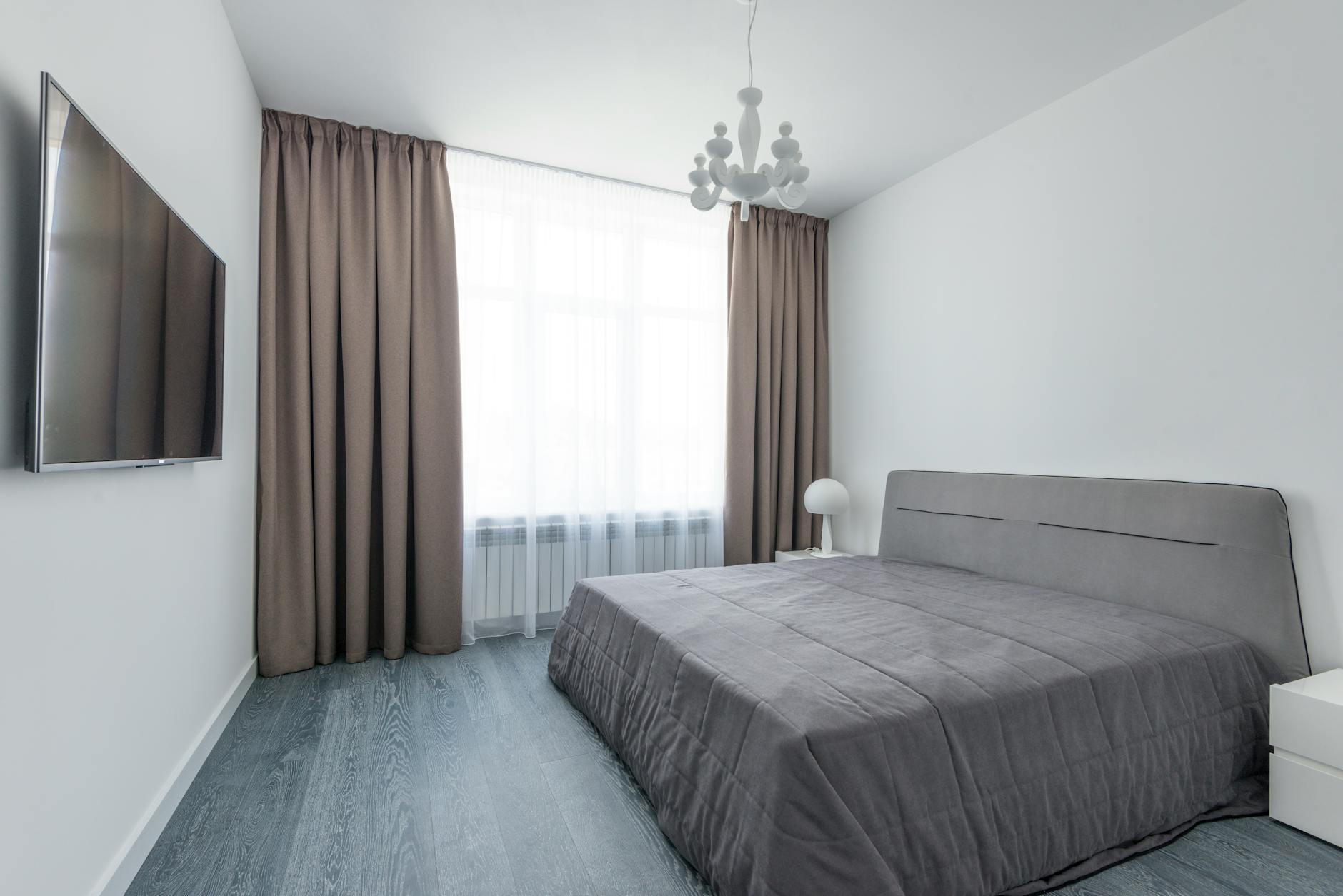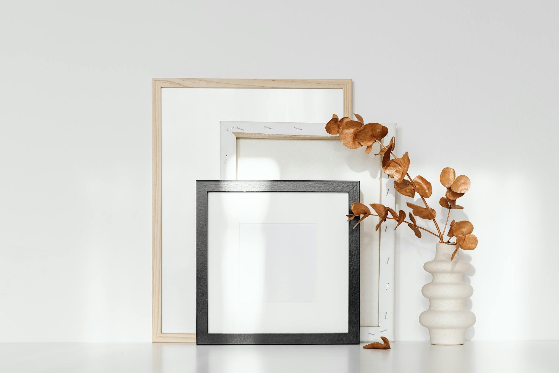
How to Choose, Print, Frame, and Hang Wall Art
Your walls have been blank longer than you planned.
You have probably scrolled through Etsy more than once, filled a cart, and quietly closed the tab. Not because nothing caught your eye, but because too much did and none of it felt quite right. The sizing felt uncertain. The framing choices were overwhelming. And somewhere between clicking "add to cart" and actually imagining a print above your bed, something stopped you.
This guide is for that moment. It covers the full process, from choosing a piece that belongs in your space to understanding sizing and framing to hanging it at the right height so it actually looks the way you pictured it. Each section stands on its own, so you can read straight through or come back to the part that's giving you trouble. Either way, the goal is the same: a wall that holds you rather than stresses you.
Why Choosing Wall Art Feels Harder Than It Should
The blank wall is not a taste problem. It is a decision problem, and decision problems feel worse when the stakes feel personal.
Your walls are the first thing you see when you wake up and the last thing you see before you sleep. A UCLA study of American households found that women who described their homes as cluttered or unfinished showed elevated cortisol levels throughout the day, while women who described their homes as restful showed measurably healthier stress patterns. Your environment is not neutral. It is working on you constantly, whether or not you have put anything on the walls yet.
The Real Barrier Is Not Taste
Most people who leave walls blank for months are not indecisive by nature. They are selective. They care about what goes on their wall because they understand, on some level, that it will become part of how their space feels. The barrier is not lacking a preference. It is not being willing to settle for something that doesn't quite say the right thing.
What Feels Overwhelming and Why
The process has too many decision points that feel high-stakes at the same time: subject matter, sizing, frame style, frame color, mat or no mat, placement, gallery arrangement, hardware. Most guides treat each of these as equally urgent. They are not. The sections below separate them out, in the order they actually matter.
How to Choose Art That Belongs in Your Space
Before sizing or framing, there is a more important question: what does this wall need to do?
A bedroom wall needs to hold you. A reading corner needs to settle you. A home office wall needs to steady you. A therapy waiting room needs to reassure without directing. Knowing the emotional function of a wall before you start shopping saves hours of browsing and dozens of closed tabs.
Reading Your Room Before You Buy
Stand in the room with the blank wall. Notice the light, the furniture, the colors that are already there. Notice what the room feels like at its best and what it feels like when it isn't working. The art that belongs there will extend what already works, not fight against it.
Look at the dominant tones. Warm wood, linen, and cream tones tend to hold warmer finishes, natural oak frames, and prints with sand, clay, or earthy backgrounds. Cooler greys, whites, and blues hold black frames and prints with softer, more graphic contrast. This is not a rigid rule, it is a starting observation.
Consider the emotional territory of the room. If the room is where you rest, look toward art that communicates stillness and safety. If it is where you work on things, look toward art that holds steady rather than pushes. Our Grounding Collection was built for stability and safety, and it tends to find its home in bedrooms and quiet corners. The Wholeness Collection belongs in spaces where you want to feel accepted as you are. The Growth Collection tends toward spaces of becoming: offices, studios, and transitional rooms.
Choosing by Emotional Intention
Emotional intention refers to the feeling you want a space to hold for you, distinct from aesthetic preferences or color matching. A room can be beautifully decorated and still feel hollow if the art on the walls says nothing that matters to you.
This is worth sitting with. Not "what looks good" but "what do I need this wall to say when I walk past it at 6am before I have had coffee." The answer to that question will tell you more about which print belongs there than any color palette will.
If you want a concrete starting point, the Sanctuary Style Quiz takes about three minutes and matches you to the collection that fits where you are right now.
If you want something to hold onto while you figure out sizing and framing, the Sizing and Framing Reference Card gives you the core rules in one place, formatted to save or print and bring to a frame shop.
Understanding Print Sizes Before You Order
The most common mistake in buying wall art is going too small. Not by a little, by a lot. A print that looks generous on a product page can disappear entirely on a wall. Understanding sizing before you order saves the heartbreak of hanging something and realizing it looks lost.
The Most Common Sizing Mistake
An 8x10 print is approximately the size of a piece of notebook paper. On a wall above a sofa, it reads as a small object, not art. For a single wall hanging above furniture, most rooms call for a minimum of 16x20 inches, and many look best at 18x24 or larger.
Interior design professionals, including those credentialed through the American Society of Interior Designers, consistently recommend that wall art above a sofa or bed span approximately two-thirds the width of the furniture below it. A standard 84-inch sofa calls for art in the range of 56 inches wide, which is either one large piece or a carefully arranged grouping.
Standard Sizes and Real-World Scale
Here is how standard print sizes read in actual rooms:
8x10 inches: Works well in a tight gallery arrangement, as one piece in a larger grouping, or in a small bathroom. On its own above a sofa or bed, it disappears.
11x14 inches: A step up, holds better on its own in smaller rooms or alcoves. Still modest above large furniture.
16x20 inches: The minimum for most single-piece above-furniture placements in average-sized rooms. This is where prints begin to have real presence.
18x24 inches: Feels intentional. Works beautifully above a queen bed, console table, or sofa. This is the size most people wish they had bought when they went smaller.
24x36 inches: A statement. Works in living rooms, above king beds, and in entryways where there is room to breathe around it.
Frame Size vs. Print Size
Frame size refers to the external dimensions of the frame, which is different from the print size. A frame labeled "16x20" fits a 16x20 print, but the external dimensions will be slightly larger depending on frame width. When shopping for ready-made frames, match the frame's inner measurement (or mat opening) to your print size, not the frame's labeled size.
If you add a mat, the mat opening is slightly smaller than the print to hold it in place. A 16x20 print with a mat will typically have a mat opening of 15.5x19.5 inches, so the print overlaps the mat edge by a quarter inch on each side. This is standard and correct.
Framing Your Art Well
A print without a frame feels temporary. A print in the wrong frame feels like a mistake. Framing is where most people feel the most lost, and it is also where the right choice makes the most difference to how a wall feels.
Frame Styles and Their Mood
Natural wood frames (oak, walnut, birch) are warm and grounding. They work in almost any room because they echo the organic materials people already have, floors, furniture, and cutting boards on kitchen counters. Our prints are printed on demand through Printful on enhanced matte paper, with framed options in Black, White, and Natural finishes.
Black frames are graphic and quiet. They give art more authority on the wall without competing with the print itself. In rooms with lighter walls and minimal furniture, a black frame holds the print firmly in place.
White frames soften. They are good in rooms that already have strong color or texture, where you want the art to breathe rather than contrast.
Ornate frames earn their place when the art inside them is simple. A heavily embellished frame around a spare typographic print creates tension that works. The same frame around a landscape becomes busy.
Mats: When They Help and When They Don't
A mat is a border of board between the frame and the print. It adds breathing room between the image and the frame edge, which makes the art feel more considered. Museums use thick mats because they signal that what's inside deserves attention.
Mats work best with:
- Smaller prints that need the visual weight of extra white space
- Detailed or photographic art that benefits from isolation
- Prints you want to feel gallery-quality
Mats are optional for:
- Bold typographic or geometric prints that fill the frame well on their own
- Large prints that already have their own presence
- Gallery wall groupings where the uniform frame sizes create enough rhythm
If you order framed prints from Haven & Hold, the framing is handled for you. Each framed print comes ready to hang with the right proportions built in.
Mixing Finishes Without Creating Chaos
You do not need to match all your frames. Matching every frame in a room reads as decor, not curation. A more honest approach is to limit yourself to two frame finishes in one room. Black and natural wood. White and walnut. Natural oak throughout with one accent frame in black. The variation creates interest without looking scattered.
How to Hang Art Correctly
Choosing and framing a piece of art is the first half of the work. Hanging it so it reads correctly on the wall is the second, and this is where a few clear rules help more than any amount of intuition.
The 57-Inch Rule and Why It Works
Major museums and galleries worldwide hang art so the center of the piece sits at 57 to 60 inches from the floor. This places the visual center of the art at average eye level for a standing adult. The American Alliance of Museums documents this as the standard for gallery installations.
To use it: measure 57 inches up from the floor and mark it lightly with a pencil. That mark is where the center of your art should sit. Then calculate the distance from the center of your print to the hanging hardware on the back (hook or wire) and measure that far above your center mark. That is where your nail goes.
Art Above Furniture: Getting the Height Right
The 57-inch rule assumes a standing viewer. When art hangs above furniture you sit in front of, you want to adjust for a seated eye level. The standard guidance is 4 to 8 inches above the furniture's top edge. This places the bottom of the frame close enough to the furniture that the art and the piece below it read as related.
If there is a gap of 12 or more inches between the furniture and the bottom of the frame, the art floats. It looks like a coincidence rather than a choice.
Hardware for Different Wall Types
Drywall: Standard picture hooks with small nails hold prints up to about 20 pounds. For heavier frames, use wall anchors or find a stud with a stud finder and drive the nail or screw into it.
Plaster walls (older homes): Plaster is brittle. Use hardened picture hooks with thin nails designed for plaster. Drive slowly. For heavy frames, use toggle bolts or find the lath behind the plaster.
Tile and brick: Use masonry anchors. Drill with a masonry bit before inserting the anchor.
Rental walls: Adhesive strips (Command strips) hold surprisingly well for lighter prints. Follow weight limits carefully. Remove according to instructions to avoid taking paint with them.
Planning a Gallery Wall
A gallery wall is where the fear of making it look wrong tends to peak. The good news is that every gallery wall that looks intentional and considered followed a process, not a talent.
Start With an Anchor Piece
An anchor piece is the largest or most visually dominant work in the arrangement. It is the piece the eye goes to first and the piece the rest of the arrangement organizes around. Identify your anchor before you do anything else.
Place the anchor at eye level at the center of your intended arrangement. Everything else arranges outward from it.
Plan on the Floor Before You Hang
Lay your prints on the floor in the arrangement you are considering. Step back and look at them from a standing position. This is the single most effective way to understand how the grouping will read on the wall before you commit any nails.
Move pieces around on the floor until the arrangement feels right. Then trace each frame outline on paper or newspaper, cut them out, and tape them to the wall with painter's tape. This lets you see the spacing and scale on the actual wall before you drive a single nail.
The Two-Inch Spacing Rule
Research from galleries and professional installation services consistently points to 2 to 3 inches as the optimal gap between frames in a gallery arrangement. Tighter than 2 inches looks crowded. More than 3 inches and the pieces begin to lose their relationship to each other and the grouping falls apart visually.
Two inches is a good default. Measure it with a ruler once, mark it, and use it consistently across the arrangement.
Common Mistakes Worth Knowing Before You Start
These are the patterns that show up again and again, and each one is easy to avoid once you know to look for it.
Going Too Small
This is the one. It shows up in almost every conversation about art placement. The print looks fine on the product page and feels overwhelming in the shopping cart and arrives and goes on the wall and then sits there looking smaller than the wall around it.
If you are uncertain between two sizes, go up. You can always add pieces around a print that is slightly too large. A print that is too small for its wall tends to stay that way.
Hanging Too High
The instinct is to hang art near eye level while standing, which places it too high for most rooms where people are seated. Art hung high on a wall pulls the eye up and creates disconnect between the art and the furniture below it. If you are watching a print from your sofa most of the time, hang it for your sofa position.
Matching Instead of Harmonizing
A room where every frame matches, every print is the same size, and every color is coordinated tends to feel like a showroom rather than a home. Harmonizing means sharing a palette or material or mood. Matching means replicating. The first creates a room that feels curated. The second creates a room that feels staged.
Frequently Asked Questions
How high should I hang art above my sofa?
The bottom edge of the frame should sit 4 to 8 inches above the top of the sofa. This keeps the art visually connected to the furniture below it. Any more than 12 inches of gap and the art starts to read as a separate element floating on the wall rather than part of the seating arrangement.
What size art looks good above a bed?
For a queen bed (60 inches wide), aim for art that spans approximately 40 to 50 inches wide. That is a single 18x24 or 24x36 print, or a grouped arrangement of 2 to 3 smaller prints. For a king bed (76 inches wide), the same proportion means art in the 50 to 60 inch range. Going smaller than this tends to make the headboard dominate.
Should I use matching frames or mixed frames in a gallery wall?
Mixed frames, when they share one consistent element, work better than identical frames. Consistent color (all black frames) with mixed sizes. Consistent material (all wood) with mixed finishes. Identical frames in a grid are a valid choice for a formal, intentional look. But if your arrangement is organic rather than grid-based, matching frames can make it feel stiff.
Do I need a mat for my prints?
A mat is not required, but it adds visual breathing room between the print and the frame edge. Smaller prints (8x10, 11x14) tend to look more considered with a mat. Larger prints with bold designs often hold well on their own. If you are ordering framed prints, check whether the frame listing includes a mat or sits directly against the print.
How do I hang art on plaster walls without damage?
Use hardened picture hooks with thin nails specifically designed for plaster. Drive the nail slowly and at a slight downward angle to reduce the risk of cracking. For heavier frames, locate the wooden lath behind the plaster using a stud finder and drive into that. Adhesive strips are a reasonable option for lighter prints (under 8 pounds) if you follow the weight limits and removal instructions carefully.
What is the easiest way to plan a gallery wall before committing?
The paper template method is the most reliable. Trace each frame on paper, cut out the templates, and tape them to the wall with painter's tape. This lets you adjust spacing and arrangement without making any permanent marks. Spend a day or two with the templates up before committing to the layout.
Can I hang different frame colors together?
Yes, with one guideline: limit yourself to two finishes in any one room. Black and natural wood work well together. White and walnut pair naturally. When you introduce a third finish, the eye starts to feel the variation rather than the art.
Putting It All Together
The wall that holds you is not a design project. It is a quiet decision about what you want to wake up to.
You do not need to get it perfect on the first try. The prints that matter most tend to arrive on your wall after some hesitation. Sarah, who lives in Portland and spent months closing Etsy tabs, eventually found the piece that stopped her scroll. It was the copy that said something real, not just something pretty. The piece went up above her bed in an 18x24 framed print. She told herself she would rearrange it. She hasn't needed to.
Start with one wall. One piece. The right size for the wall, hung at the right height, in a frame that holds rather than competes. See how it changes the room. A space that feels held tends to hold you back.
If you are still at the beginning of this process, the Sizing and Framing Reference Card is a useful place to keep the core measurements close at hand. And if you are not sure which collection fits the room you are working on, the Sanctuary Style Quiz narrows it down to one.
The wall is waiting. It has been waiting. You are allowed to take your time, and you are also allowed to start.
You might also enjoy
- How to Print Digital Downloads at Home (Without the Frustration)
- Creating a Meditation Corner in Any Size Home
- What Size Art Print Do I Need? A Room-by-Room Guide
- Home Office Wall Art That Won't Make You Cringe on Video Calls
- Meaningful Gifts for Someone Starting Therapy (Not Self-Help Books)
- How to Create a Gallery Wall with Quote Prints
- Bathroom Wall Art Ideas That Don't Feel Random
- What to Put on the Walls After Divorce
- How to Hang Art Without Ruining Your Walls: Renter-Friendly Methods
- Entryway Wall Art That Sets the Tone for Your Home
- Nursery Wall Art Beyond Elephants and Rainbows
- How to Choose the Right Frame for Your Art Print
- How to Build a Cohesive Wall Art Collection One Piece at a Time
- Printable Wall Art Sizing Chart: What Fits Above Your Bed
- DIY Gallery Wall Template: Free Printable Planning Guide
- art-print-care-guide-how-to-keep-your-prints-looking-beautiful-for-years
- How to Choose Wall Art for a Quiet, Specific Taste

Written by Haven & Hold