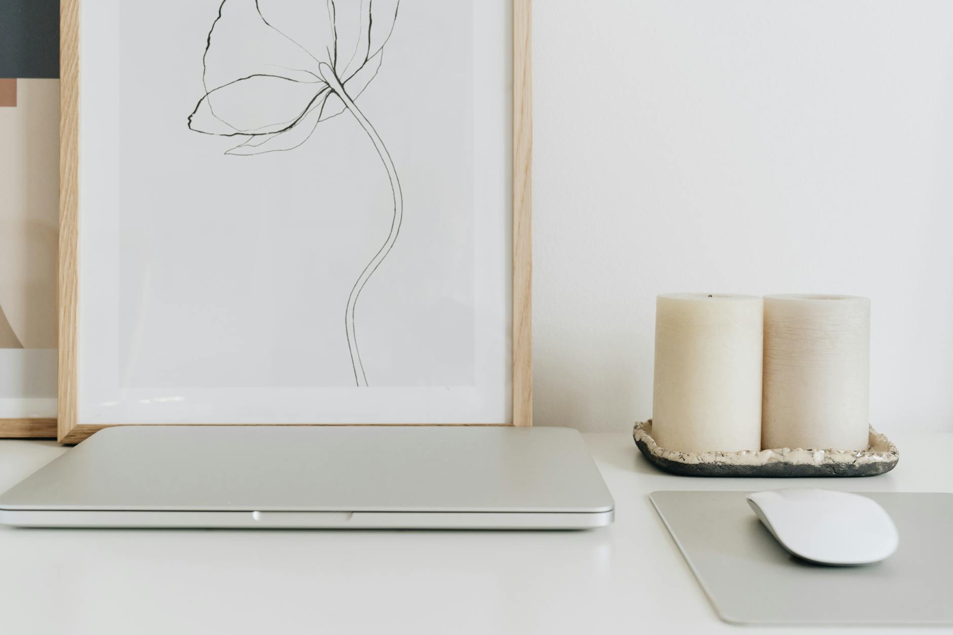
How to Print Digital Downloads at Home (Without the Frustration)
You hit print and wait. The file looked exactly right on your screen, the warm tones settling against each other the way you wanted, the text clean and centered. Then it comes out. And it's either too cool, or slightly blurry, or there are those faint horizontal lines across the middle that nobody warned you about.
This happens to most people who try to print digital art at home. Not because their printer is broken or their taste is off, but because home printing has a short set of variables that, once you understand them, mostly stop being mysterious.
This guide covers the practical decisions, from file resolution to paper weight to printer settings, that determine whether a digital download comes out the way you imagined it. It also covers when home printing is the right call, and when it isn't.
What your file actually needs before it touches paper
Resolution is measured in DPI, which refers to dots per inch, meaning how many ink dots a printer lays down per linear inch of paper. Professional printers process images at 300 DPI. Below 150 DPI, the result looks noticeably soft or pixelated when you're standing close to it. Above 300 DPI, you gain no visible benefit at standard viewing distance.
Most digital downloads sold through Etsy, design shops, or art studios come export-ready at 300 DPI. But it's worth confirming before you print. In most image editors, you can check Image Size and see the resolution listed alongside the dimensions. The key thing is that the resolution holds at the size you intend to print. If a file is 300 DPI at 8x10, printing it at 16x20 halves the effective DPI to 150, and the edges will show.
File format matters less than resolution, but it matters. PDF files preserve exact dimensions and scale cleanly to standard paper sizes. JPG files work well too, but avoid resaving a JPG multiple times, since each save compresses the image a little further. PNG is lossless and reliable for graphics with flat color areas.
One more consideration before you print: color mode. Your screen displays color using RGB (red, green, and blue light). Your printer builds color using CMYK (cyan, magenta, yellow, and black ink). CMYK printing can reproduce approximately 70% of the sRGB color space visible on a standard monitor, which means some vivid blues, bright greens, and saturated warm tones will print noticeably muted compared to how they appear on screen. Most consumer home printers manage this conversion automatically, so in most cases you can let the printer handle it. If a specific color is printing badly off, checking whether your file is in the sRGB color space, which is the standard for screen-optimized digital downloads, is a useful first step.
The paper decision (most people get this wrong)
Standard office paper is 75 gsm (grams per square meter). It was designed for spreadsheets and letters. When you print a warm-toned art file on it, the ink sits near the surface, the paper shows through slightly, and the whole thing looks flat.
Quality art paper begins around 180 gsm. Fine art matte papers run 200-230 gsm and above. The weight and texture change how ink absorbs into the paper, how light interacts with the surface, and ultimately how the piece reads when it's hanging in a room.
For home printing, three finishes to know:
Matte fine art paper (200-230 gsm): Best for warm and neutral prints with subtle tones. No glare, and the ink absorbs evenly. This is what most minimalist and quote art prints are designed to be seen on.
Lustre or satin paper: A middle ground between matte and glossy. A slight sheen without being mirror-bright. Works well for prints with a lot of tonal variation or photographs.
Glossy photo paper: Vivid contrast and saturated color. Can look plastic-y in certain light and shows fingerprints easily. Rarely the right choice for art you intend to live with.
For prints where the tone is quiet and the design depends on subtlety, matte is almost always the right answer. Paper brands worth looking at include Epson Ultra Premium Matte, Hahnemuhle Photo Rag, and Red River Aurora Art White, all of which are available through Amazon and photography supply stores.
If you're working through sizing decisions alongside paper choices, The Sizing and Framing Card takes you through standard print sizes and framing options, one decision at a time.
Inkjet vs. laser: which actually works for wall art
If you're choosing between printer types, inkjet produces better results for art prints. Here is why.
Inkjet printers lay down microscopic droplets of liquid ink in overlapping layers, which creates smooth color gradients and soft transitions between tones. If your print has warm neutral backgrounds, subtle color washes, or areas where tones shift gradually from one to another, inkjet handles this well because it builds color continuously.
Laser printers use heat to fuse toner particles onto paper. For documents and text-heavy prints, they're fast and sharp. But for images with smooth gradients (like a background wash or the soft color fields in minimalist art), laser printers can produce banding. Banding refers to faint horizontal or vertical stripes in areas that should appear as a smooth continuous tone. It happens because toner builds color in a halftone dot pattern rather than continuous ink flow, and gradients expose this.
If you have a laser printer and want to use it, print at the highest quality setting, on smooth heavier paper, and test small before committing. Some laser printers handle gradients noticeably better than others. But for most home printing of art and quote prints, an inkjet is the practical preference.
A 2021 review published by Wirecutter found that entry-level inkjet photo printers from Epson and Canon consistently outperformed similarly priced laser printers on fine art and gradient-heavy prints, with inkjet results rated equivalent to professional lab output in controlled testing conditions.
Printer settings that change everything
Your printer's default settings are calibrated for speed and everyday documents. Printing art asks something different of it.
Before you print, work through these steps in order:
Step 1: Set print quality to "High" or "Best." The default is usually "Normal," which limits how much ink the printer uses and reduces the number of print passes per line. For art, you need the higher-density setting.
Step 2: Match the paper type setting to your actual paper. Most printers have a dropdown for paper type in the print dialog. If you're printing on matte photo or fine art paper, select the matching option. Using the wrong paper type setting causes the printer to apply ink as if it's working with plain office paper, which noticeably shifts the color output.
Step 3: Choose one color management method and turn the other off. Your print dialog will offer you the option to let the printer manage colors, or to let the application manage colors. Running both simultaneously creates a double conversion loop that shifts everything. For most home printing from a PDF viewer or standard image viewer, letting the printer manage color is the simpler path.
Step 4: Print a small test before committing to the full size. Before printing at 8x10 or larger, print at 4x6 or 5x7 and hold it against a neutral wall in the room where it will hang. Natural light shows color shifts that even a well-calibrated monitor can hide. This small step saves ink, paper, and frustration.
For a deeper guide on how sizing affects the experience of a print in a room, What Size Art Print Do I Need? A Room-by-Room Guide walks through the decisions by space.
When home printing is not the right choice
There are situations where home printing will frustrate you even when you do everything right.
Prints above 11x14 are difficult to produce cleanly on standard home printers. The resolution issues and color variations that are invisible at smaller sizes become more apparent as the print gets larger. Wide-format printers (13x19 and above) exist for home use, but they're an investment, and for a single statement print above a bed or sofa, a professional lab is usually the more honest choice.
Color-critical work is also harder to dial in without a calibrated setup. Professional print labs use consistent paper stocks, calibrated wide-format equipment, and regular color profiling. A home printer's output drifts over time as ink cartridges age and room conditions shift. If you're printing something you intend to frame and live with for years, the color consistency of professional printing on archival paper is genuinely different from home output.
Archival paper matters more over time than it seems to in the moment. Standard office or even mid-grade art paper is not acid-free, meaning it will yellow and degrade within a few years in light. Archival fine art paper is pH neutral, and independent testing by fine art paper manufacturers including Hahnemuhle and Canson shows their archival papers retain color fidelity for 100 years or more under standard indoor lighting conditions. Standard non-acid-free paper shows visible yellowing and color shift within five to ten years. The prints in the Grounding Collection, for example, print on 230 gsm archival matte paper, the same standard used by fine art studios and museum print services.
If you are trying to figure out how to frame and hang whatever you end up printing, professionally or at home, How to Choose, Frame, and Hang Wall Art covers every decision from scale to hardware.
Troubleshooting the most common problems
Colors look washed out or too cool: This usually points to a paper type setting that's applying less ink than the paper needs, or a color mode mismatch. Switch print quality to "Best," confirm the paper type setting matches your actual paper, and run a printer nozzle check (in most inkjet printer menus under Maintenance or Tools). If a cartridge is running low, even with visible ink remaining, it affects color density.
Horizontal banding (faint lines across the print): Almost always a clogged print head. Run the printer's built-in head cleaning cycle from the settings menu and print a test page afterward. If banding persists after two or three cleaning cycles, the print head may need deeper maintenance or replacement. Most printer manufacturers offer this as a built-in automated process.
Blurry edges or soft text: Usually a resolution issue. Confirm that your file is 300 DPI at the intended print size. If you're printing larger than the file was designed for, the edges will soften. Try reducing the print size to stay within the file's native resolution.
Ink smearing or wet-feeling output: The paper type setting is likely wrong, and the printer is applying ink as if it's working with glossy photo paper, which stays wetter longer on matte surfaces. Select the correct paper type in the print dialog and give each print at least sixty seconds before handling.
The psychology of your space after the print goes up is worth thinking about as much as the technical process of getting it there. The research is worth reading if you haven't come across it: a study on how color and visual environment affect emotional regulation covers the difference between a wall that holds a room and one that simply fills it.
Frequently asked questions
What resolution do I need for home printing?
300 DPI is the standard resolution for print-quality output. A file at 300 DPI at its target print size will appear sharp and clear at normal viewing distance. Files below 150 DPI will look visibly soft or blurry, especially at sizes above 5x7. Check your file's DPI at the intended print size before committing, since scaling a file up reduces the effective DPI proportionally.
What paper should I use for printing art at home?
For most art and quote prints, a matte fine art paper in the 200-230 gsm weight range gives the best results. Standard office paper is 75 gsm and was not designed to hold art-quality ink. Fine art matte papers absorb ink evenly, reduce glare on the finished piece, and give the print a quality that holds in a room. Look for options from Epson, Hahnemuhle, or Red River at photography supply stores and online retailers.
Why do my colors look different from my screen?
Screens display color using light-based RGB values, while printers apply physical CMYK ink. Some colors visible on a screen fall outside what a home printer can reproduce in ink. The most common shift is warm tones printing slightly cooler and saturated colors printing flatter. Calibrating your monitor, selecting the correct paper type setting in your print dialog, and printing a small test before the final size are the practical steps. If the shift is significant, adjusting brightness or saturation in your image editor before the final print is a reasonable fix.
Can I use a laser printer for art prints?
You can, though inkjet produces better results for art with smooth gradients or soft tonal ranges. Laser printers can show banding in gradient areas because toner builds color in halftone dot patterns rather than continuous ink flow. For text-heavy or high-contrast pieces, a laser printer works well. For full-color art with soft neutral tones, inkjet is the better tool.
What is the largest size I can print at home?
Most standard home printers handle up to 8.5x11 (US Letter) or 8.5x14 (Legal). Some inkjet printers accept 13x19 paper, often labeled "Super B" or A3+. Above that size, you need either a wide-format printer or a professional print lab. For prints you plan to frame in a prominent room position, a print lab offers size range and color consistency that matters at larger scales and over longer periods of time.
You might also enjoy
- What Size Art Print Do I Need? A Room-by-Room Guide
- Best Paper for Printing Art at Home: GSM, Matte, and Archival Explained
- Where to Print Digital Art Near You: Local Options Beyond Your Home Printer
- Digital vs Physical Art Prints: Which Should You Choose?
- how-to-print-art-at-costco-walmart-and-fedex-a-quality-comparison
- art-print-care-guide-how-to-keep-your-prints-looking-beautiful-for-years
Which collection speaks to your season?
Take the 2-minute Sanctuary Style Quiz and find your starting point.
Take the QuizWritten by Haven & Hold
