7 Minimalist Bedroom Wall Art Ideas That Help You Sleep
Lying awake at 11pm, your body has gone still but your eyes haven't found anywhere to rest. The wall above your headboard is either empty in a way that feels unfinished, or crowded with things you haven't really looked at in months. Either way, the room hasn't quite settled. And neither have you.
The connection between what hangs on your bedroom walls and how well you sleep isn't a design trend. It's physiology. Before you consciously register your surroundings, your nervous system has already scanned the room for threat or safety. Visual complexity, competing colors, and restless imagery send a low-level signal that the environment isn't ready to rest. Your brain takes its cues from what surrounds it.
These seven ideas aren't about a particular aesthetic. They're about the conditions that allow your room to say: you can let go now.
What Your Walls Are Doing While You Try to Sleep
Visual complexity refers to the amount of information a space asks your visual cortex to process at any given moment. A wall covered in prints, varied frames, and layered imagery isn't just busy-looking. It maintains a degree of cognitive arousal that works directly against the deactivation your brain needs for sleep onset.
Researchers at UCLA, in a 2010 study published in Personality and Social Psychology Bulletin, found that women who described their homes as cluttered showed significantly elevated cortisol levels throughout the day. The bedroom environment was among the most significant contributing spaces. The body doesn't fully distinguish between visual noise and actual threat. It simply responds.
This is also why a bare wall that feels like a failure might actually be doing better work for your sleep than a gallery arrangement you haven't finished curating. The starting point matters: less is not just an aesthetic preference, it's a neurological one. And working from that understanding makes every choice feel less arbitrary.
1. Keep Visual Complexity Low
The first thing to consider isn't style, color, or subject matter. It's the total amount of visual information your bedroom wall is asking you to process when you close your eyes and then reopen them at 3am.
In practice, this means fewer pieces rather than more. One considered print in a quiet frame gives the eye a place to land and then leave. Four mismatched pieces in different sizes compete for attention in a way that keeps the visual system from fully disengaging. Your nervous system, trying to find something to settle on, moves between them.
If your bedroom wall currently holds more pieces than you actively chose and placed with intention, that's worth noticing. You're allowed to take things down.
2. Stay Within a Warm, Narrow Palette
Color temperature affects how your nervous system interprets a space. Warm tones, the soft sands, warm whites, and muted earth hues, register as shelter. Cool, bright, or highly saturated colors register as stimulation, which is precisely what the bedroom needs less of at the end of a long day.
In 1984, stress researcher Roger Ulrich published a landmark study in Science demonstrating that viewing low-complexity natural scenes, including soft organic forms and earth tones, produced measurable reductions in physiological stress markers. What hangs on your bedroom wall is doing work on your nervous system, quietly, every time you look up.
For bedroom art, a warm and narrow palette means choosing pieces whose colors belong to the same family as the rest of the room. Warm sand, deep charcoal, soft warm white. Not contrast for its own sake, but cohesion for the sake of ease.
If you want a place to start, The One-Wall Reset walks you through reassessing and resetting a single wall, one step at a time.
3. One Piece Above the Bed Rather Than Many
The wall above the bed is the most visually significant surface in a bedroom. It's where your eyes go first in the morning and last at night. What lives there shapes the emotional quality of the entire room.
A single, properly scaled piece above the bed creates a focal point with visual resolution. The eye finds it, rests there, and doesn't keep searching. Two or three smaller pieces, unless very deliberately chosen and related, ask the eye to keep moving. That movement has a cost when you're trying to wind down.
For scale, a piece that spans roughly two-thirds of the width of your headboard tends to read as anchored without overwhelming the space. An 18x24 or 24x36 print in a solid frame works well above a queen or king bed. For twin and full beds, an 11x14 to 16x20 range often gives the right proportion.
If you're still working out sizing, our complete guide to choosing and hanging wall art walks through the room-by-room specifics.
4. Choose Shapes That Signal Stability
The language of form matters more than most people realize. Triangles and horizontal lines, the shapes associated with mountains, horizons, and foundations, communicate stability at a pre-verbal level. Your nervous system reads geometry before your conscious mind does.
This is part of why abstracted geometric art and simple botanical prints tend to land so well in bedrooms. They provide something for the eye to follow without asking it to solve anything. A horizon line, the edge of a triangle, a single unfurling botanical form. The shape says: the ground is still here.
The Grounding Collection works with this principle directly. Triangles, horizon lines, and rooted forms chosen for the specific emotional territory of stability and safety. The kind of art that holds the wall so the wall can hold you.
5. Choose Words That Give Permission, Not Assignments
Word-based art reads differently from purely visual art. If there are words above your bed, your brain processes them, including during the drowsy states just before sleep. What those words say matters more than most people consider when they're hanging them.
Words that carry achievement, urgency, or performance language keep that mental channel open when you need it closed. Words that give permission to rest, to be still, to be held, work with the sleep process rather than against it.
"Rest here." "You are held here." These aren't motivational statements. They're something quieter. The difference between a wall that expects something from you and a wall that asks nothing at all.
For a deeper look at how word choice in your home connects to your inner life, the guide to therapeutic home design explores this in full.
6. Hang at the Right Height for Your Lying-Down Sightline
Most hanging guidelines are written for standing viewers. But you spend hours in your bedroom lying down.
The traditional rule is to center a piece at 57 to 60 inches from the floor, which aligns with standing eye level. For art above the bed, this often works for the waking moment, but the more useful measurement is where the piece falls relative to your pillow.
Above the headboard: the bottom edge of the frame should sit 6 to 8 inches above the headboard. This keeps the piece in visual relationship with the bed without looming over it. For a side wall or nightstand piece, placing art at pillow height, so it lands in your sightline when lying on your side, creates an intimacy that larger above-bed pieces can't replicate. Small prints and botanical companions work especially well here.
The height question matters more than it sounds. A piece hung too high becomes ceiling art. A piece hung too low presses down on the bed. The right height lets the room feel like it's looking after you.
7. Let the Art Coordinate With the Room, Not Compete
The bedroom is asking to be a single thing. A place with one emotional purpose. Art that introduces a competing color, a conflicting mood, or a visual temperature that doesn't belong to the rest of the room breaks that coherence, even subtly, even in ways you notice only as unease.
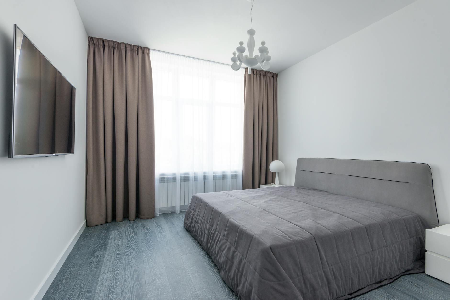
Coordination doesn't mean everything has to match. It means the art belongs to the same conversation as the rest of the room. The same emotional temperature. The same degree of quiet. A warm-toned print in a natural oak frame in a room of linen and wood will feel inevitable. The same print in a cold silver frame against a bright white wall will feel like it arrived from somewhere else.
When choosing art for your bedroom, bring the room into the decision. What's the existing palette? What textures are already present? Where does the light come from at night? The art that works best is the one that already seems like it was always meant to be there.
For a broader framework on how to approach the entire process, The Complete Guide to Minimalist Wall Art covers the full territory, from choosing to hanging to living with what you've chosen.
Your bedroom doesn't need to be a design project. It just needs to be a place that knows what it's for.
If you're not sure where to start, take the quiz to find which collection fits the feeling you're reaching for. Or simply begin with the wall above your bed. One piece. One quiet choice. The room will meet you there.
Frequently Asked Questions
Does bedroom wall art actually affect sleep quality?
Yes. The visual environment of a bedroom directly influences the nervous system's ability to shift into a relaxed state. A 2010 study from UCLA, published in Personality and Social Psychology Bulletin, found that women in cluttered home environments showed elevated cortisol levels throughout the day, with the bedroom among the most significant contributing spaces. Art that introduces visual complexity, stimulating color, or conflicting emotional content maintains arousal that works against sleep onset.
How many pieces of art should I hang in my bedroom?
For most bedrooms, one to two pieces is enough. One statement piece above the bed is the simplest and most effective approach. If you want to include a side wall piece, keep it smaller and quiet enough not to compete with the primary piece. More than three pieces in a bedroom almost always tips toward visual noise that the nervous system keeps processing through the night.
What colors work best for bedroom wall art?
Warm neutrals, muted earth tones, and low-saturation colors in any family tend to support rest. Soft warm whites, warm sands, deep charcoals, and muted greens or blues in their most hushed register all work well. Avoid highly saturated or bright colors, which maintain a level of visual stimulation that works against the deactivation process.
Where should I hang art above my bed?
The bottom edge of the frame should sit 6 to 8 inches above the headboard. This keeps the piece in visual relationship with the bed without feeling like it's pressing down on the space. For sizing, aim for a piece that spans roughly two-thirds of the width of your headboard for a proportional and anchored look.
Can the words on bedroom wall art affect sleep?
Yes, and this is one of the most overlooked considerations in bedroom decor. Text-based art is processed by the brain, including during the drowsy transitional states before sleep. Words with achievement, urgency, or performance language keep that mental channel active. Words that offer permission, stillness, or a sense of being held support the shift into rest rather than working against it.
You might also enjoy
- Living Room Wall Decor for Homes Actually Lived In
- Nursery Wall Art Beyond Elephants and Rainbows
- Small Apartment Decor Ideas for a Calm, Restful Space
- Guest Bedroom Wall Art: Making Visitors Feel Held
- Printable Wall Art Sizing Chart: What Fits Above Your Bed
- Black and White Wall Art: When Simplicity Says Everything

Written by Haven & Hold