Home Office Wall Art That Won't Make You Cringe on Video Calls
Ten seconds before you click "Join Meeting," something shifts. You glance at the wall behind your desk and actually look at it for the first time in weeks, and you see the stack of paperwork you moved out of frame, the nail hole from the print you took down, the blank expanse that has been blank since you moved in. Or worse: the motivational poster that came with the apartment's previous tenant, still hanging, still saying something about Monday mornings.
Your background on a video call is the first thing people register. Before you say a word, the wall behind you has already made an impression. This isn't a reason to stress, but it is worth thinking about, especially if you spend three to five hours a day on camera.
Here's what actually works, what doesn't, and how to choose something you'll still want to look at when the calls are over.
What Your Background Is Already Communicating
A 2021 study by Stanford researchers, published in Technology, Mind and Behavior, documented four distinct causes of what they called video call fatigue. One of them is the cognitive burden of being seen, specifically the experience of watching yourself on screen for hours at a time. Your nervous system treats the camera differently than a mirror. You become aware, in a sustained, low-level way, of how you appear, including what's behind you.
That awareness isn't vanity. It's your brain trying to manage how you're perceived in a professional context, and it's tiring in a way that normal in-person conversation isn't.
The background matters because visual context shapes first impressions faster than any verbal introduction. Researchers in environmental psychology have documented the phenomenon consistently: visual noise refers to the accumulation of competing visual elements that prevent the eye from settling anywhere in particular. A wall full of visual noise reads as chaotic, even when the person in front of it is calm and composed. A wall that gives the eye somewhere to rest reads as grounded, even before you've spoken.
This isn't about performing a curated life. It's about removing friction. When your background is calm, your presence in the frame becomes clearer.
What Makes a Wall Distracting on Camera
Some things that look fine in person read badly on a two-inch thumbnail.
Busy patterns are the clearest culprit. A wallpaper with a repeating geometric motif, a gallery wall where every print fights for attention, a bookshelf where every title is visible and competing. Cameras compress depth and flatten contrast. Patterns that read as texture in person turn into visual static on screen.
Highly personal items create a different problem. Family photos, the kids' school drawings, a corkboard covered in sticky notes and appointment cards. None of these are wrong to have. They just tend to invite questions you aren't prepared for in a work context, and they shift the visual focus away from you. The same is true of anything that feels more like a statement than a backdrop. A very political poster, a very bold piece of typography, a collection of things that requires context to understand. Your background doesn't need to explain you. It just needs to hold you.
Clutter of any kind reads as disorganized. Not because it actually is, but because the camera doesn't have room for nuance. A 2023 study published in PLoS ONE by researchers at Durham University found that bookcase and plant backgrounds scored the highest ratings for both competence (4.96 and 4.90 out of 7, respectively) and trustworthiness, while home and living room backgrounds scored significantly lower. The lead researcher's framing was direct: "A carefully selected video call background seems to be the new business suit." The distinction between an enriched background and a cluttered one is important: enriched means intentional and calm. Cluttered means competing and anxious.
The motivational poster deserves its own mention. The one with the silhouette of a mountain climber. The one that says "HUSTLE" in block letters. The one your company gave out at a team retreat in 2019. These communicate something specific, and it's rarely what you intend.
If you want a concrete place to start with the wall behind your desk, The One-Wall Reset walks you through it, one wall at a time.
What Actually Reads Well Behind You
The short answer: minimal art with clean lines, in a muted palette, at a scale that fills but doesn't overwhelm the frame.
One piece, considered. A single print or canvas, well-positioned behind you, reads as confident and intentional on camera. It gives the eye one place to land. It says, quietly, that you made a choice rather than accumulated things. The print doesn't need to say anything clever. It doesn't need to advertise your taste or your values. It just needs to hold the wall without demanding attention.
Muted, warm tones. Camera compression tends to flatten and sometimes oversaturate colors. Bright primary colors read more intensely on screen than they do in person. Warm neutrals, soft earth tones, muted sage and slate and clay, all hold well on camera. They don't compete with your face, which is the actual focal point. A print with a warm sand background reads as grounded and warm on any monitor. A print on deep charcoal reads as sophisticated without being harsh.
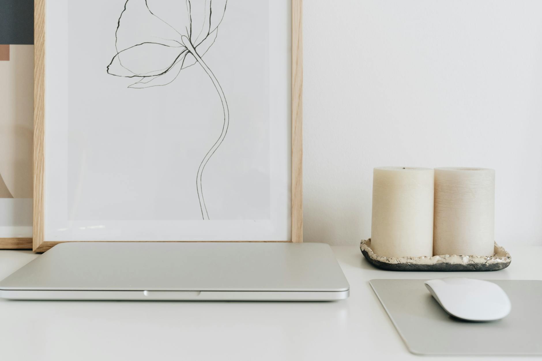
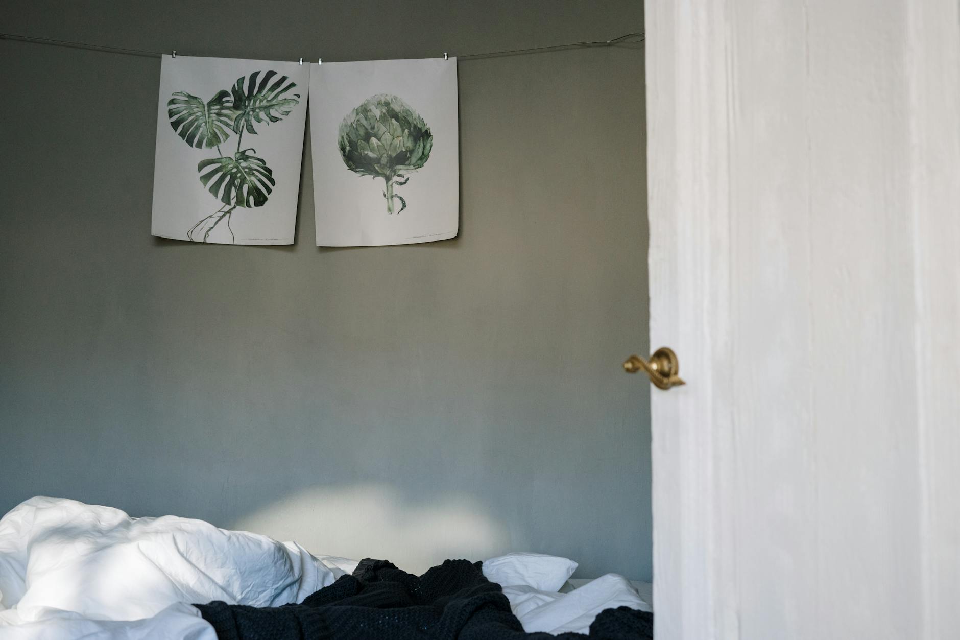
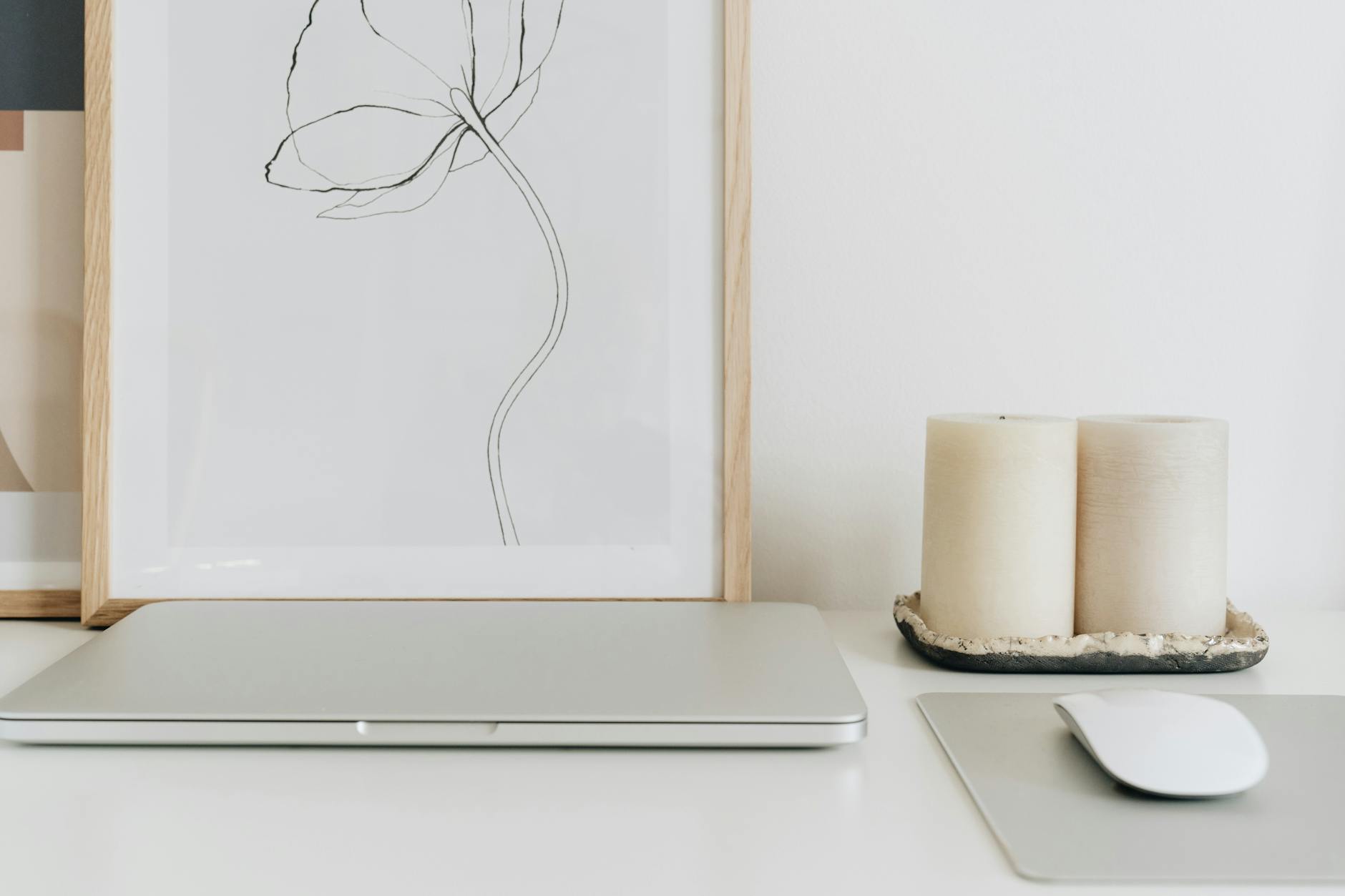
Botanical imagery and abstract forms. A single botanical print, a line drawing, an enso circle, a minimal geometric form. These provide visual interest without visual noise. The eye finds the shape and settles. That settling is what you want the viewer to experience before you start talking.
Correct scale for the frame. The art should be visible as art, not so small it disappears or so large it dominates your whole feed. This is where most people go wrong. A print that looks generous in the room, say 16x20 or 18x24, often reads as small or insignificant on camera. Design professionals recommend art that is at least 36 inches wide to hold visual presence in a video frame. A 24x36 print, framed or unframed, is typically the minimum for the art to read clearly as a considered choice rather than a faint rectangle on the wall.
If you want to explore prints specifically chosen for nook and office spaces, the Nook and Office collection has pieces that photograph well and live well in the same space.
The Camera Test: See What They See
Before you make any changes, do this: open your video call app, turn on your camera, and actually look at what's behind you.
Move your chair to where you normally sit. Look at the proportions. How much of the wall is visible? What does the eye land on first? Is there anything in the background that's brighter or more saturated than your face? Anything that creates visible distortion, busy pattern, or competing typography?
Now try this: ask someone you trust to be honest to join a quick test call and tell you what they notice about your background before you do. Not what they think of you, but what they see. It's a five-minute conversation that saves weeks of low-level self-consciousness on calls.
Good lighting matters as much as the art. If the light source is behind you, you'll appear in silhouette and the wall becomes irrelevant because no one can see either of you clearly. Position your light source in front of you, aimed at your face. Natural light from a window in front of you is the best. A desk lamp that faces you will do the work when natural light isn't available. When the lighting is right, whatever is on the wall behind you reads clearly and calmly.
The final check: does the wall make you feel anything when you look at it? Not pride in your aesthetic, but a quiet sense of rightness. Your space is going to be in frame for a significant portion of your working life. It's worth asking not just whether it looks good, but whether it feels like somewhere you can do your work.
Making It Yours Without Making It Performative
There's a difference between choosing art because it speaks to you and choosing art because it performs a version of you.
The performative approach looks like: "What will this say about me?" and answers with the most impressive, most curated, most recognizable version of yourself you can construct. It's exhausting. It also tends to result in a background that feels slightly off, because the art isn't actually connected to anything you care about. It's props.
The other approach starts from a different question: "What do I want to feel when I look up from the screen?"
The answer to that question is yours. But if you've been working from home for any length of time, you've probably noticed that the spaces you feel best in aren't the most decorated or the most impressive. They're the ones where every object feels chosen. Where the walls hold you rather than perform for you.
Art for a home office doesn't need to be neutral in the sense of being empty or corporate. It can have weight. It can have meaning. It can say something true about what this work season has been like, or what you're holding together on an ordinary Tuesday, or what it means to you to have a space of your own in which to do this. That kind of art tends to be quieter in design but louder in presence. It holds a room. It holds you.
The Grounding Collection has prints designed for exactly that quality: stable, calm, and quietly present. Pieces that work in the background of a call without demanding to be talked about, but that feel like something when the calls are over and the room is yours again.
Frequently Asked Questions
What kind of wall art looks good on video calls?
Minimal prints with clean lines and muted, warm tones work best on video calls. Single-image art, such as botanical prints, abstract geometric forms, or quiet typographic pieces, gives the eye one place to land without competing with your face. Avoid busy patterns, gallery walls with many competing pieces, and anything with very bright or saturated colors, as these tend to read more intensely on camera than they do in person.
How large should my wall art be for a video call background?
Larger than you think. Art that looks appropriately sized in the room often disappears on camera. Design professionals recommend art that is at least 36 inches wide to read clearly in a video frame, which means a 24x36 print is typically the minimum for real presence on screen. Position it slightly above and to one side of your seated position for the most natural composition in frame.
What colors show up best on a video call background?
Warm neutrals, muted earth tones, soft sage, slate, clay, and warm white all hold well on camera without competing with the speaker. Bright primary colors often appear more saturated on screen than they do in the room, so cooler, more muted tones are a reliable choice for backgrounds. Dark, rich tones like deep charcoal read as sophisticated without harshness, as long as the lighting in front of you is good.
Should I avoid personal photos behind me on video calls?
Personal photos are not inherently problematic, but they do shift attention and invite questions that aren't always welcome in professional contexts. Photos of people, especially children, can pull focus from the call. A more considered choice is art that feels personal to you in meaning without requiring explanation from others. This gives you the sense of being held in your space without putting your private life in frame.
Does lighting matter more than the art for video call backgrounds?
Yes. The best art on the wall will disappear if the lighting is wrong. Light placed in front of you, aimed at your face, is the foundation of a good video call background. Once your lighting is set, what's behind you reads clearly and your art choices have the effect you intend. A well-lit space with simple art will always look better on camera than a beautifully decorated space where the light is behind you.
Your wall doesn't need to be impressive. It needs to be yours, and it needs to hold you in the hours between calls as much as it holds the background during them.
If you're not sure what that looks like yet, that's a reasonable place to be. Most people haven't spent much time thinking about what they want their walls to do. The space you work in is worth a little of that attention, not to make it camera-ready, but to make it somewhere you can actually breathe.

Written by Haven & Hold