Therapy Office Wall Art: 12 Ideas for a Holding Environment
The chair where your clients sit has probably been chosen with care. The lighting, the soundproofing, the way you've arranged the room so both of you can breathe. But when a client's gaze drifts while they're searching for words, it lands on your walls. What it finds there either supports the work or quietly works against it.
What a Holding Environment Actually Means for Your Office Walls
The holding environment is the term British pediatrician and psychoanalyst D.W. Winnicott introduced in 1960 to describe the conditions, physical and relational, that allow a person to feel safe enough to fall apart and come back together again. He was writing about the mother-infant relationship, but clinicians have long extended this framework to the therapeutic space itself. Your office becomes part of the holding relationship.
The walls are part of that.
A 2001 study by Pressly and Heesacker, published in the Journal of Counseling Psychology, found that office aesthetics significantly affected clients' perceptions of their therapist's credibility, warmth, and trustworthiness. The room was communicating before the session began. Art, in particular, sends signals your clients read without knowing they are reading them.
What follows are twelve ways to make those signals worth reading.
The Foundation: What Goes on the Walls Before the Work Begins
The decisions below feel like aesthetic choices. They are clinical ones, made in a different register.
1. Choose Art That Opens Rather Than Instructs
The prescriptive poster assumes clients need direction. The bare wall assumes they need nothing. The space between those two positions is where art that genuinely supports the therapeutic frame lives.
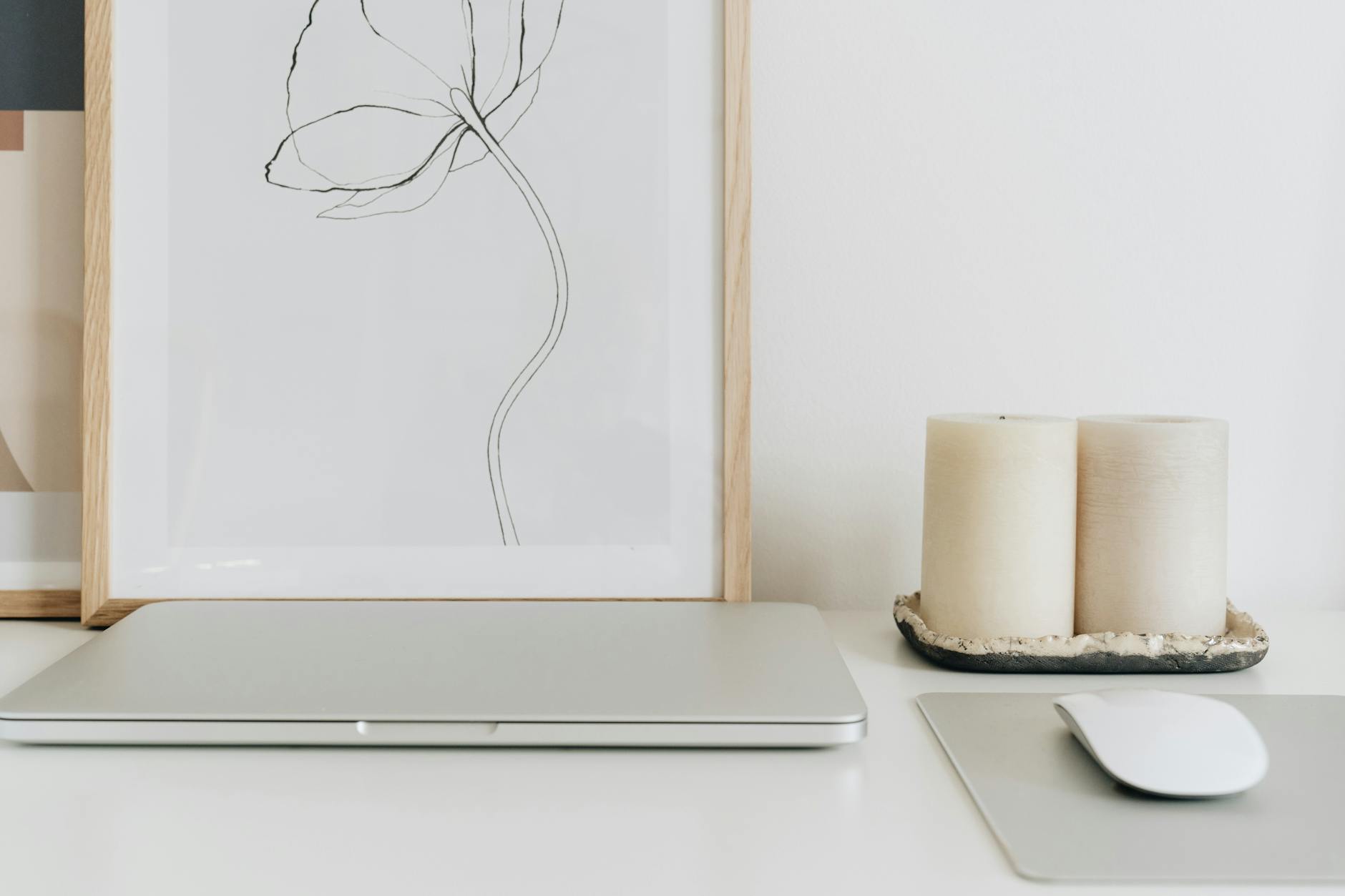
Art that opens asks questions without stating them. An abstract form, a single botanical line, a quiet phrase clients can sit inside rather than receive as an instruction. When a client looks at a print and finds their own meaning in it, that is the work happening. When they look at a print and feel lectured, something closes.
You want walls your clients can breathe with.
2. Place Art in Client Sightlines, Not Behind You
This sounds obvious and is frequently overlooked. Where does your client's gaze tend to drift when they are searching for words? Usually to one side, or toward a middle distance. Rarely directly at you.
Art placed in those natural resting zones, at eye level from the seated client position, becomes a soft anchor during difficult moments. Art hung behind you, or at a height that requires looking upward, serves the room's proportions more than the person sitting in it.
Hang intentionally. Walk to your client's chair, sit down, and see what you see.
3. Commit to Visual Quiet Over Visual Interest
A wall with too much on it competes with the work. Visual noise raises cortisol in ways that are measurable and affect a client's ability to regulate in session.
Roger Ulrich's landmark 1984 study in the journal Science found that hospital patients with access to nature views showed significantly lower anxiety and required fewer pain medications than those facing cluttered or blank environments. The principle translates to clinical offices: calm visual input supports calm internal states, and less, used intentionally, is almost always more.
One or two pieces, chosen with care, do more for the therapeutic frame than a gallery filled with variety.
If you'd like a starting point for assessing your space, the Therapy Office Checklist walks you through exactly what to look for, one room at a time.
What to Look for in the Art Itself
Once you know where it is going and how much you need, the question becomes: what are you actually looking for?
4. Favor Abstract and Geometric Forms Over Explicit Scenes
Figurative art, scenes with people, recognizable landscapes, and specific objects can provoke projection in ways that are difficult to anticipate. The same photograph of a forest trail reads as freedom for one client and as the hike they have not been able to take since their diagnosis for another.
Abstract forms hold more gently. A circle, a triangle, a brushstroke that suggests rather than depicts: these give the mind somewhere to rest without inadvertently triggering an association that takes twenty minutes to process. Geometric and botanical forms are among the most reliable anchors for a clinical environment precisely because they do not direct the meaning the client brings to them.
5. Keep the Color Palette Muted and Warm
Color temperature affects the nervous system in measurable ways. Bright, saturated colors signal alertness. Muted, warm tones signal safety. For a space where clients often arrive already activated, art that signals urgency works against what you are trying to build.
Earth tones, soft blues, warm whites, and sage greens create what designers sometimes call a visual exhale. They do not demand attention. They hold it, quietly, while the session does its work.
6. Let Negative Space Do the Holding
White space in a composition does the same thing silence does in a session. It gives what is present room to breathe.
Prints that feel crowded, text running edge to edge, forms competing for attention, transmit that crowding into the room. Compositions with generous space around the central element communicate spaciousness. That spaciousness is contagious. When you are choosing between two prints of similar quality, choose the one with more room around it.
7. Choose Frames That Disappear Into the Room
The frame is the finish line of the piece. A frame that competes with the print divides the eye. A frame that completes the print directs attention inward.
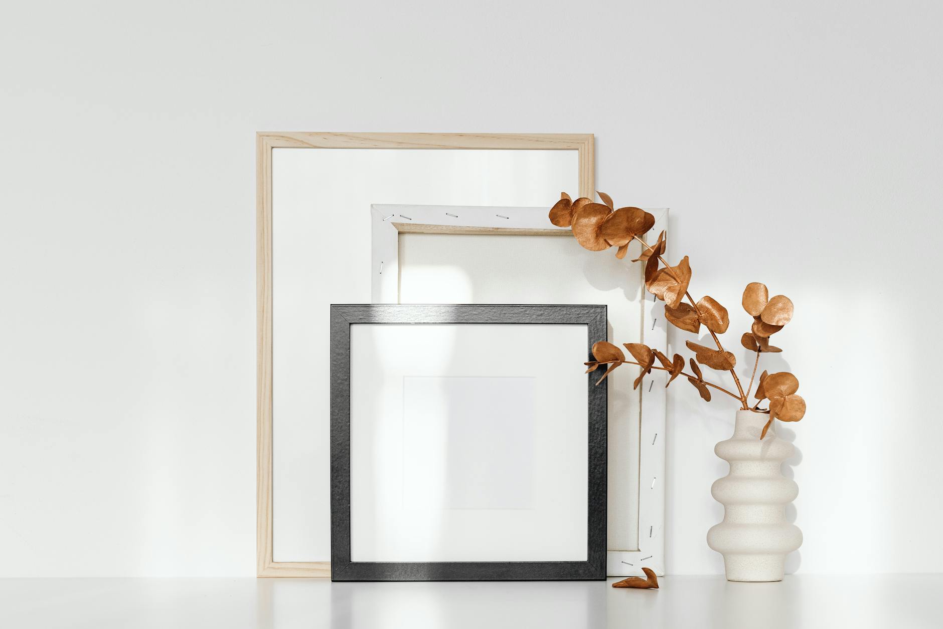
For most therapy environments, natural oak or clean white frames hold the work without adding visual weight. Dark or ornate frames can work in spaces with strong natural light and warm undertones, but the default toward restraint almost always serves the room better. The frame should feel inevitable, not chosen.
8. Pair Botanicals With Textual Prints for Texture Without Noise
A single botanical illustration alongside a quote print adds warmth and variety without adding complexity. The botanical is visual rather than verbal. The quote print is verbal rather than visual. Together, they create a quiet conversation on the wall without competing for the same register of attention.
This pairing is one of the simplest ways to build a wall that feels intentional without feeling arranged.
Building the Wall: From Single Statement Piece to Gallery
9. The Single Statement Piece
One print, placed well, is often enough. The session room does not require a gallery. It requires an anchor.
A single print in the client's natural sightline accomplishes the purpose without overwhelming the space. If you are deciding between adding a second piece and leaving the wall as it is, consider staying with the one that is working. The absence of more is part of the holding.
10. The Layered Gallery Wall
For waiting rooms, consultation areas, or offices with significant wall space, a small grouping of three to five coordinated prints creates an environment that feels considered rather than accumulated.
Coordination matters more than variety here. Prints from a single thematic framework, with consistent frame finishes and complementary palettes, read as intentional. Mixed frames, varied orientations, and unrelated themes read as collection rather than curation.
You are building a room, not a mood board.
Browse the Nook and Office Collection to see how coordinated prints work together in a professional space.
11. The Waiting Room Versus the Session Room
These two spaces have different jobs.
The waiting room is where clients arrive, often activated, already running the session in their heads before it starts. Art here should ground. Neutral imagery, anchoring phrases, and clean compositions help with the transition from the outside world to the work inside.
The session room is where the work happens. Art here needs to be less directive and more open. A waiting room print can name a feeling. A session room print should leave room for the client to arrive at their own.
Think of them as two movements in the same piece of music, each necessary and each distinct.
12. The One Question to Ask Before You Hang Anything
Before anything goes on the wall, sit in your client's chair and ask: if I were here for the hardest session of my year, the one where I finally said the thing I have been holding for months, would this help me feel held?
Not distracted. Not decorated at. Held.
If the answer is yes, it belongs. If it is neutral, consider whether you need it at all. If the answer is no, do not hang it out of convenience or aesthetic habit.
Your clients are reading your walls while they search for words. The question is whether what those walls say matches the kind of care you bring into the room.
Frequently Asked Questions
What kind of art is best for a therapy office?
Art that is abstract or gently symbolic tends to serve the therapeutic frame best. Figurative scenes and explicit imagery can trigger unintended associations in clients. Minimalist compositions with muted palettes, geometric forms, and botanical illustrations allow clients to rest in the visual without being directed by it.
Where should artwork be hung in a therapy office?
Hang art at eye level from the client's seated position, in the natural resting zones of their gaze rather than behind the therapist. Before finalizing placement, sit in your client's chair and observe what falls in your line of sight. Art that catches the eye during difficult moments should feel grounding, not demanding.
Should therapy offices have quotes on the walls?
The best therapy office quotes are open-ended rather than prescriptive. Phrases that name a feeling or hold space for one ("You are held here," "Space for all of you") are less likely to feel directive than phrases that instruct the client. The distinction is subtle, but clients feel it. A quote the client finds their own meaning in serves the work better than one that tells them what to feel.
How many pieces of art should be in a therapy office?
One to three pieces is sufficient for most session rooms. The goal is visual quiet, not visual interest. A single, well-chosen print in the client's sightline accomplishes more than a crowded wall. Waiting rooms can carry slightly more, but three to five coordinated pieces is the practical upper limit for most clinical spaces.
Does office decor affect the therapeutic relationship?
Research suggests it does. A 2001 study by Pressly and Heesacker in the Journal of Counseling Psychology found that clients' perceptions of therapist credibility and warmth were both influenced by the aesthetic quality of the office environment. The room communicates before the session begins, and art is among the clearest signals it sends.
The right art does not need explaining. Your clients will find their way into it on their own, which is exactly the point.
If you are ready to see what that looks like in a practice setting, the Grounding Collection is a good place to start. Every piece in it was chosen for the specific emotional territory of stability and safety, which is what most clients need when they sit down.
Related guide: For a lower-pressure way to choose, use the checklist to match wall placement with the feeling each room needs to hold. therapy office wall art checklist.
You might also enjoy

Written by Haven & Hold