Companion Mantras: The Hidden Layer Behind Every Haven & Hold Print
You picked up a print because something about the words stopped you.
Not in the way a catchy slogan stops you. Not the way an Instagram quote makes you double-tap and scroll on. This was different. The words found something that had been sitting quietly in the back of your chest, and for a moment, you felt less alone in carrying it.
That is not an accident. It is also not just good copywriting.
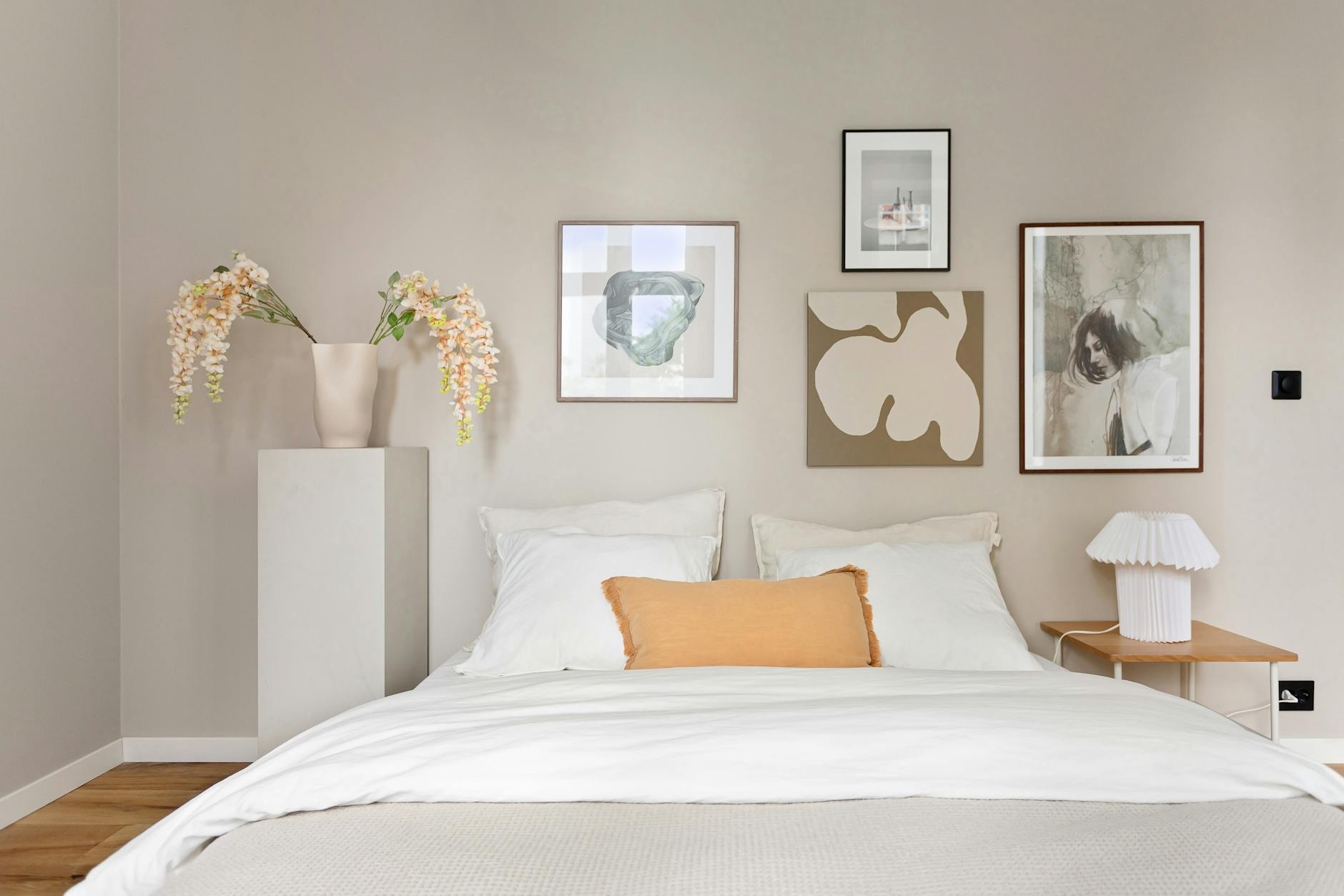
Every Haven & Hold print was chosen to hold a specific emotional territory. Not a mood board aesthetic. Not a trend cycle phrase. Each mantra was written to land in a particular moment of a particular struggle, and behind every one of them is what we call a companion layer: the emotional map that guided every design decision, from the words themselves to the color palette to the geometric form the print carries.
This is that layer, made visible.
What a Companion Mantra Actually Is
A companion mantra, as used in the context of Haven & Hold's design process, refers to the emotional use case that lives beneath each printed phrase. It is the answer to the question: when does someone need this? Not in general terms, but specifically. Not "when you're stressed" but "when you've been holding everything together for three weeks and you finally sat down at 10pm and realized you cannot remember the last time you felt safe."
Research on mantra-based practice supports what many people already know from experience. A 2022 systematic review and meta-analysis published in PMC found that mantra-based meditation produces significant reductions in anxiety and stress, and measurable improvements in overall wellbeing. The mechanism is not mystical. Repetition of a meaningful phrase activates the parasympathetic nervous system, quieting the physiological fear response and creating room for the nervous system to settle.
But there is a difference between repeating a phrase and living inside one. Haven & Hold prints are not practice aids in the traditional sense. They are what psychotherapist D.W. Winnicott described as part of the holding environment: the physical and relational context that makes inner work feel safe enough to do. The idea of a holding environment refers to the conditions, both physical and relational, that allow a person to feel secure enough to experience difficult feelings without being overwhelmed by them. When the words on your wall belong to a print that was chosen specifically for where you are, the wall becomes part of that environment.
That is the companion layer. The print is the visible thing. The companion layer is why it works.
The Three Collections and Their Emotional Territories
Haven & Hold is organized into three collections: Grounding, Wholeness, and Growth. Each collection holds a distinct need, and the mantras within each one were chosen to meet that need at its most specific.
Understanding which collection speaks to you right now is less about preference and more about recognition. You tend to know which one you need when you read the description.
Grounding: When You Need the Floor Beneath You
The Grounding Collection was built for the moments when everything feels unsteady. Grief, burnout, anxiety, overwhelm. The particular exhaustion that comes from having been strong for too long. These are the moments when you do not need someone to help you think through your options. You need someone to say: you are still here, and that is enough.
The Grounding mantras carry weight on purpose. "You are held here." "Safe harbor." "Within these walls." "Rest here." These are not phrases meant to move you forward. They are meant to stop the momentum, to create a pause where your nervous system can catch up.
A 2019 study published in the Journal of Environmental Psychology found that exposure to environments perceived as safe and coherent produced measurable reductions in cortisol levels in participants. The study documented this effect through the presence of specific spatial cues including warm color temperatures, familiar forms, and visual anchors at eye level, precisely the design decisions made in every Grounding print.
The geometric signature of the Grounding Collection is the triangle and the horizon line: stable, low-centered, forms that the nervous system reads as solid before the mind processes what it is seeing. The palette is warm sand and charcoal. The prints are meant to feel like a hand steadying itself on a table.
If you have stood in your hallway at midnight and felt the need to just be somewhere solid for a moment, these are the prints that hold that space.
Wholeness: When You Are Tired of Trying to Fix Yourself
The Wholeness Collection holds a different ache. It is the collection for the woman who has been in therapy for two years, doing real work, and still cannot stop the voice that says she is not enough yet. The woman who takes care of everyone around her and cannot figure out how to hold herself with the same gentleness. The woman who has done enough inner work to know what integration is supposed to feel like, and is still waiting for it.
"Held gently, held wholly." "Space for all of you." "You belong here." "Soften here."
These are phrases that name the thing the healing process often skips past: that you do not have to be finished to be whole. That all of the parts of you, including the ones you are still working on, fit here.
The Wholeness Collection's geometric signature is the circle and the enso. Complete forms. Forms that include the gap. The palette is soft blue and warm clay. The design logic was: what would it look like if acceptance were a shape? Not the striving kind of acceptance, but the kind that settles, the kind your therapist models when they look at you and seem genuinely unsurprised by the complicated thing you just said.
If you have spent more time in therapy than you expected and you are still, sometimes, hard on yourself in the dark, the Wholeness Collection holds that space specifically.
If you are not sure where to begin, the Sanctuary Style Quiz can help you find the approach that fits where you are right now.
Growth: When You Are Between Who You Were and Who You Are Becoming
The Growth Collection is for the in-between. Not the happy ending. Not the breakthrough moment. The actual uncomfortable middle, where you are doing the work and you cannot yet see the shape of what comes next.
"Between chaos and calm." "Still becoming." "Held in transition." "Where courage lives."
These mantras do not promise arrival. They acknowledge the difficulty of the process, and they hold space for the possibility that becoming is already enough. That you do not have to be finished to be okay. That the courage required to be in this exact moment, unresolved and still showing up, is real courage.
The Growth Collection's geometric signature is the lotus and the spiral: forms that emerge, that carry motion without rushing. The palette is sage green and warm sand. The design intention was to make something that felt like hope without demanding it from you.
If you have started therapy, or ended a relationship, or begun again after something broke, and you are in the part that feels like too much space and not enough structure, the Growth Collection holds that place specifically.
How to Find the Right Collection for Where You Are
Choosing a Haven & Hold print is not about interior design preferences. It is about where you are right now. Here is how to find the collection that fits:
-
Read the Grounding description. If something in you settles when you read "when everything feels unsteady," that is your starting point. The Grounding Collection holds the season of overwhelm, grief, and burnout, the period when you need to feel the floor beneath you before anything else.
-
Read the Wholeness description. If you felt a quiet recognition in "tired of trying to fix yourself," the Wholeness Collection holds the work of self-acceptance. These prints are for the long middle of healing, when you are doing real work and still sometimes hard on yourself.
-
Read the Growth description. If you are in an in-between place, a transition you did not choose or one you chose but still find disorienting, the Growth Collection holds that uncomfortable middle. These mantras do not promise arrival. They hold the space of becoming.
-
Trust the one that made you pause. You do not need to analyze it. The collection that slowed your reading is the right one for right now. If two of them stopped you, both are telling you something true.
-
Take the Sanctuary Style Quiz if you are still uncertain. The Sanctuary Style Quiz asks a few questions and points you toward the collection that matches where you are. It takes less than two minutes.
Why the Words Were Not Chosen by Algorithm
There is a fair question about print art that carries words: why these words? Anyone with Canva and a font can put text on a background. What makes this different?
The honest answer is: the words were chosen the way a careful therapist chooses what to say. Not for maximum appeal. Not to feel relatable to the widest possible audience. They were chosen to be true for a specific kind of person in a specific kind of moment, and if they do not land for you right now, that is information. It means you are not in that moment. Or you are in a different one.
"You are held here" is not trying to mean everything to everyone. It is trying to mean something precise to the person who has been told, usually implicitly and too many times, that they are a burden. That person knows exactly what those words are doing. Everyone else can walk past them.
This precision is also why the prints do not use the language you will find in most of the therapeutic art market. The words that appear on most wellness decor ("you've got this," "be the change," "good vibes only") are motivational language. They push. Haven & Hold prints do not push. They hold. Permission-giving language does not ask you to be different. It acknowledges who you already are, and it makes room for that person.
The blank wall you have been staring at is not evidence of indifference. It is evidence that you care too much to put something on it that lies to you. You have scrolled Etsy. You have looked at the options. And you have closed the tab every time because nothing said anything real.
That is a reasonable response to a market full of prints that perform caring without doing it.
The Companion Botanicals: What Grows Beside the Words
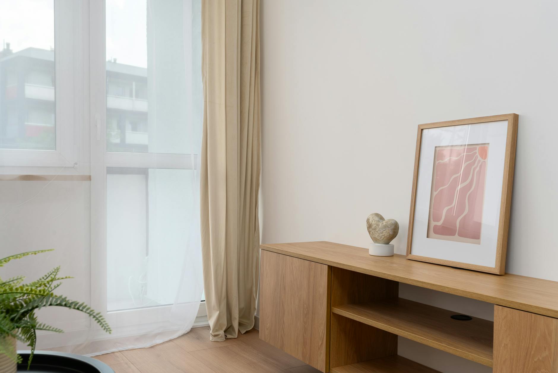
Each collection also carries a set of botanical companion prints, and these too were designed with the same intentionality as the mantras.
The Sanctuary Botanicals are single-plant studies: an olive branch, a eucalyptus sprig, a new shoot emerging from soil, an unfurling fern frond, a lavender stem. They were not chosen for generic visual appeal. Each plant was selected for its resonance with the collection it belongs to and the emotional territory it holds.
The olive branch belongs to the Grounding Collection. Its title is "A Quiet Holding." The eucalyptus belongs to Wholeness, titled "The Healing Is Already Here." The new shoot belongs to Growth, titled "Permission to Begin."
These titles are the companion layer made explicit. The botanical is not just a beautiful plant. It is holding the same emotional territory as the mantra prints around it, quietly. In a gallery wall arrangement, the botanicals give the eye somewhere to rest between the more direct weight of the word prints. They extend the holding environment without asking the viewer to keep reading.
The Enso and Wabi-Sabi series within the Wholeness and Growth collections carries a related intention. The Open Enso, painted in a single brush stroke, holds the gap in the circle as part of the design, not as absence but as inclusion. The stone cairn in "Balanced, Not Perfect" is slightly imperfect by design. The Kintsugi line in "Stronger Where It Mended" traces the break as the thing of beauty.
None of these are accidents of aesthetics. They are the companion layer in visual form.
The Question Your Walls Are Already Asking
Most people who find Haven & Hold are not looking for art. They are looking for a specific feeling they have not been able to name yet, and they have been surprised to find it here.
That feeling is being held by a space that understands something about you without requiring you to explain yourself. A room that offers the same thing a good therapy session can offer: presence, without judgment, and room for exactly who you are right now.
The research on the relationship between physical environment and emotional regulation suggests that what surrounds you is not neutral. A landmark study published in Environment and Behavior found that people assigned to spaces with coherent visual environments recovered faster from stressful tasks than those assigned to visually chaotic spaces. The visual environment is always doing something to your nervous system. The question is only whether it is doing something useful.
Haven & Hold was built on a simple premise: the words on your wall should hold you, not perform for you. Each print in every collection was designed to meet a specific emotional moment with something true. The companion layer is not extra context. It is the work.
Your walls have more room for this than you think.
Frequently Asked Questions
What is a companion mantra?
A companion mantra is the emotional use case behind a printed phrase: the specific moment or state of mind that a particular print was designed to hold. Rather than selecting words for broad appeal, each Haven & Hold mantra was chosen to resonate with a particular struggle, such as feeling unsteady, feeling like too much, or being in the uncomfortable middle of becoming.
How do I know which Haven & Hold collection is right for me?
The three collections hold distinct emotional territories. Grounding is for periods of instability and overwhelm, when you need to feel the floor beneath you. Wholeness is for when you are tired of trying to fix yourself and need permission to be whole as you are. Growth is for transitions and in-between places, when you are becoming something and cannot yet see what it is. Most people recognize their collection when they read the description.
Are these prints suitable for a therapy office?
Yes. Haven & Hold prints were designed with therapeutic settings in mind. The mantras support the therapeutic frame without directing it: they hold space rather than prescribing a specific emotional response. Therapists who prefer their office art to feel held rather than motivational tend to find these prints a natural fit.
What makes Haven & Hold different from other quote print shops?
Most quote print shops select phrases for broad motivational appeal. Haven & Hold prints were chosen for precision: each one holds a specific emotional territory and was designed as part of a coherent collection system (Grounding, Wholeness, Growth) rather than as individual decorative items. The companion layer, the "when you need this" context behind each print, is what separates these from wall decoration.
Do the botanical companion prints need to be paired with the word prints?
No. The botanical prints stand on their own and work as quiet anchors in any space. That said, they were designed to extend the emotional territory of the collection they belong to, so pairing them with the corresponding word prints creates a more complete holding environment in a room. The Wholeness botanicals, for example, carry the same permission-giving quality as the Wholeness mantras, expressed through image rather than text.
What sizes are available?
Haven & Hold prints are available unframed and framed, from 8x10 ($45 unframed) through 24x36 ($265 framed). Framing is available in natural, walnut, black, and white oak finishes. All prints are produced on 230gsm archival matte paper with real glass for framed options.
You might also enjoy
Which collection speaks to your season?
Take the 2-minute Sanctuary Style Quiz and find your starting point.
Take the QuizWritten by Haven & Hold