Neutral Tone Home Decor: Why Sand, Clay & Charcoal Work
Your shoulders drop the moment you walk through the door. Not every door, and not every time, but in rooms with certain walls, a certain quality of light, and a color that asks nothing of you, something settles before you've even put down your bag.
Most of us recognize that feeling. Fewer of us have built it into our own homes yet. The walls are blank, or the colors felt right in a showroom and wrong in the actual room, or the space has never quite cohered and you haven't known why.
Neutral tones have an answer to that. Not as a passing trend and not as a decorator's shortcut, but as something that touches how the nervous system reads a room.
What Neutral Tone Home Decor Actually Means
Neutral tone home decor refers to building a color palette around low-saturation hues that exist between pure chromatic color and true achromatic white or black: the sands, clays, warm whites, linens, soft charcoals, and muted taupes that carry undertones of earth, stone, and worn wood rather than the sharp signal of a primary color.
This is different from the flat beige of a rental apartment that no one chose intentionally. Intentional neutrals carry warmth, depth, and relationship to each other. Sand leans toward straw and light. Clay carries the weight of the ground beneath it. Charcoal holds the room the way a good frame holds a print, giving the softer tones something to rest against without competing with them.
The distinction between flat and intentional matters because not all neutrals feel restful. A cool gray with blue undertones in a north-facing room reads as cold rather than calm. A warm sand in afternoon light reads like exhaling. The difference is undertone, and undertone is everything.
Why Your Nervous System Notices the Difference
The body responds to color before the conscious mind does. This happens in milliseconds. The eyes receive the information, the nervous system scans it, and the threat-or-comfort assessment lands before you've had a single thought about wall paint.
Research supports this. A 2010 study published in Personality and Social Psychology Bulletin found that women who described their homes as cluttered or unfinished showed elevated cortisol levels throughout the day, while those who described their homes as restorative showed normal cortisol patterns. The visual environment does continuous regulatory work, in both directions.
Research published in Frontiers in Psychology examining interior color and psychological functioning found that highly saturated color environments negatively affected mood compared to neutral or low-saturation conditions. High saturation asks the nervous system to process more. Low saturation gives it room to settle.
Sand, clay, and charcoal sit in that settling range. They don't demand a response. They hold steady, the way a room should.
The Emotional Register of Each Tone
These three tones are not interchangeable. Each one does a different kind of holding.
Sand is arrival. It's the warmth you notice when afternoon light lands on a linen cushion or a bare wood shelf. Sand tones read as open and welcoming, the color of a soft intake of breath. Rooms built in sand have a permissive quality. Nothing in them says "be on."
Clay is grounded. Deeper and earthier than sand, clay carries the weight of mineral and root. It reads as held, stable, and tactile, the color of something that has been here a long time and will continue to be. Rooms with clay tones feel like places where the week can stop chasing you.
Charcoal is anchor. It doesn't recede the way sand and clay do. Charcoal gives the room its edges, its definition, and its depth. Used well, charcoal acts the way a good frame does: it doesn't compete with what it holds, and without it, everything feels unfinished.
These three tones work together because they respect each other. Sand and clay give the room warmth. Charcoal gives it weight. Together, they create the visual equivalent of a room that has been thought about rather than just filled.
If you want a place to start, The One-Wall Reset walks you through it, one wall at a time.
Warm Neutrals vs. Cool Neutrals: What Your Space Is Asking For
One of the most common reasons a neutral room doesn't feel restful is undertone mismatch. The color reads as neutral on a paint chip and wrong on the wall, and the reason is almost always the quality of light in the space.
North-facing rooms receive cooler, more diffused light. Warm neutrals, including sand and clay, balance that quality and keep the room from reading as cold or flat. South-facing rooms receive warmer, more golden light throughout the day. In those rooms, a cooler charcoal or stone gray creates better balance than another warm tone layered on top.
The test is simple: hold a paint swatch against your wall at different times of day, in morning light, afternoon light, and lamp light after dark. The color that looks restful in all three conditions is your answer.
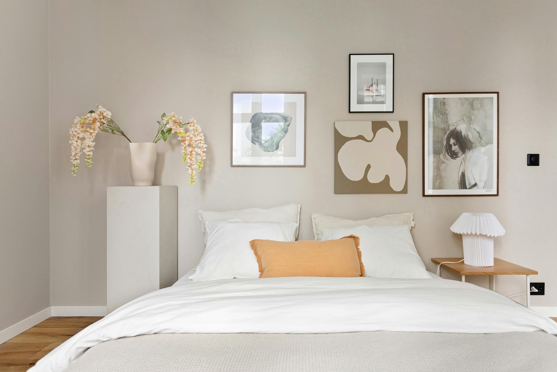
For most rooms, a layered approach holds best. A sand wall with clay-toned textiles and one charcoal element, whether a frame, a side table, or a piece of art, gives the eye a place to rest and a place to land without either feeling like too much.
How Intentional Art Fits into a Neutral Palette
A neutral room is not a finished room. It's a room that's ready.
The neutrality creates the conditions for something else to land with weight. In a highly patterned or colorful room, a print competes. In a neutral room, a print holds the wall with intention. Every piece you choose reads more clearly because the space around it is quiet.
This is one reason neutral decor and intentional art belong together. The wall isn't just background. It's the holding environment for the thing you've chosen to put there, and the color surrounding it shapes how that thing feels.
For a sand or clay wall, prints with warm undertones and minimal design hold particularly well. The Grounding Collection uses warm sand backgrounds with deep charcoal typography, which means these prints are built to sit inside the palette you're already creating. The Wholeness Collection carries softer, cooler tones for rooms that want something quieter still.
The words on the wall should earn their place the same way the colors do. Not by shouting, and not by decorating, but by holding.
You Don't Have to Start with Everything
Here is the thing about building a neutral space: it doesn't require a renovation, a new sofa, or a repainted room.
It starts with one surface, one area where the visual noise comes down. A shelf cleared of clutter. A wall that gets one quiet print instead of a collection that hasn't been curated. A blanket folded over a chair in a tone that asks nothing of the eye.
The nervous system responds to incremental change. Small reductions in visual noise accumulate. The room doesn't need to be a design project. It just needs to start moving toward quiet.
If you're trying to understand which emotional territory your space is asking for right now, the Haven & Hold quiz can help you find the collection that fits where you are.
Frequently Asked Questions
What colors count as neutral tones in home decor?
Neutral tones in home decor are low-saturation colors that lack strong chromatic identity, including whites, creams, beiges, taupes, warm grays, and earth-adjacent hues like sand, clay, mushroom, and charcoal. True neutrals don't compete with other colors in a room because they give other elements space to breathe. The key is low saturation, not necessarily light value, which is why charcoal counts as a neutral even though it's dark.
Why do sand and clay tones feel warmer than gray?
Sand and clay carry warm undertones rooted in yellow, orange, and red, the colors associated with warmth, safety, and organic material. The nervous system has been calibrated over millennia to associate warm earth tones with shelter, which is part of why sand and clay read as comforting in a way that pure gray often doesn't. Gray undertones sit in the blue-green spectrum, which reads as cooler and more recessive by comparison.
How do I use charcoal in a neutral room without it feeling heavy?
Charcoal works best as an anchor rather than a ground. Use it in small doses: a picture frame, a throw pillow, a side table, or a piece of wall art with a deep charcoal background. Avoid using charcoal on large expanses of wall unless the room has significant natural light to balance the depth.
Can neutral tones work in a small space?
Neutral tones work well in small spaces, particularly the lighter end of the palette. Warm whites and sands reflect light and make rooms feel more open than they are. The key is to keep the palette limited to two or three tones maximum, so the eye reads the space as cohesive rather than crowded.
What art works best in a neutral room?
Art with clean lines, minimal composition, and a limited color palette holds well in neutral rooms. Prints that use the same warm or cool undertones as the walls integrate naturally, while those with contrasting colors become intentional focal points. In rooms built on sand and clay tones, art with warm charcoal or warm white backgrounds feels like it was always meant to be there.
Your home is not a design project. It's the place you come back to, and it deserves to feel like that.
The colors on your walls, the textures on your surfaces, and the words you choose to live with all do quiet, continuous work on your nervous system. Neutral tones don't ask anything of you. That's why they feel like coming home.
Take your time. The right palette, and the right pieces to sit within it, will find you.
You might also enjoy

Written by Haven & Hold