Article: What to Put Above the Bed for a Softer Room | Haven & Hold
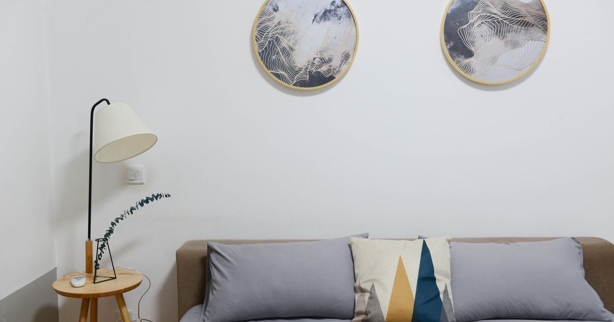
What to Put Above the Bed for a Softer Room | Haven & Hold
Sunday morning. You wake up slowly, face still pressed into the pillow, and the first thing your eyes find is the wall above the headboard.
If what's there feels right, something in your body relaxes before your mind has a chance to catch up. If it's blank, or holds something you've quietly outgrown, or has been waiting for a decision you've been putting off for longer than you'd like to admit, your nervous system notices that too.
For a room that feels softer, the wall above the bed is where to begin. A single piece with quiet tones, still forms, and a phrase that gives permission rather than instructs tends to do the most work in the least space.
What makes the right choice depends on your room, your headboard, and what you actually need the space to say. The rest of this is about how to find it.
Why This Wall Is Different From the Others
Most walls in a home are seen in passing. The entry, the hallway, the kitchen. You move through them, and they do their work peripherally.
The wall above the bed is the exception. You see it first thing in the morning, before you've decided how the day is going to feel. You see it last at night, when the day has finished with you. Whatever lives there is present at your most unguarded moments, the ones before sleep and the ones before waking.
A 2010 study led by researchers at UCLA, published in the journal Personality and Social Psychology Bulletin, found that women who described their homes as cluttered or unfinished showed significantly higher cortisol levels throughout the day, compared to women who described their spaces as restful and restorative. The bedroom environment was a particularly strong predictor. What the space communicates in those early, quiet minutes sets a hormonal tone that lingers for hours.
This is not a small thing. The wall above the bed is not just decoration. It is a daily signal to your nervous system about whether the room is safe, held, and yours.
If you're curious about the broader psychology of why some rooms feel like relief while others keep your shoulders raised, the piece on containment theory and why some rooms feel like a hug goes deeper into the research.
What "Softer" Actually Means in a Room
Softness is not a style category. It is not the same as neutral, or minimal, or Scandinavian, or any aesthetic you can pin on a board and label.
Sensory softening refers to the process by which a space reduces visual and physiological arousal through deliberate choices about tone, form, and complexity. A room feels softer when there is less competing for the eye's attention, when shapes resolve rather than interrupt, and when the palette breathes.
A wall above the bed does one of two things: it asks for attention, or it gives it back.
Busy gallery walls, high-contrast graphic prints, and bold statement pieces ask. They are energizing, and there are rooms where that is exactly right. But in a bedroom, in the hours before sleep and the minutes after waking, a wall that gives attention back tends to feel like relief.
Softness is the quality of not having to work. The room allows you to exhale. The space doesn't require anything of you.
That quality comes from restraint more than any particular style.
One Piece or a Small Grouping
The most common question about decorating above the bed is whether to use one piece or several. The answer is genuinely room-dependent, not a matter of trend.
If the bedroom already holds texture, through bedding, a rug, layered pillows, or warm wood tones in the furniture, a single large print above the bed tends to hold everything together. It becomes the still point that the rest of the room orbits. One piece in this context feels resolved rather than sparse.
If the bedroom is spare, two or three prints in the same tone family bring warmth without weight. The key is that the pieces should belong to each other in palette and in feeling, with visible breathing room between frames. Collected, not crowded.
The mistake most people make is choosing the number of pieces before reading the room. Start by looking at what's already there. The room will tell you how much it needs.
For sizing, a useful guideline: a single piece above a queen or king should span roughly 60-70% of the headboard's width. Too small and the print floats, disconnected from the space below. Too large and it crowds. The printable wall art sizing chart gives exact recommendations by mattress size if you want numbers you can take straight to the wall.
For the full process from choosing to hanging, How to Choose, Print, Frame, and Hang Wall Art covers each step in detail.
If you'd like something to keep close while you shop, the Sizing and Framing Guide is a free one-page reference that walks you through the key decisions, one at a time.
What Makes a Print Feel Soft in a Bedroom
Not every art print softens a space. Some prints energize, which is right for a studio or a workspace. For the wall above the bed, a few specific qualities make the difference.
Tone. Muted, low-saturation tones recede rather than advance. Warm neutrals, soft sand, warm white, and clay, tend to let the eye settle. Muted blue-greens and warm gray-browns do the same. High-contrast palettes and saturated colors pull attention forward. A print in a quiet palette lets the eye rest instead of work.
Form. Still, resolved shapes carry the quality of an exhale. Circles feel complete. Horizontal imagery, a sweeping botanical, a gentle horizon line, a wide organic form, reads as grounding. The visual equivalent of something that is simply present, not arriving or departing.
Words. If the print carries text, the words matter in the same way the tone and form do. A phrase that gives permission lands differently in the quiet before sleep than a phrase that instructs or declares. "Soften here" asks something different of you at 11 pm than "rise and shine." The Soften Here print was made specifically for this: a word that holds rather than directs.
Environmental psychologist Roger Ulrich, in his foundational 1984 study published in Science, found that exposure to organic, low-complexity visual imagery produced measurable reductions in heart rate and physiological stress markers. His work on visual environments and recovery has since been cited extensively in research on residential and healthcare spaces. A print doesn't have to show a forest to carry this quality, but calm forms and quiet tones do the same work that Ulrich's research identified in natural imagery.
If you're looking for prints made specifically around self-compassion, acceptance, and the quality of being held, the Wholeness Collection uses circle forms and warm neutral palettes by design. Each piece was chosen for what it says and how it lands in the room where you sleep.
A Note on Framing and Finish
The frame is part of the softness. It is not a neutral decision.
A Natural Oak frame adds warmth to almost any palette. A White frame opens space and makes the print feel lighter. A Black frame is strong and grounding, which serves some bedrooms well, but if soft is what you're after, starting with lighter finishes gives the print room to breathe.
Unframed prints on matte paper have a quieter, more understated quality. They work especially well when leaned on a shelf or dresser rather than hung, which also makes them renter-friendly without sacrificing the feeling.
The height matters too. The center of the piece should sit approximately eight to ten inches above the top of the headboard. This keeps the art visually connected to the bed below rather than floating. If the headboard is unusually tall, adjust slightly, but the relationship between the print and the headboard matters more than any specific measurement.
For a bedroom where you're renting or cautious about putting holes in the wall, how to hang art without damaging your walls covers methods that work even for heavier frames.
The Space You Come Home To
If you want the bedroom to feel softer, the wall above the bed is where to begin. Not because art is a simple fix, but because what you see first and last each day leaves a residue. The visual environment shapes what the body expects, and over time, that expectation becomes the room.
You don't need to figure out the whole room at once. If the thought of starting feels like too much, there is real value in starting with a single wall and letting it settle. One quiet piece changes what you see when you open your eyes. That's enough to begin with.
And if mornings are the part of the day that feel hardest, the Haven & Hold daily wellness app offers a free grounding practice for the minutes before you get up. The same prints that hold the wall are in the app too. It is the daily version of what a carefully chosen piece can hold permanently.
Frequently Asked Questions
What size art print should go above a bed?
For a queen bed, a single print in the 18x24 to 24x36 inch range tends to work well, depending on headboard height and visible wall space. For a king, go larger, or use two prints side by side that together span 60-70% of the headboard's width. The most common mistake is going too small: a print that feels substantial in your hands will often look smaller once it's on the wall.
Should I use one large piece or a gallery wall above the bed?
For a bedroom you want to feel softer and calmer, a single large piece or two to three smaller prints in the same tone family tends to work better than a full gallery wall. Gallery walls bring visual energy and personality, which is right for some rooms. Above the bed, less visual complexity tends to support the rest you're asking the room to hold.
How high should art be hung above a headboard?
The center of the print should sit roughly eight to ten inches above the top of the headboard. This keeps the art visually connected to the bed rather than floating. If the headboard is unusually tall, adjust slightly, but maintaining the connection between the headboard and the piece matters more than hitting an exact measurement.
What style of art makes a bedroom feel softer?
Prints with low-contrast palettes, still or organic forms, and muted tones tend to soften a space. Horizontal imagery, a botanical, a horizon line, or a circular form, reads as restful. High-contrast, graphic, or text-heavy pieces bring energy, which works well in other rooms but can work against rest above the bed.
Can a quote print work above the bed, or does it feel like too much?
A quote print works above the bed when the words are restful rather than instructional. A phrase that gives permission lands differently in the quiet before sleep than one that motivates or declares. The print should feel like something the room says to you, not something that asks something of you.
What frame finish works best for a soft, calm bedroom?
Natural Oak and White frame finishes tend to make a print feel lighter and let the room breathe. Black frames are grounding and work well in some bedrooms, but for softness, a lighter finish is a good starting place. Unframed matte prints are also a strong option for a quieter, more understated look, and work well leaned or hung on a clean wall.

Written by Haven & Hold