Small-Space Art Guide: How to Avoid Visual Noise
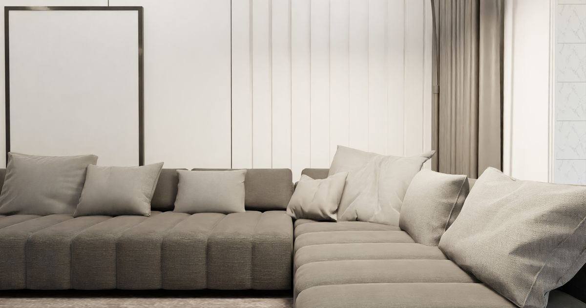
Six small frames above a sofa can make a living room feel like it has something to prove.
That reaction is not aesthetic. It's neurological. In a small space, every piece of art on the wall is in your peripheral field at the same time, which means your nervous system is processing each one on every pass through the room. A large space can absorb that kind of visual complexity. A small one usually cannot.
And if your walls are mostly blank because nothing has felt right yet, that is not indecision. It is your nervous system protecting you from the very thing this post addresses.
This is a guide to choosing art that settles into your space rather than competes with it, treating restraint as a practical act of care for the room you actually live in.
What Visual Noise Actually Is
Visual noise is the condition that results when a space presents more competing visual information than your nervous system can comfortably absorb in a single glance. It is not the same as clutter, exactly. A shelf of books reads as a unified whole. Five mismatched frames in varying sizes, each demanding individual processing, create visual static even when the wall itself looks tidy.
Environmental psychologists have studied this dynamic in home settings for decades. A 2010 study by Darby Saxbe and Rena Repetti at UCLA, published in Personality and Social Psychology Bulletin, found that women who described their homes as cluttered or as having a lot of unfinished visual work to attend to had measurably elevated cortisol levels throughout the day compared to women who experienced their homes as restful or restorative. The researchers concluded that the visual burden of an overstimulating home environment carries a genuine physiological cost, not merely an aesthetic one.
In a small space, this effect is amplified. There is less room for the eye to travel. Every element on the wall is within your sightline nearly all the time. What reads as "layered and full" in a large loft reads as "anxious and crowded" in a studio apartment. The density is the same. The room's capacity to hold it is not.
Visual noise is worth naming because it explains why you can spend an entire evening arranging and rearranging frames on a wall and still feel like something is off. The problem is often not the art. It is the quantity, and the way the pieces are asking the room to hold too many separate conversations at once.
Why One Well-Chosen Piece Almost Always Wins
The instinct in a small space is to use small art. Small room, small frames. It feels proportionate. It is almost always the wrong call.
A single piece sized correctly for its wall gives the eye one task: land here, complete the visual thought, and rest. Several smaller pieces distributed across the same wall create the opposite effect. The eye has to travel between them, register each one separately, and never fully settles. Interior designers call this fragmentation, and it is one of the most consistent reasons a small room feels busy without any single element being objectionable on its own.
Kaplan and Kaplan's foundational work on Attention Restoration Theory, developed at the University of Michigan and published over several decades beginning in 1989, identifies "coherence" as one of the central qualities of restorative environments: a sense that the elements of a space belong together and form a comprehensible whole. Environments with high visual complexity and low coherence, they found, deplete directed attention and prevent the quality of rest a home should offer. Choosing one anchoring piece rather than several competing ones is a direct application of this principle to your walls.
One piece. Proportioned well. Hung correctly. That is not a minimalist aesthetic preference. It is a nervous-system-friendly one.
If you want a clear starting point for sizing and framing decisions, the Sizing and Framing Quick-Reference Card gives you the proportions that work for every common wall width, without the guesswork.
Getting the Size Right
Most people choose art that is too small. A print that should anchor a wall gets replaced with something that floats in the center, 12 inches wide on a 4-foot span. The room looks like it forgot to finish the thought.
A practical guide to proportions:
| Wall width | Recommended art width | Sizes that work |
|---|---|---|
| Under 30 inches | 60-70% of wall width | 8x10, 11x14 |
| 30-48 inches | 55-65% of wall width | 11x14, 16x20 |
| 48-72 inches | 50-60% of wall width | 16x20, 18x24 |
| Over 72 inches | 45-55% of wall width | 18x24, 24x36 |
Above furniture, the standard recommendation is that the art should span roughly two-thirds the width of the piece beneath it. Above a 60-inch sofa, that means art in the 36-to-40-inch range. A single print at that width, hung about 8 inches above the sofa back, reads as deliberate and grounded. Art hung 2 inches above the sofa looks placed without thought. Art hung 18 inches above reads as disconnected from the room.
The same logic applies to bedrooms: a print above the bed should span roughly two-thirds the width of the headboard. A king headboard at 76 inches calls for art in the 48-to-52-inch range, which for a single print often means an 18x24 or 24x36. For smaller beds, an 11x14 or 16x20 in a well-chosen frame lands with considerably more presence than three small prints arranged in a loose cluster.
The room-by-room sizing guide goes deeper on this if you are working through your home space by space.
Color, Undertone, and the Space Illusion
Color affects perceived space. This is not design mythology. It is optics.
High-contrast art, a bright print in a dark frame against a pale wall, creates a sharp visual break. The eye stops at the edge of the frame. In a small space, one strong contrast point reads as an anchor. Multiple sharp contrast points read as fragmentation, which is why a gallery wall of alternating black and white frames on a single pale wall can feel more unsettled than it looks during the planning stage.
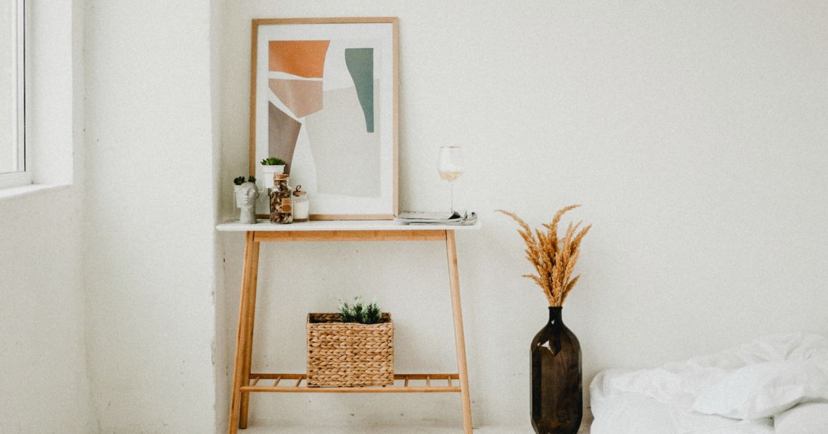
Art that shares undertones with your wall color integrates rather than interrupts. A warm sand print against a warm cream wall creates continuity. Continuity makes a room feel more settled, and perceptually, larger. The art does not disappear. It belongs.
Cool-toned walls, greige, blue-grey, and soft whites with blue undertones, pair well with prints that carry cool undertones. Warm-toned walls, cream, warm white, sand, and terracotta, pair with earth-toned art. This is where the Grounding collection tends to land naturally: its warm sand and deep charcoal palette is designed to feel like the room already knew it was coming.
The exception is intentional contrast. If a room has very little visual weight anywhere and you want a single anchor with presence, a higher-contrast piece can do that work effectively. One contrast point. Not three.
Frame finish matters here too. A print in a Natural Oak frame reads warmer than the same print in a Black frame. The frame is part of the color equation. In a small space with warm undertones, a black metal frame on an otherwise warm-toned piece introduces a visual sharpness that can work as a single accent but creates noise in multiples.
Placement and the Importance of Breathing Room
Where you hang art matters as much as what you hang.
Art hung too high loses its connection to the room. It floats above the furniture line and reads as an afterthought. Art hung too close to neighboring pieces loses its breathing room, and each piece starts to crowd the next. Both conditions generate visual noise rather than reducing it.
The standard recommendation is to hang the center of the piece at eye level, which most people place between 57 and 60 inches from the floor. In a small apartment with 8-foot ceilings, erring toward 57 inches keeps the art anchored in the human part of the room rather than pulling the eye toward the ceiling.
The blank wall surrounding art is not empty space waiting to be filled. It is part of the composition. The breathing room on either side of a print gives the piece visual weight it would not have if crowded by other frames. Negative space is active, not passive. It tells the eye: this piece is worth your attention. The complete guide to minimalist wall art goes into the full logic of restraint as a design principle if you want to understand why less often reads as more presence, not less.
When You Want More Than One Piece
Sometimes one piece is not the answer. A long hallway benefits from two vertical prints that draw the eye through rather than stopping it. A bedroom might hold a quote print paired with a botanical companion, creating a quiet grouping without fragmentation. The goal is not minimalism as an ideology. It is intention.
When grouping multiple pieces, three principles keep the arrangement from tipping into visual noise:
Keep the frame finish consistent. Mixed metals and mixed wood tones across several pieces create visual chatter even when the art itself is quiet. One finish, held consistently across the group, allows the grouping to read as a single decision.
Choose a shared palette or a shared emotional register. Prints from the same collection carry a visual kinship that makes groupings feel curated rather than assembled. Two pieces with the same warm sand background and deep charcoal type create coherence. Two pieces with completely different color systems create conversation, which in a small space can tip quickly into noise.
Treat the grouping as a single unit. Before hanging anything, tape paper templates to the wall in the exact dimensions of each piece and step back. Ask whether the grouping reads as one decision or several. If it reads as several, simplify.
If the room is already asking something of you visually and you are feeling the weight of that, it is worth reading about when your home feels too loud before adding anything new to the walls. Sometimes the first step is quieting what is already there.
Frequently Asked Questions
Does a mirror count as art in a small space?
A mirror occupies wall space and reflects visual information, effectively doubling the visual complexity of whatever it faces. One mirror in a clean frame can genuinely open a small room, particularly if it reflects a window or a quiet wall. Multiple mirrors, or a mirror facing a gallery wall, tend to amplify visual noise rather than reduce it.
Should I hang art in a small hallway or leave it empty?
A small hallway benefits from one vertical piece that draws the eye through the space rather than stopping it. A print that is taller than it is wide creates a sense of movement and depth. Leaving the hallway empty is also a legitimate choice. The only rule is that anything you hang should feel deliberate, not like filling.
Is one large piece or several small pieces better for a tiny bedroom?
One large piece above the bed almost always performs better than several small ones. A correctly proportioned print, roughly two-thirds the width of the headboard, reads as settled and intentional. Several small prints scatter the eye across a space that is already working hard to feel restful, and a room that cannot settle cannot hold you.
Can dark-colored art work in a small space?
Dark art works in a small space when it is the room's only strong visual statement. A deep charcoal or forest-toned print against a warm white wall reads as an anchor. The difficulty arises when dark art competes with other high-contrast elements: dark furniture, dark floors, and dark framing together reduce visual breathing room and make the space feel compressed. One strong dark element, with lighter surroundings, holds well.
How do I know if my current art is adding visual noise?
Stand in the doorway of the room and take it in as if you had never seen it before. Notice where your eye lands first, and then notice what it does next. If your eye moves restlessly between four or five focal points before settling, the room has more visual demands than it needs. If your eye lands somewhere and rests, the room is working. That reading is usually more honest than any rule.
If tending to your space each day resonates with you, the Haven & Hold companion app offers a free daily grounding check-in built around the same three collections. You can find it on the App Store.
Your wall does not need to do everything. It just needs to do one thing well, and do it quietly.
When you are ready to find that piece, the collection quiz will tell you which of the three collections speaks to where you are right now.

Written by Haven & Hold