How to Style Quote Prints Without Looking Like a Dorm Room
You closed the tab again. The search was something like "meaningful wall art" and there were thousands of results, and the cursive script on a pastel background, and the "she believed she could so she did" poster, and the Etsy shop with 200 font options and no reason to choose any of them.
The blank wall has been there a while. You've walked past it most mornings without really seeing it, which is its own kind of answer.
Quote prints shouldn't end up looking like dorm art. The problem is that most of them do, and it's almost never the fault of the quote itself. It's a collection of specific, avoidable decisions around it. Once you can name them, you can work around them.
Why Quote Prints End Up Looking Like Dorm Art
The dorm room aesthetic in wall art refers to the visual pattern created by unframed or cheaply framed affirmation posters, hung close together without regard for scale, spacing, or the emotional register of the space. The print itself is rarely the issue. What surrounds it, or what's missing around it, is what ages it.
A 2010 study by researchers at UCLA found that women who described their homes as cluttered or disorganized showed elevated cortisol levels throughout the day, while women who described their spaces as restorative showed lower stress hormone activity. The visual environment affects your nervous system in ways you don't consciously track. A wall full of competing prints, even meaningful ones, reads as visual noise. Your body knows the difference between a wall that holds you and a wall that demands your attention.
Three patterns age a quote print immediately:
An unframed poster tacked or taped to the wall. Even if the art is excellent, the method of display signals impermanence, as if you haven't decided yet whether you're staying.
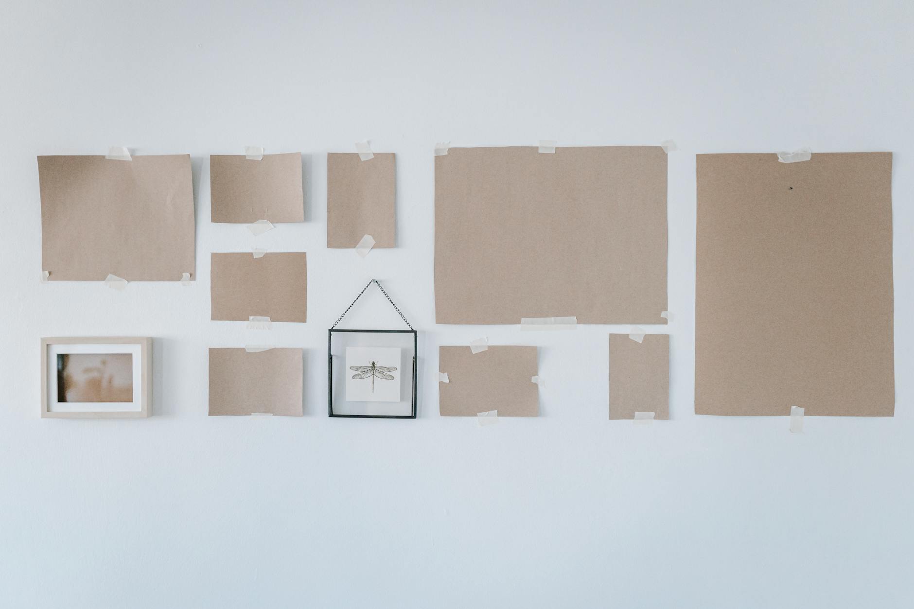
Multiple prints clustered together with no breathing room between them, which turns the wall into a mood board rather than a living space.
A print that's the wrong scale for its wall. A small print floating above a bed or a sofa is one of the most common and least examined mistakes in adult home decorating.
What a Frame Actually Does
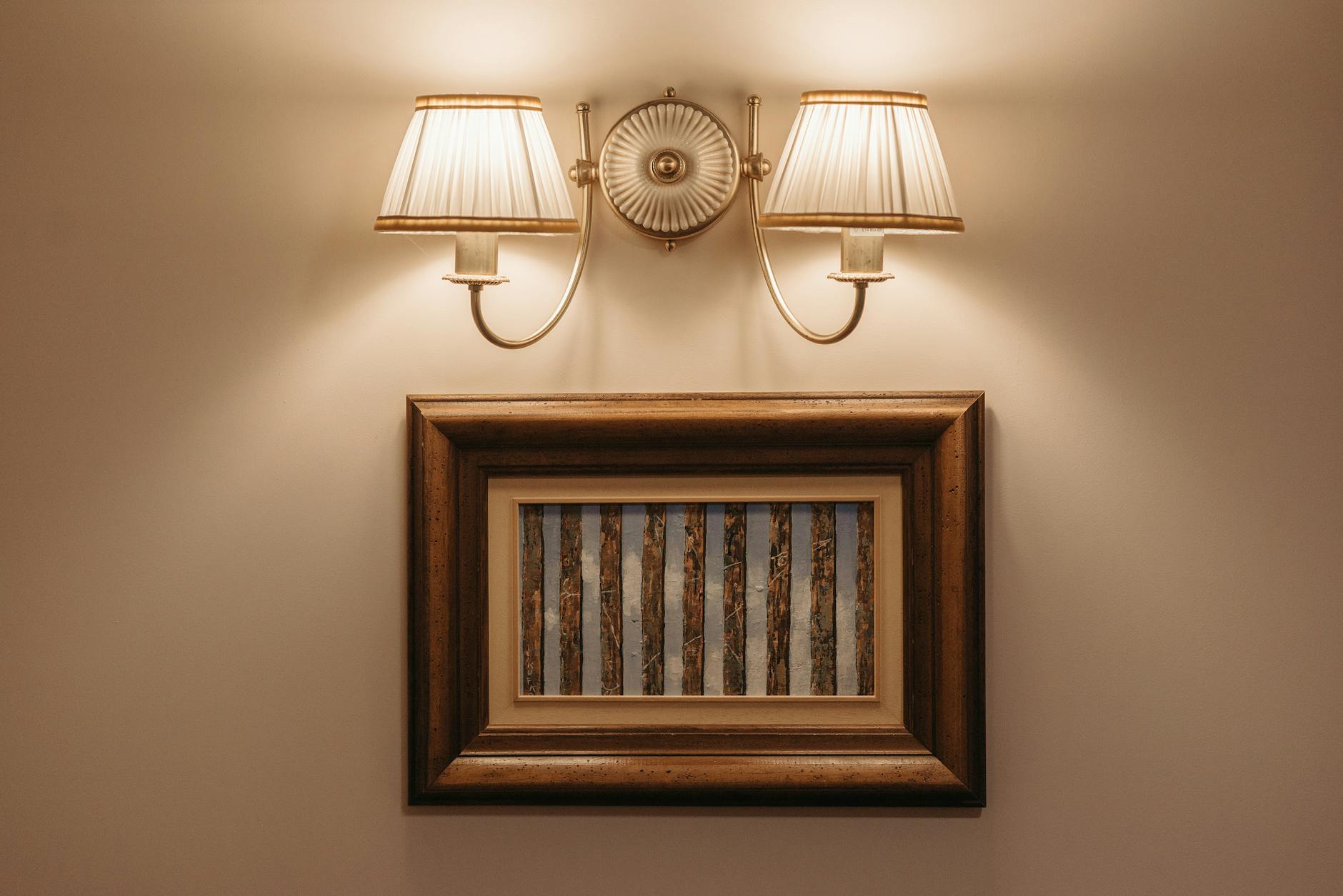
The frame isn't decorative. It's a decision.
A frame defines where the print ends and the wall begins. It gives the art a clear boundary, and that boundary is what turns a piece of paper into an object you live with intentionally. The same words look different in a thin black metal frame than in a solid oak frame with a warm natural finish. One reads contemporary and gallery-adjacent. The other reads warm, considered, and settled.
When choosing a frame, start by matching it to one other material in the room. If you have oak floors or a walnut side table, a natural oak frame will feel like it belongs rather than like an addition. If your space is leaning more minimal and contemporary, a thin black or white frame creates clean definition without competing.
A mat board makes a noticeable difference. The mat, the border between the print and the inner edge of the frame, adds perceived size and a sense of formality to a smaller print. An 8x10 print in a mat inside an 11x14 frame carries more presence than the same print in a frame cut exactly to its size. The white space around the image gives the eye room to arrive at the words rather than landing on them immediately.
The glass matters more than most people realize. Prints behind real glass read as permanent and cared-for. Prints without cover, or behind thin plastic, read as temporary. The material of the frame signals whether you chose this for your home or whether you're still deciding.
If you're working through one wall and not sure where to start, The One-Wall Reset walks you through the decisions one step at a time.
The Question of Scale
Most people choose a print that's too small, and then spend months feeling like something is off without knowing why.
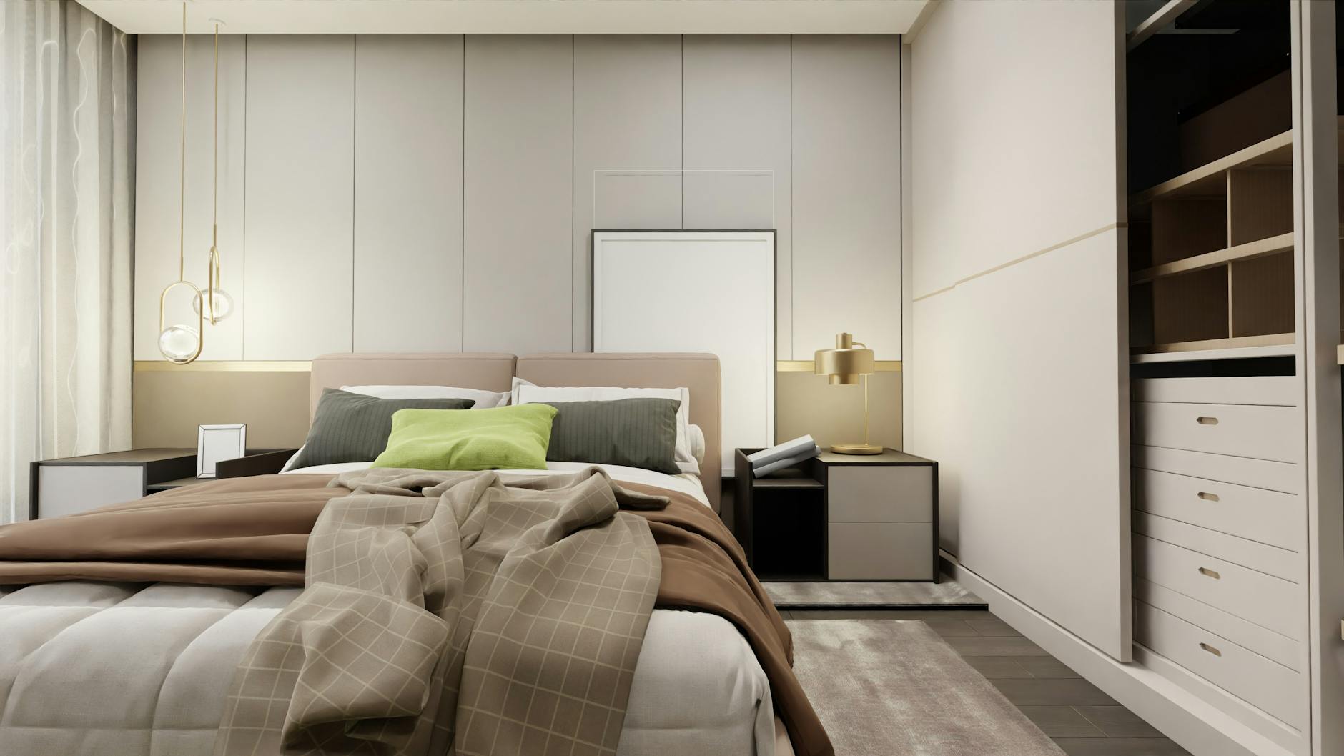
Interior designers broadly recommend that wall art should occupy between 60 and 75 percent of the available wall width above a piece of furniture. For a standard queen bed, that means a piece or grouping at least 24 to 36 inches wide. For a sofa, it means art that spans roughly 48 to 60 inches. A piece that falls below that threshold doesn't disappear. It floats. The eye lands on it and registers something wrong before the mind catches up to what it is.
If you love a smaller print, a mat board solves part of the problem. Another option is to hang two or three identically framed prints in a horizontal row, spaced evenly at two to three inches apart. Three prints in matching frames read as a single installation rather than three separate decisions.
Mounting height matters as well. The standard guideline is to center art at approximately 57 to 60 inches from the floor, which corresponds to average eye level. Art hung too high is common in apartments, probably because it seems to create more breathing room between the print and the furniture below, but it actually makes the ceiling feel lower and the furniture feel disconnected from the wall behind it.
Building a Wall Around One Print, Not Adding Prints to a Wall
This is the reframe that changes most spaces.
The dorm room approach adds prints to a wall until it feels full. The considered approach starts with one print and asks what that print needs around it.
A single well-chosen, well-framed print, hung at the right height and given enough breathing room on all sides, can hold an entire wall. It doesn't need company. It needs space.
If you do want a gallery wall, give each print its own territory. Three to four inches between prints is the practical minimum. The prints should share something: a frame style, a color palette, or a consistent mounting line. But not all three at once. Too much sameness reads as curated to the point of feeling retail. Enough variation creates the sense that the collection grew over time rather than arriving in a single order.
One question worth sitting with before you start: what do you want this wall to do? A wall above a bed can hold you as you fall asleep and catch you when you wake. A reading nook wall can carry a single print at eye level so your gaze has somewhere to rest when you look up from a book. The function shapes the choice more than any trend.
For spaces where you want to feel steady, the Grounding Collection was built specifically for that territory.
When the Words Matter as Much as the Design
A landmark 1984 study published in Science by researcher Roger Ulrich found that hospital patients whose rooms included a view of natural scenery recovered faster, requested less pain medication, and received fewer negative nursing notes than patients who looked at a brick wall. The visual environment is not neutral. What you look at, and what it means to you, affects how you feel in your body.
This matters for quote prints in a specific way. A print with words you actually believe, words that speak to where you are right now rather than where you're trying to be, will do more for a room than the most beautifully designed piece that says nothing you need.
The difference between a print that becomes part of your home and one you stop seeing within a week is almost always this: does it say something true for you right now? Words that hold you where you actually are, not words that push you somewhere else.
If you're sitting with something heavy, or coming out of a season that asked a lot of you, the Wholeness Collection has words for that. They're accepting rather than aspirational. They say: you're allowed to be where you are.
Frequently Asked Questions
How do I know what size print to buy?
Start with the furniture it will hang above and measure the width of that piece. Art should be roughly 60 to 75 percent of that width to feel proportional rather than floating. For a queen bed, an 11x14 or 16x20 print in a mat-and-frame combination is usually the right scale. Err larger when uncertain, because a print that initially feels slightly large tends to settle into a space, while a print that feels too small rarely grows into it.
Can I mix quote prints with photography or abstract art?
Yes, and a mixed wall often reads better than a wall of all quote prints. The key is to maintain a consistent frame style or color palette across all the pieces. One quote print as the anchor, surrounded by simpler botanical prints or abstract line art, lets the words carry weight without the wall becoming text-heavy. The quote print should be the largest or most centrally placed piece.
What frame color works in most rooms?
Natural oak and warm white are the two most versatile finishes. Warm white works in light, neutral spaces and creates a clean, gallery-like feeling. Natural oak works in rooms with wood tones and warm neutrals and reads as settled and earthy. Avoid mixing more than two different frame finishes in a single grouping, because the eye will register the variation as unresolved rather than intentional.
How much space should I leave between prints in a gallery wall?
Three to four inches between prints is the practical standard. Less than that and the pieces start to compete with each other. More than four inches and the grouping loses coherence, reading as a collection of separate decisions rather than an arrangement that belongs together. Consistent spacing across the grouping matters more than the specific measurement.
My rental doesn't allow nails. What are my options?
Large adhesive picture-hanging strips rated for the weight of your frame work reliably for most prints. The critical step is following the weight rating exactly and mounting on a clean, dry wall. For heavier framed pieces, strips designed specifically for gallery hanging, listed by weight capacity on the packaging, perform better than general command strips. A leaning arrangement, where a larger framed print rests against the wall on a shelf or console, is another option that reads as intentional rather than provisional.
Why do some quote prints feel like dorm art and others feel permanent?
The difference is almost always framing, scale, and the weight of the words. A print on lightweight cardstock, without a frame, hung with tape, reads as temporary regardless of how meaningful the quote is. The same quote printed on archival paper, matted, and framed in a solid frame reads as considered and permanent. The words also age differently: prints with generic affirmations become invisible quickly, because they ask nothing specific of the reader. Prints with words that speak to something real tend to stay visible.
Your wall has been waiting a while. It doesn't need to be filled. It needs one right choice, given enough room to breathe and a frame that says you meant it.
Start with the wall that matters most to you right now. The rest will follow.
You might also enjoy
Which collection speaks to your season?
Take the 2-minute Sanctuary Style Quiz and find your starting point.
Take the QuizWritten by Haven & Hold