DIY Gallery Wall Template: Free Printable Planning Guide
You know exactly which wall you want. The one in the hallway, or the corner of the bedroom, or above the sofa where the afternoon light is right. You have known for a while. The difficulty has never been finding the wall.
The difficulty is everything that comes next. Which sizes, how many frames, where the center should be, how far apart things should hang. You do not want to fill holes and rehang. You do not want to spend money and then feel like something is off. So the wall stays empty, and the wall stays honest.
This guide walks you through a printable planning template you can use before you buy a single frame or drive a single nail. It is practical enough to prevent the most common mistakes people make, and simple enough to do on a Sunday afternoon.
Why Gallery Walls Feel Harder Than They Should
A gallery wall arrangement refers to any intentional grouping of framed prints, photographs, or art pieces displayed together on a single wall section to create a unified visual composition. The word "intentional" is doing a lot of work there. Most blank walls feel easier to leave empty than to fill wrong.
There is research behind this feeling. A 2010 study published in Personality and Social Psychology Bulletin, conducted by researchers Darby Saxbe and Rena Repetti at UCLA, found that women who described their homes as cluttered and disorganized showed measurably higher cortisol levels throughout the day compared to women who described their homes as restful and orderly. The visual environment is not neutral. What you put on your walls, and how it is arranged, affects how your body holds stress.
That is why getting it right matters, and why it feels worth planning carefully. A gallery wall that is slightly off, with frames too high or spacing that feels crowded, reads as visual noise. A gallery wall that breathes, that sits at the right height, that has a clear center of gravity, does something else entirely. It settles the room.
The good news is that most gallery wall problems are planning problems. They are not taste problems or money problems or design-skill problems. They are solved by spending twenty minutes with paper and tape before you touch a hammer.
What a Planning Template Actually Does
Before you buy frames, before you choose prints, before you do anything with a hammer, you need to know what you are working with. A planning template is the practice run. It lets you test the arrangement at full scale without consequences.
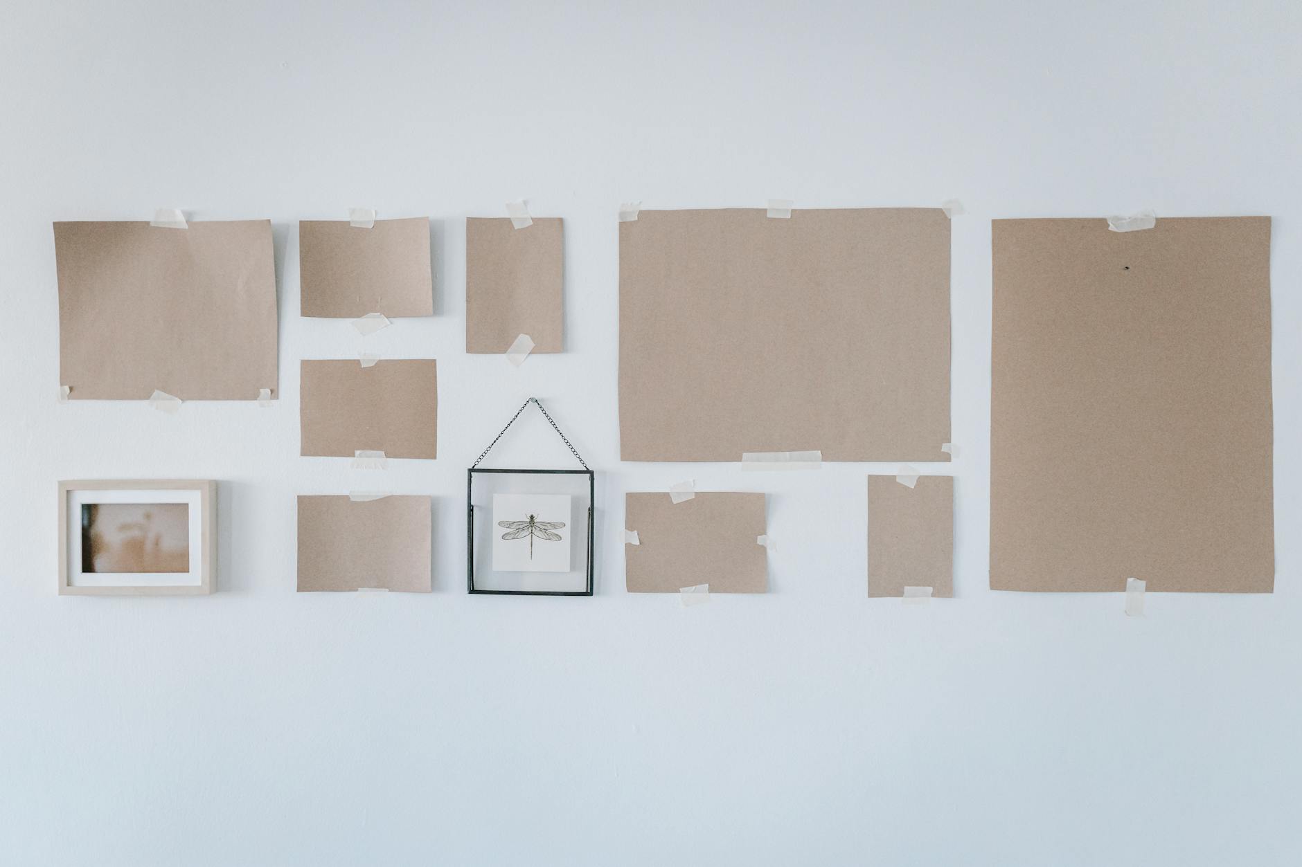
The method is low-tech by design. Cut paper to the sizes of your frames, brown kraft paper works well, or just printer paper taped together for larger sizes, then tape the paper shapes to your wall and step back. Rearrange until it looks right. Only then do you start marking for nails.
This step saves the most common gallery wall frustration: hanging a frame, stepping back, realizing something is wrong, filling the hole, trying again. The paper template method costs nothing and takes about twenty minutes. Skipping it costs drywall repairs and a few hours of quiet frustration.
If you want to start with the right sizing and framing from the beginning, the Sizing and Framing Card lays it out clearly, so you know what you are buying before you buy it.
Building Your Template: Step by Step
Step 1: Measure the furniture first, then the wall
Start with the furniture, not the wall. The standard guideline for gallery wall placement is that your arrangement should span roughly two-thirds of the width of the furniture below it. So if your sofa is 84 inches wide, your gallery wall footprint should be approximately 56 inches wide. This creates a visual connection between the art and the furniture rather than making the wall feel unrelated to what lives below it.
Measure the full wall section from edge to edge. Write both numbers down. These two measurements, furniture width and total wall width, give you the outer boundary of your arrangement.
Step 2: Choose your layout type before you choose your frames
Two layouts cover most situations.
The grid layout uses frames of matching size hung in even rows and columns. It reads as calm and ordered, works well in smaller spaces, and requires less decision-making during installation. Three 8x10 frames in a row, or six 8x10 frames in two rows of three, are both straightforward grid examples.
The organic layout uses a mix of sizes and orientations arranged around a central anchor piece. It reads as collected and personal, works well in larger spaces and above sofas. The anchor piece is typically the largest print in the arrangement, placed at center mass, with smaller pieces radiating outward.
Choose one before you do anything else. A wall that starts as a grid and shifts toward organic partway through tends to read as unresolved.
Step 3: Cut your paper templates
Cut paper pieces to match the outer dimensions of each frame you plan to use. Include the frame itself in the measurement, not just the art inside. Label each piece lightly in pencil: size, which print, or just a number if you prefer.
If you are mixing sizes, cut them all before you start taping. Laying them on the floor first lets you test the full arrangement before committing anything to the wall.
Step 4: Tape to the wall and assess from across the room
Start with your anchor piece, centered on the space. The standard hanging height, used by museums and galleries worldwide, places the vertical center of the arrangement at 57 inches from the floor. This is the same standard used by the American Alliance of Museums, based on average human eye level when standing in a room. For art hung above furniture, position the lowest frame 6 to 8 inches above the top of the furniture piece.
Tape your paper pieces in place. Then walk to the far edge of the room before you assess.
Questions to ask while you are looking from a distance:
Does the arrangement breathe, or does it feel crowded? The recommended spacing between frames is 2 to 4 inches. Closer than 2 inches reads as dense; wider than 4 inches and the pieces begin to feel like separate objects rather than a unified composition.
Is the center too high? If you are assessing the arrangement while standing directly in front of the wall, step back. The correct height reads correctly from across the room, not from 18 inches away.
Does the largest piece feel like the natural center of gravity? In an organic layout, if your eye keeps sliding to a corner, the anchor needs to move.
Step 5: Mark for nails and remove the paper
Once the arrangement feels settled, use a pencil to mark the top corners of each paper template. Remove the paper. The marks tell you exactly where each frame's top edge should sit.
For framed prints with hardware on the back, measure from the top edge of the frame to the hanging point, then subtract that distance from your pencil mark. This gives you the exact nail position.
Choosing Prints That Hold the Room Together
A gallery wall works best when a unifying thread runs through all the pieces. That thread can be a color palette, a frame finish, a visual theme, or a combination of all three. You only need one thread. One is enough.
For a bedroom or reading nook, prints that carry quieter words tend to work better than those with more complex imagery. The room is already doing the work of holding you. The art should support that, not compete with it.
Frame finish is worth deciding early. Matching frames, same finish throughout, read as cohesive and deliberate. Mixed frames work well when the art is doing the unifying work, but require more confidence in the arrangement. If you are uncertain, match the frames and let the art vary.
For walls that need both beauty and weight, a collection approach is worth considering. Choosing several prints from within the same emotional territory and letting them speak to each other. The Grounding Collection groups prints around the territory of stability and safety. Used together, they create a wall that returns you to yourself rather than sending you somewhere else.
If you are building toward a gallery wall over time, you can start with an anchor piece and add to it over months. The key is deciding on your layout type and frame finish before you begin, so each addition fits the plan you already have. A wall built this way often feels more personal than one assembled all at once.
If you are still finding your footing with what you want your space to feel like, the collection quiz helps you identify which emotional territory fits where you are right now.
Frequently Asked Questions
How many prints do I need for a gallery wall?
Three to five pieces is a comfortable range for most walls. Three works well as a triptych, either in a row or a triangle arrangement. Five allows for an organic layout with a central anchor and four surrounding pieces. Fewer than three tends to feel incomplete unless the prints are large. More than seven requires careful planning to avoid visual overwhelm.
What size frames work best for a gallery wall?
A mix of two sizes works better than three. A common combination is one larger anchor (16x20 or 18x24) paired with several medium pieces (8x10 or 11x14). Using all identical sizes, all 8x10 for example, reads as clean and structured. Mixing three or more different sizes requires more planning to balance visual weight across the arrangement.
How far apart should gallery wall frames be spaced?
The standard is 2 to 4 inches between frames. At 2 inches, the arrangement reads as a unified group. At 4 inches, there is more breathing room between pieces. Spacing beyond 4 inches begins to look like separate art decisions rather than a coherent gallery. Keeping the spacing consistent throughout the arrangement is more important than the exact number you choose.
How high should a gallery wall be hung?
The center of the arrangement should sit at 57 to 60 inches from the floor, which corresponds to average standing eye level. When hanging above furniture, position the lowest frame 6 to 8 inches above the top of the sofa, bed, or console. The most common mistake is hanging too high, which creates a gap between the furniture and the art that reads as disconnected rather than intentional.
Do gallery wall frames need to match?
They do not need to match, but they need a unifying element. If the frames vary in finish or style, the art inside should share a color palette, theme, or emotional register to hold the arrangement together. If the art varies widely, matching frames create the through-line. At least one consistent element, whether frame, color, or theme, keeps the wall feeling composed rather than random.
Can I build a gallery wall gradually over time?
Yes, and this is one of the more satisfying ways to do it. Starting with an anchor piece and adding to it over months is a natural way to grow a wall. The key is deciding on your layout type and frame finish before you begin, so each addition fits the plan you already have. A wall built this way often feels more personal than one assembled all at once.
What is the paper template method for hanging a gallery wall?
The paper template method involves cutting paper pieces to match the outer dimensions of each frame, taping them to the wall in your planned arrangement, and adjusting until the layout feels right before making any holes. It is the single most effective way to prevent the most common gallery wall mistake, which is hanging everything and then realizing the spacing or height is off. The paper costs nothing. The time investment is about twenty minutes.
The wall has been waiting. You have been waiting too, and not because you did not care, but because you did. Take the time to plan it right. The arrangement you land on will feel different from anything you picked in a hurry, and the wall will know it.

Written by Haven & Hold