How to Create a Gallery Wall with Quote Prints
You close the browser tab again. Not because nothing caught your eye, but because nothing caught it in the right way. The blank wall stays blank, and somewhere underneath the frustration, part of you is relieved.
That relief is information. A wall full of the wrong things is worse than an empty one. And most advice about gallery walls skips that part entirely, offering instead a cheerful list of "steps" as though the real problem is logistical.
It is not logistical. The real problem is that a gallery wall made of quote prints has to do something your wall currently does not: hold you, quietly, in exactly the right register.
Why Most Gallery Walls Look Like a Pinterest Board Threw Up
The short version: too much is being asked of the wall at once.
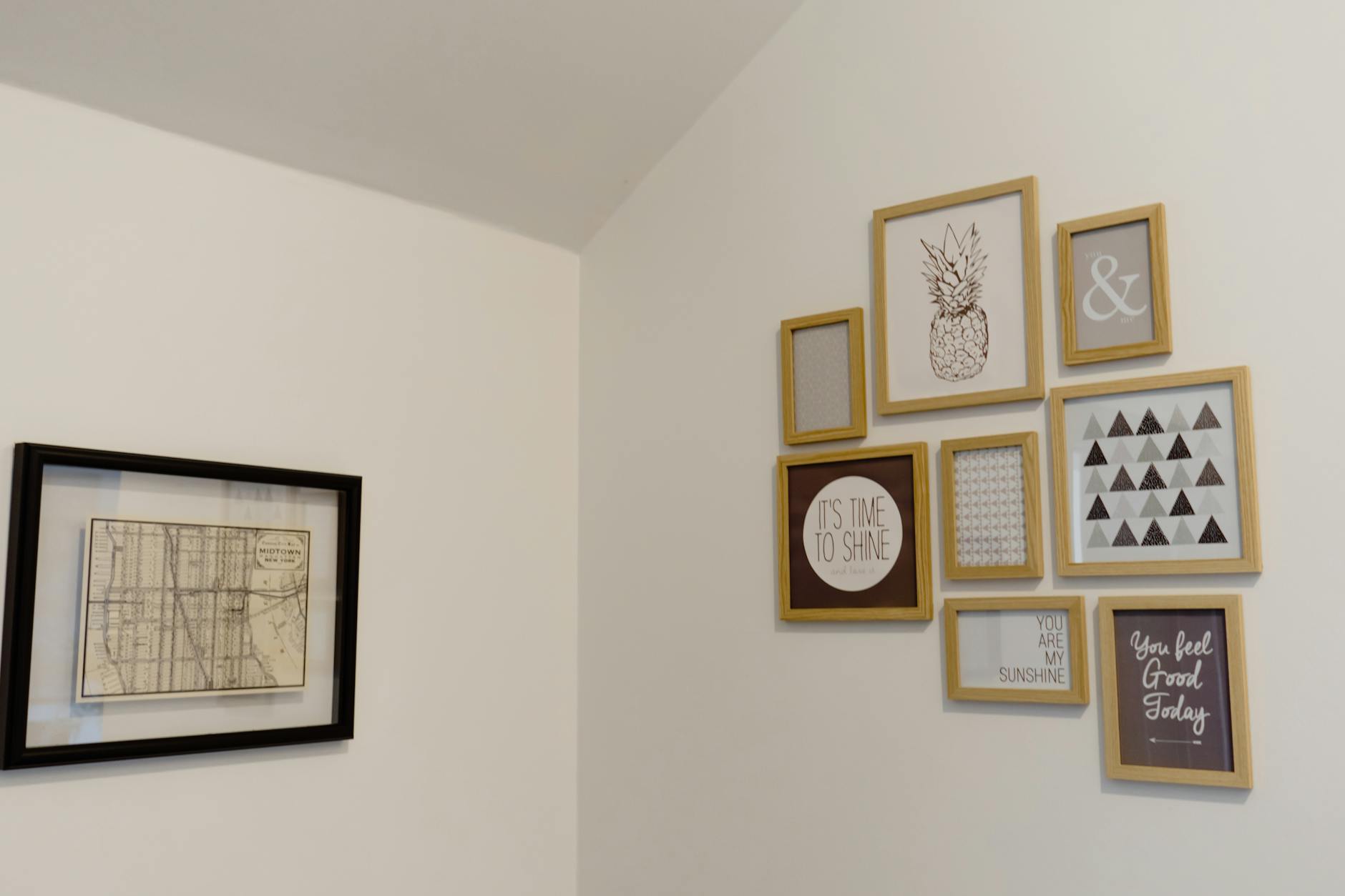
A gallery wall assembled from a single afternoon on Etsy announces its origins. Every piece elbows the others for attention. The words compete for your eye before you have even chosen one to settle on. Designers sometimes call this "visual noise," but a more useful phrase is one interior writer coined to describe the failure mode of quote-heavy rooms: the wall becomes "too talkative." When every piece is asking to be read, none of them can be felt.
A 2010 study published in Personality and Social Psychology Bulletin found that women who described their homes as cluttered or full of unfinished projects had measurably higher levels of the stress hormone cortisol throughout the day compared to women who described their homes as restful. The research focused on object clutter, but the principle extends equally to visual clutter. A wall with too many competing messages is not restful. Your nervous system knows this even when your eye has not yet identified the problem.
The gallery walls that look like a "Pinterest fail" share a few specific characteristics. Every piece was bought on the same day. The frame finishes span four different metals and two wood tones. There are six quote prints and none of them are speaking to each other. The sizes are all medium, because medium feels safe, which means nothing reads as intentional. The whole thing looks like an exercise in filling space rather than an act of choosing what belongs.
This is also, it bears saying, not a failure of taste. It is a failure of sequence. Most people build gallery walls by accumulating first and curating second, if at all. The fix is not harder shopping. The fix is a different starting question.
What a Gallery Wall That Holds You Actually Needs
A gallery wall is a curated arrangement of framed art, prints, or objects displayed together on a single wall surface. That word "curated" does a lot of work. Curated means chosen with a specific end in mind. It implies that something was left out.
The gallery walls that feel right, the ones that make you exhale a little when you walk into the room, share a quality that is harder to describe than size ratios or spacing formulas. They have a point of view. You can sense that someone knew what they were doing, even if the arrangement looks loose or organic. There is usually one piece that anchors the whole thing: larger, more quiet, more certain than the rest. The other pieces orbit it.
For walls that are meant to hold you rather than perform for you, that anchor is almost always a single meaningful print. Not the most colorful one, not the one with the most interesting frame, but the one whose words actually mean something in that room and to the person who lives there. Everything else is chosen around it.
If you want a place to start, The One-Wall Reset walks you through it, one wall at a time.
This is also where the objection "I could just print my own" tends to dissolve. You could print your own. But the blank wall is still blank. If a Canva file would have worked, the wall would not still be empty. The people who have been sitting with the blank wall the longest are usually not the ones who lack ideas. They are the ones who care too much to put the wrong thing up.
The Practical Side: Sizing, Spacing, and Where to Hang
Now for the part that most guides lead with, and that actually only makes sense once you have an anchor piece in mind.
How high to hang
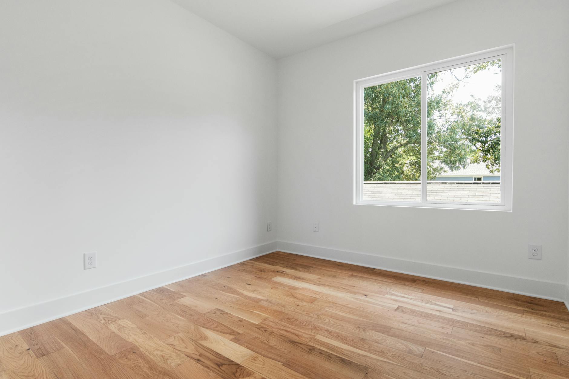
The standard followed by museums and galleries worldwide is to hang art so the center of the piece sits at 57 to 60 inches from the floor. This corresponds to the natural eye level of most adults and the height at which the eye settles when walking through a room. Hanging art higher than this creates disconnection: the piece floats above the furniture and above the body. Hanging it lower can feel cramped. When you are building a gallery wall above furniture, treat the top of that furniture as your reference point and apply the same principle: the visual center of your arrangement should feel like it belongs at eye level.
How far apart to space pieces
For a tight, grid-style arrangement, 2 to 3 inches between frames keeps the grouping cohesive. For a more organic, salon-style layout, 4 to 6 inches gives each piece room to breathe. The most common mistake is inconsistency: mixing one 1-inch gap with one 8-inch gap in the same arrangement, which signals accident rather than intention.
What size to use
The 2/3 rule is the most useful starting point. Art hung above a sofa or a bed reads best when it spans roughly two-thirds the width of the furniture below it. A 60-inch sofa pairs well with art or a grouped arrangement that spans 36 to 40 inches. This is not a rule to follow rigidly, but it is a useful guardrail against the most common sizing errors, which are going too small (a single 8x10 above a king bed looks apologetic) and going too large (a single 36x48 above a loveseat overwhelms the furniture entirely).
How many frame finishes
Two, at most three. Choose a primary finish and a secondary finish that complements it: natural oak and matte black, warm gold and white, walnut and brass. More than three finishes and the arrangement starts to look like it was assembled from different apartments rather than chosen with intention.
How Many Quote Prints Are Too Many
One quote print, positioned with intention, is more powerful than six arranged by default.
This runs counter to the impulse of gallery wall building, which tends toward accumulation. But the restraint is the point. A single print with words that mean something in that room creates a quiet center of gravity. The eye finds it, rests there, and then moves to the other pieces with a sense of orientation.
Two or three quote prints can work beautifully when they share an emotional territory rather than just a visual style. The wall does not need to match. It needs to belong to the same sensibility. Three prints about different aspects of rest, for example, create a coherent atmosphere even if their designs differ. Three prints from different emotional registers, one upbeat, one melancholic, and one wry, fight each other. The wall becomes a debate rather than a resting place.
Four or more quote prints in a single arrangement need a very deliberate hand. The risk is what that designer meant by "too talkative." When every piece is asking to be read, none of them can be felt. The wall becomes a reading assignment rather than a place to land.
The practical answer for most walls: lead with one anchor quote print. Add one to two pieces that provide visual texture without asking to be read, a botanical illustration, an abstract composition, an enso circle, or a simple photograph with no text. If a second quote print belongs, you will feel it rather than decide it.
If you are building toward a bedroom wall or a reading nook, the Grounding Collection is a useful place to sit with options. The prints there are designed to be minimal enough to live beside other pieces without taking over the wall.
Building the Wall Over Time, Not Over a Weekend
The gallery walls that look collected rather than decorated share one quality: they were not assembled all at once.
This is not advice to be passive about your space or to wait indefinitely for inspiration. It is an acknowledgment that a wall built over several months, adding pieces as they earn their place, will always look different from one sourced in a single shopping session. The first approach looks like your wall. The second looks like a wall.
The practical version of this: start with the one piece that you are most certain about. Hang it. Live with it for a few weeks. Notice what it asks for beside it. Add the next piece from that observation rather than from a mood board you found online. Repeat.
This is slower, and it asks more of you. But the result is a wall that holds the shape of your attention rather than someone else's aesthetic.
The blank wall is not a failure. It is an opening. The question is not "what fills this space" but "what belongs here."
Frequently Asked Questions
How many prints do you need for a gallery wall?
A gallery wall can be as few as three pieces or as many as fifteen, depending on the size of the wall and the density of the arrangement. What matters more than number is cohesion. Start with fewer than you think you need and add from there.
What is the correct height to hang a gallery wall?
The center of your arrangement, or the optical midpoint, should sit at approximately 57 to 60 inches from the floor. This is the standard followed by museums and galleries worldwide and corresponds to the natural eye level of most adults. When hanging above furniture, adjust slightly so the arrangement feels connected to the piece below it rather than floating above it.
Can you mix quote prints with other types of art?
Yes, and the wall usually benefits from it. A gallery wall made entirely of quote prints risks becoming "too talkative," meaning the eye has nowhere to rest that is not also asking to be read. Mixing in a botanical print, a simple abstract, or a line drawing gives the arrangement visual breathing room and makes the quote prints feel more considered.
How do you choose which quote print to anchor the wall?
The anchor print is the one whose words mean something in that specific room and to the person who lives there. It is not necessarily the largest piece or the most visually complex. Ask what you want to feel when you walk into the room, then find the print that speaks to that feeling directly rather than decorating around it.
How far apart should you space frames in a gallery wall?
For a grid arrangement, space frames 2 to 3 inches apart. For a more organic, salon-style arrangement, 4 to 6 inches gives each piece more presence. The most important rule is consistency within the arrangement. Varied spacing within a single gallery wall signals accident rather than intention.
What frame finishes work best together in a gallery wall?
Choose one primary finish and one secondary finish that complements it. Natural oak and matte black work well together, as do warm gold and white. Three finishes is the upper limit for most arrangements; beyond that, the eye reads the frames as individual objects rather than a unified whole.
The wall does not have to be finished to be right. It just has to be honest, which means choosing pieces that belong there rather than pieces that fill space. The difference between those two things is something you already know. The blank wall has been waiting for the right thing, not the first thing.
Written by Haven & Hold