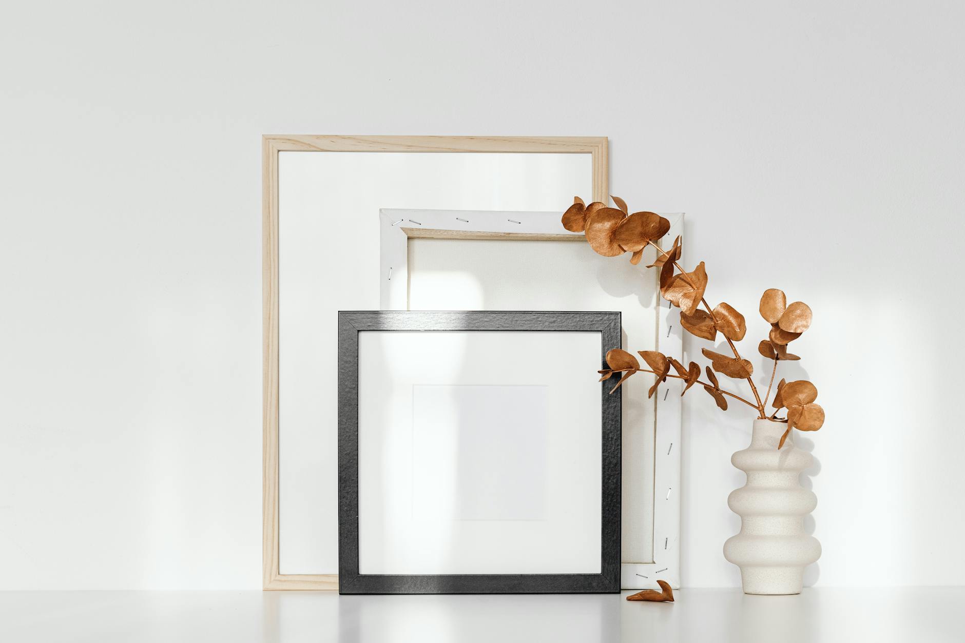
How to Choose the Right Frame for Your Art Print
The print arrives rolled in tissue, more beautiful than you expected. You set it against the wall to see how it feels. Then the question surfaces: which frame goes with this?
It is not a small question. The frame you choose changes how the print reads in a room, how the colors land, and how much weight the piece carries on the wall. Choose well and the frame disappears, letting the art hold the space. Choose poorly and the frame argues with everything around it.
This guide walks you through the decisions that actually matter, so you can choose with confidence rather than second-guessing at a shop counter.
The process breaks down into five decisions:
- Choose your frame material. Wood is the most forgiving starting point. Metal reads as contemporary. Acrylic creates a float effect.
- Select a finish color. Match the frame's tone to your wall palette: warm finishes (Natural Oak, Walnut) for warm walls, cool finishes (Black, White) for cool ones.
- Decide on a mat board. If the print runs to the paper's edge, use a mat. A width of 2 to 3 inches on all sides is the standard for gallery display.
- Match frame width to print size. A frame moulding between 1 and 2 inches wide works for the majority of residential prints.
- Plan your arrangement. If you are hanging multiple pieces, settle on one organizing principle before you purchase.
The sections below go deeper on each decision.
Why Framing Feels Like Such a Big Decision
Most of us were not taught how to think about frames. We know what we like when we see it, but translating that intuition into a purchase is harder than it sounds.
Part of the difficulty is that framing is genuinely layered. The material, the color, the width, the presence or absence of a mat board: each choice interacts with the others and with the specific print you are hanging. There is no single correct answer, but there are principles that will help you stop second-guessing.
The other part of the difficulty is emotional. A blank wall carries its own pressure. It holds the possibility of getting it right, and also the possibility of getting it wrong. Research published in Acta Psychologica found that the frame surrounding an artwork measurably influences how viewers perceive the piece itself, affecting ratings of harmony and aesthetic coherence. In other words, the frame does real work. It is not just a border.
And that anxiety is worth naming, because it is what keeps most people from finishing a room. You are not overthinking it. Framing really does matter, and you are allowed to take it seriously.
Frame Materials: Wood, Metal, and Acrylic
Frame moulding is the profiled trim that forms the physical border around your print. It comes in a range of depths, widths, and materials that interact differently with various art styles and room settings.
Wood Frames
Wood is the most common choice for art prints, and for good reason. It is warm, versatile, and works with almost any interior style from Scandinavian minimal to layered, collected rooms. Oak in particular has a natural grain that reads as intentional rather than generic. The framed options used for framed Haven & Hold prints come in Black, White, and Natural finishes. These four cover the vast majority of room palettes and personal aesthetics.
Walnut is worth singling out. It is rich without being heavy, and it works alongside prints with warm or cool undertones. If you are genuinely unsure where to start, Walnut is rarely the wrong choice.
Metal Frames
Metal frames offer a cleaner, more contemporary look. A thin black metal frame suits prints that are graphic and high-contrast. A brushed gold or silver frame adds quiet elegance in rooms with other metallic accents. Metal frames tend to show the art more directly because the frame profile is thinner and less visually present.
Acrylic Frames
Acrylic frames, sometimes called float frames, take a different approach. The print appears to float in front of a clear surface with no visible border between the art and the room. These work well for modern abstract prints but can read as inexpensive if the acrylic quality is low.
A Word on Budget Frames
An IKEA Ribba frame, properly matted, looks fine on most walls. The gap between a budget frame and a premium one is not always visible at a glance. What you lose in a budget frame is material quality (thinner moulding, lighter weight, lower durability over time) and fit precision. If the frame is for a print you love and plan to live with for years, investing in quality is worth it. If you are experimenting with a gallery wall arrangement while you figure out the layout, an affordable frame while you plan is a reasonable place to start.
If you want a simple reference for decisions like this one, the Sizing and Framing Card pulls together the core choices in one place, so you can take it with you when you shop.
How Frame Color Interacts with Your Print and Wall
This is where most people get stuck. The instinct is to match the frame to either the colors in the print or the colors in the room. Neither rule works perfectly on its own.
A more useful frame: think of the frame as a bridge between the art and the wall. Its job is to hold the relationship together without dominating either side.
Warm Finishes: Natural Oak and Walnut
These work well with warm-toned or earth-toned prints, warm white or cream walls, and rooms with wood furniture, rattan, or warm textiles.
A 2010 study published in Personality and Social Psychology Bulletin by researchers at UCLA found that women who described their homes as cluttered or unfinished showed measurably higher cortisol levels throughout the day than those in tidy, complete spaces. The way a frame finishes a print is one of the small details that moves a space from feeling unresolved to feeling held.
Cool Finishes: Black, White, and Silver
These work well with high-contrast or graphic prints, cool white or grey walls, and rooms with clean lines and minimal ornamentation. A thin black frame in particular is close to universal. It gives almost any print a gallery quality without drawing attention to itself.
The Oak vs. Black Question
Both are versatile. Neither will date your space the way a trend-forward finish will. If you truly cannot decide, use your wall color as the tiebreaker: warm walls (cream, white with a yellow undertone) suit oak, and cool walls (bright white, grey) suit black.
White frames deserve separate mention. They add breathing room and work well in very minimal spaces. In a gallery wall, one white frame among several oak frames reads as intentional. Two white frames look cohesive. A single white frame without context is what sometimes reads as accidental.
Mat Board: Do You Need One?
A mat board is the border between the print and the inner edge of the frame. It creates visual breathing room around the image and is the detail that most clearly separates a gallery look from a snapshot look.
The standard guidance is simple: if the print has a white or light border built in, a mat is optional. If the print runs to the edge of the paper, a mat provides the breathing room the design needs.
Mat width matters too. A narrow mat (one inch or less) can feel rushed. A generous mat of two to four inches reads as fine art and gives the print room to settle. When in doubt, go wider than seems necessary.
For color: white mats work with almost everything. Off-white or warm cream suits warm-toned prints. A colored mat is a more deliberate choice, usually only warranted when you are matching a very specific element in the print.
One detail worth knowing: archival mat boards are rated acid-free, meaning a pH of 7.0 or higher. Acidic mats cause prints to yellow and deteriorate at the edges over years, a process called mat burn. For any print you plan to keep, specifying an acid-free mat is a single, low-cost decision that protects the piece for decades.
Frame Width and Proportion
Frame profile refers to the width and depth of the moulding itself. A thinner frame (under one inch) reads as contemporary and minimal. A medium frame (one to two inches) is the most versatile range and works for most print sizes. A wide frame (over two inches) makes a stronger visual statement and suits larger prints or rooms that can hold that presence.
Scale matters. A thin frame on a large print can look underscaled, a bit tentative. A wide, heavy frame on a small print overpowers the image. The general guide: match frame weight to print size, leaning slightly heavier than seems necessary. The eye reads a properly weighted frame as settled, not shouting.
For reference: standard print sizes used by most POD printers and framers run 8x10, 11x14, 16x20, 18x24, and 24x36 inches. Prints ordered in these exact dimensions fit standard off-the-shelf frames, which run 30 to 50 percent less expensive than custom-cut framing. For 8x10 to 16x20 prints, a frame moulding between 0.75 and 1.5 inches wide is the most common choice in residential settings and gives the image room without overpowering it.
Mixing Frames in a Gallery Wall
The fear most people carry into a gallery wall project is: what if it looks like a mistake? The answer is that the more intentional your mixing, the more coherent it reads. What looks like a mistake is usually a random assortment without an organizing principle.
One material, varied sizes. All oak frames in different sizes. The variation in size creates visual interest; the consistent material creates cohesion.
Two finishes, same material. A mix of Natural oak and Walnut oak frames. Both are warm, both are wood, but the tonal variation gives the arrangement depth.
One dominant, one accent. Mostly black frames with a single white or natural oak frame as an accent. One accent creates intentionality. Two accents become a pattern.
When you are building out a wall, the Grounding Collection and the Wholeness Collection each have their own natural frame affinities. The warm earth tones of Grounding prints tend to sit well in Natural Oak or Walnut frames. The softer, cooler palette of Wholeness holds well in White or Black frames.
If you want to find which collection speaks most to your space, the Haven & Hold quiz takes about two minutes and gives you a clear starting point.
Frequently Asked Questions
Does the frame have to match the colors in the print?
The frame does not need to match the print exactly. Its job is to bridge the print and the wall, not to echo the print's palette. Choosing a frame that complements the dominant tone of the print (warm or cool, light or dark) will usually work better than matching a specific color. The frame disappears when it is in harmony; it announces itself when it is a forced match.
Should I use a mat board for all prints?
A mat board is not mandatory, but it adds a fine art quality that most prints benefit from. If the print runs to the edge of the paper with no built-in border, a mat gives it the visual breathing room it needs. When in doubt, use a mat and choose a width wider than seems necessary.
Is wood or metal better for art prints?
Both work well for art prints. Wood feels warmer and more traditional; metal reads as more contemporary and minimal. The choice depends more on your room's existing materials and the tone of the print than on the format of the print itself.
What is the most versatile frame color?
A thin black frame is close to universally versatile. It suits almost any print and any wall color, gives the art a gallery quality, and does not impose itself on the room. Natural oak is a close second for rooms with warm palettes.
Can I mix frame finishes in a gallery wall?
Yes. The key is having an organizing principle. Mixing finishes works when there is a dominant material or color with one deliberate accent. Random variation without a through-line is what reads as unintentional.
How do I choose the right frame size?
The frame should extend beyond the print's dimensions. If you are using a mat board, the mat brings the visible border inward while the outer frame dimensions stay the same. As a starting point, choose a mat width of at least two inches on all sides to give the print adequate breathing room.
Are expensive frames worth it?
For prints you plan to live with for years, quality matters. Premium frames use thicker moulding, better corner joinery, and more durable finishes. A budget frame looks fine short-term, especially when the print itself is strong, but it is more likely to warp, discolor, or loosen at the corners over time.
You do not need to get this perfect on the first try. Most people rearrange their walls more than once, and that is not a failure. That is how a space becomes yours.
The frame you choose is one decision among many you will make for this room. What matters most is that the print you have chosen feels right for where you are now. The frame is there to hold it. That is its only job.
You might also enjoy

Written by Haven & Hold