


Safe harbor
FREE Shipping
Satisfaction Guarantee
25% off orders over $175+
Unlock 25% off your entire order at $175.
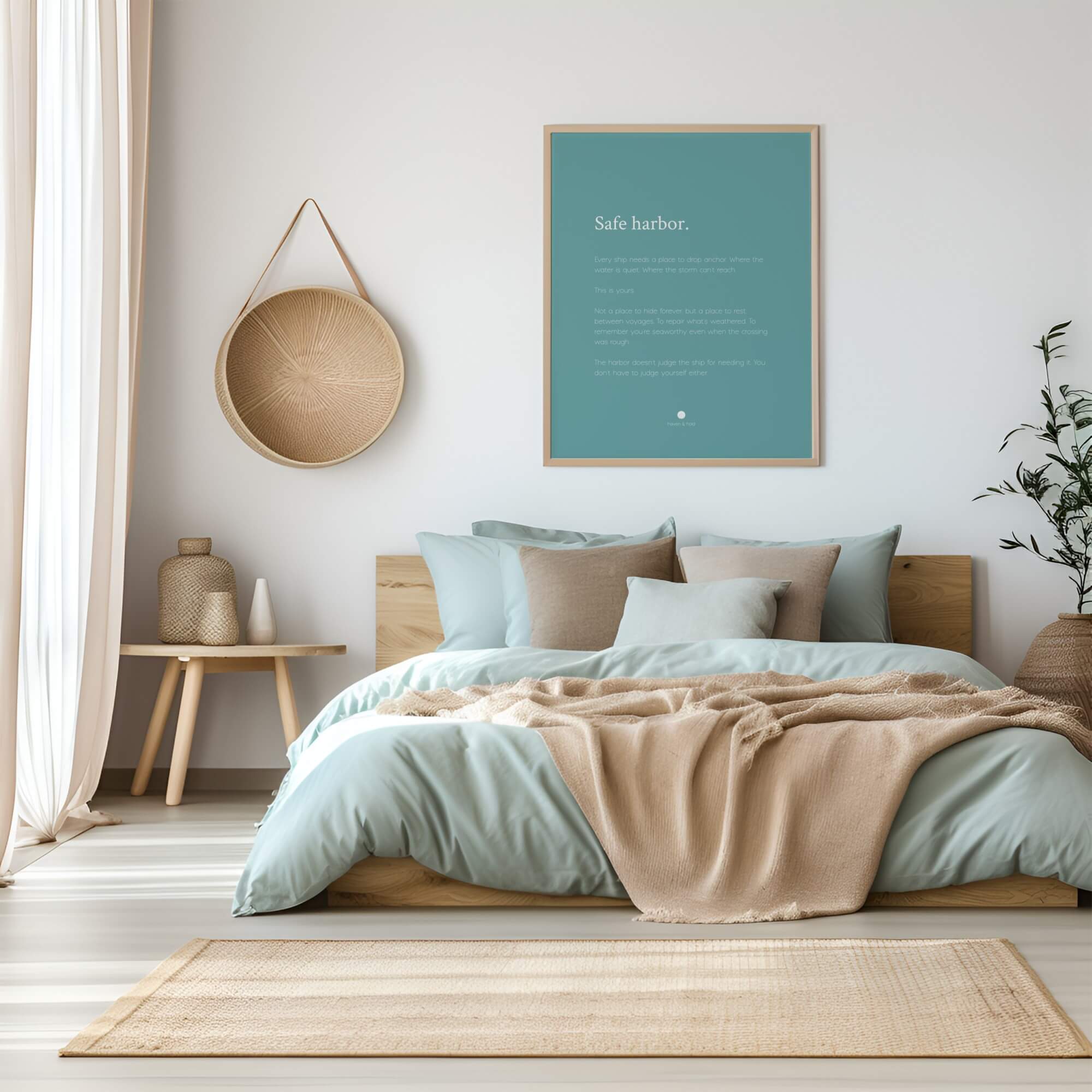
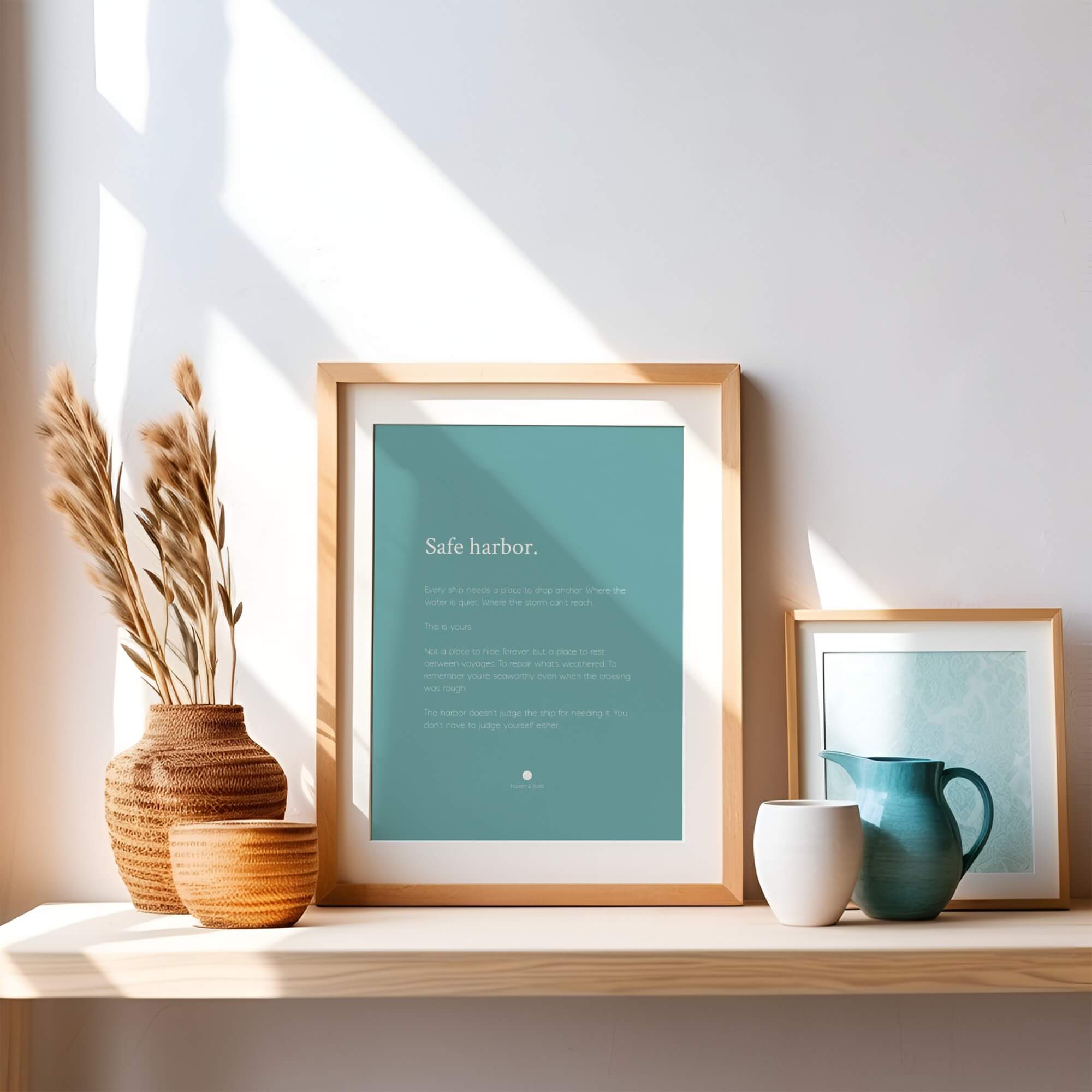
Safe harbor.
Every ship needs a place to drop anchor. Where the water is quiet. Where the storm can't reach.
This is yours.
Not a place to hide forever, but a place to rest between voyages. To repair what's weathered. To remember you're seaworthy even when the crossing was rough.
The harbor doesn't judge the ship for needing it. You don't have to judge yourself either.
Haven & Hold's "Safe Harbor" is a minimalist quote print from the Grounding collection. Available in seven sizes from 8x10 ($35 unframed) to 24x36 ($175 framed). Printed on enhanced matte paper with muted teal (#5F9EA0) background and warm white typography. Designed for reading nooks, bedrooms, and quiet corners.
There are places in your home that hold you differently than others. The chair by the window. The corner with the lamp. The spot where you sit when the rest of the house feels too loud, even if no one else is home. "Safe Harbor" names that feeling. It is two words that say: this is the place where you come back to yourself.
Why Teal Holds Differently
The muted teal background of "Safe Harbor" is the only cool-toned print in the Grounding collection, and that is intentional. Where the other Grounding prints use warm earth tones to create a sense of rootedness, "Safe Harbor" uses the steady blue-green of still water. It carries a different kind of safety, the kind that comes from depth rather than solidity.
Paired with warm white text (#FAF9F6), the contrast is soft enough to live with every day. The print does not demand attention. It waits for you to notice it.
Archival Materials and Framing
Produced on enhanced matte paper through Printful. The matte finish holds the teal tone true without the color shift that glossy paper introduces. Framed options are available in Black, White, and Natural finishes. Built to last the way a safe harbor should.
Where "Safe Harbor" Belongs
Reading nooks are the natural home for this print. The teal tone works alongside warm textiles, knit blankets, worn leather, linen cushions, and creates a visual anchor for the corner of the room dedicated to quiet. It also works in bedrooms as a companion to warmer-toned Grounding prints, and in therapy offices where the color brings calm without clinical coldness.
This print speaks to you if you have been building a reading corner or quiet space in your home and everything else you have found online feels either too loud or too generic. If you want the art on the wall to say something real about what the space is for.
Pairing and Gallery Wall Ideas
"Safe Harbor" and "Within These Walls" create a striking two-piece pairing: teal and charcoal, cool and warm, both grounding. Add "Sanctuary" for a three-piece gallery wall that builds the full vocabulary of safety. The Stone Stack piece from the Enso and Wabi-Sabi series ("Balanced, Not Perfect") shares the cool-warm balance and pairs naturally.
Frequently Asked Questions
What rooms does the "Safe Harbor" print work best in?
The muted teal background makes it especially well-suited for reading nooks, quiet corners, and bedrooms. It also works in therapy offices and home offices where a calming presence matters. The cool tone balances warm-toned furniture and textiles.
Why is the background teal instead of earth tones like other Grounding prints?
"Safe Harbor" references the safety of still water rather than solid ground. The muted teal carries a different kind of grounding, one that comes from depth and calm rather than weight and rootedness. It adds visual variety to the collection while staying true to the emotional territory.
Does the teal print clash with warm-toned decor?
No. The muted, desaturated teal is specifically chosen to complement warm neutrals like wood, linen, cream, and sand. It adds a gentle cool accent without competing with warm tones in the room.
Can I pair "Safe Harbor" with prints from other collections?
Yes. "Safe Harbor" pairs particularly well with Wholeness collection prints like "You Belong Here" (which shares the teal background) and with Growth collection prints for a gallery wall that moves from safety through acceptance to becoming.
What is the difference between the standard design and quote-only variant?
The standard design includes geometric elements from the Grounding collection alongside the typography. The quote-only variant features clean typography on the teal background, a minimal option that lets the color and words carry everything.
This smooth, neutral-white matte paper is ideal for fine art, photo reproduction, and decor prints. It offers accurate color reproduction, high contrast, and sharp detail. With a weight of 230 GSM and a thickness of 9.5 mil, it has a durable feel. The instant-dry coating resists fingerprints and smudging. This acid-free paper is compatible with all aqueous inkjet printers, whether using dye or pigment inks.
Specifications
| Texture | Smooth | Weight | 230 GSM |
| Thickness | 11 Mil | Finish | Matte |
| Color | Neutral White | Min Print Size | 3" x 7" |
| Max Print Size | 36" x 70" | Printing Method | Pigment-Based Giclée Inkjet |
| Paper Type | 100% α-Cellulose | Country of Origin | United States |
- Clear front protector for framed prints
- Black, White, or Natural frame finishes
- Includes pre-attached hangers for easy horizontal or vertical display
- Clean, modern profile to complement any art style
Free shipping included on all orders within the continental United States.
If your print arrives damaged or you are not completely satisfied, reach out within 30 days for a replacement or full refund. Your walls deserve something that feels right.
Choose options
Blog posts
What 'Still Becoming' Means When You're Tired of Arrival Pressure
You know this pattern. You work toward something for months. You get there, mostly. The relief lasts a few days. Then the next version of yourself appears, just ahead, and you are already leaning t...
Read more
How We Chose 15 Quotes From 850 | Haven & Hold
You have probably scrolled past a hundred quotes that were almost right. Almost. Like the words reached toward something true and stopped one step short. You kept moving. Not because nothing was th...
Read more
What "Rest Here" Means When Rest Feels Like Giving Up
When rest feels like giving up You finally stopped. And somehow it feels worse than keeping going. You know the moment.
Read more