Therapy Waiting Room Design: Calm Before the Session Starts
The chair is positioned away from the door. The light comes from a lamp in the corner, not a fixture overhead. The art on the wall says something quiet and unexpected, and you read it twice before you realize your shoulders have dropped.
Your client has been in this room for four minutes. The session hasn't started.
This is the waiting room doing its work, before any of yours begins. For therapists designing or refreshing a practice space, this matters more than most design decisions get credit for. The waiting room is not a holding pen between arrival and appointment. It is the architectural beginning of the therapeutic frame, and it is doing something to every person who sits in it, whether you have thought about that or not.
What the Waiting Room Is Already Doing
Before a client speaks, their nervous system has already assessed the space. The process happens in milliseconds. Threat or safety. Vigilance or ease. The brain scans color, light, spatial arrangement, sound, and sensory texture and renders a verdict the client may not consciously register, but will feel in their body as the session begins.
A 2020 study published in Counselling and Psychotherapy Research, examining what both therapists and service users found psychologically supportive about waiting room architecture, found that clients consistently named three environmental qualities as most significant: visual calm, a sense of containment, and freedom from feeling observed. The authors described the waiting room as an architectural extension of the therapeutic frame, a space that can either support or actively undermine the work that follows.
That framing is worth sitting with. The space outside your therapy room is not neutral. It is actively preparing your client for what comes next, or actively working against it. The decision to treat it as a design afterthought has consequences that show up in session.
Color, Light, and the Foundation of Calm
The most researched dimension of calming environments is also the one most frequently underdone in professional spaces. Color affects physiological arousal directly. Blue and green tones have been consistently linked to reduced heart rate and lower blood pressure in environmental psychology research. Neutral warm tones, sand and clay and warm white, create a sense of enclosure that reads as shelter rather than sterility.
Think of it this way: high-saturation, high-contrast color combinations increase visual arousal. They are energizing, which is exactly what most clients sitting in your waiting room do not need. Soft and low-saturation is almost always the right direction.
Lighting does equal work, more quietly. Overhead fluorescent fixtures are not a neutral choice. They signal alertness and activity. For a client who has spent the day managing what they carry, the last thing they need is an environment that keeps them on. Adjustable warm-toned lighting, lamps where possible, and natural light filtered through sheer curtains all send the same message: you are allowed to slow down here.
Color and light require no ongoing maintenance once set. They are the foundation everything else is built on, and they do more sustained emotional work than any single decorative object.
Seating, Sound, and the Body's First Response
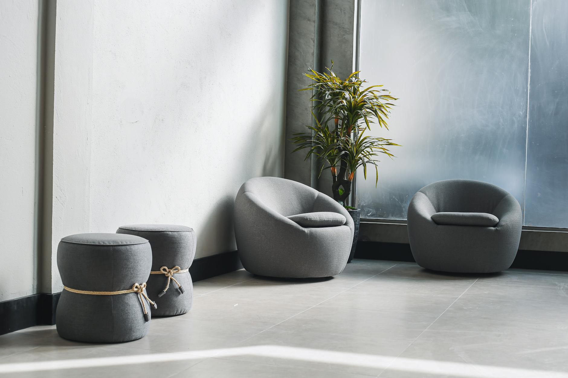
Where you place seating shapes the felt experience of the room as much as anything visible on the walls. Research on spatial preference in anxious individuals consistently shows that people choose corner placement when available. Having one's back to a wall and a clear sightline across the room reduces the low-grade vigilance that anxiety requires. If your waiting room has a corner, make it the most comfortable seat in the space.
Variety matters. A single low sofa requires real effort to rise from and may be exclusionary for clients with mobility considerations. A mix of seating heights, at least one straight-backed chair and one softer armchair, allows people to choose based on how they feel that day. That small act of choice, offered before anything else, begins the quiet restoration of agency.
Sound is consistently underestimated in waiting room design. What a client hears while waiting, including any sound that carries from inside the therapy room, shapes their sense of safety before a single word is spoken between you. Hard surfaces, bare floors, and sparse furnishings reflect sound and create an ambient alertness. Soft furnishings, area rugs, and upholstered seating absorb it. The felt difference is significant. The goal is not silence but a quality of stillness that communicates: what happens here is private, and you are safe in that.
If you want a place to start with the visual environment, The One-Wall Reset walks you through it, one wall at a time. It is designed for rooms that feel close but not quite right yet.
Art That Holds Space Rather Than Directing It
Most therapy office art falls into one of two categories. The first is generic landscape prints, pleasant and weightless, saying nothing in particular. The second is motivational or clinical posters designed specifically for healthcare settings, the kind that feel like an assignment before the session begins. Your clients notice both. They may not say so, but they notice.
The space between those two options is where the most useful art lives.
Art in a waiting room is the most sustained visual conversation a client has while they wait. This is not a trivial point. In a room where someone is sitting with anticipation, or dread, or the particular quiet of a person who has been in therapy long enough to know how hard the next hour sometimes is, the art on the wall is a kind of company. It communicates something about what the practice believes about the people who come to it.
Environmental psychologist Roger Ulrich's foundational research, published in the journal Science, demonstrated that patients with access to natural views showed measurably better recovery outcomes than those without. The research has since been extended to a range of designed environments: spaces where people sit with difficult feelings benefit from visual elements that signal safety and natural calm. But imagery alone only goes so far. Language on a wall offers something different: a specific acknowledgment that another person thought carefully about what someone sitting here, right now, might need to feel.
"Safe harbor." "You are held here." "Space for all of you."
These are not motivational statements. They are permissions. They do not tell a client what to feel or what to do. They say: this room knows you came from somewhere difficult, and it is ready to hold you.
For a therapy waiting room, prints from the Grounding Collection tend to do this work particularly well. The Grounding territory, stability, safety, and rootedness, maps directly to what most clients need in the minutes before a session begins. Prints like "Safe harbor" and "You are held here" communicate containment without prescribing a feeling or directing a response.
For individual therapy rooms and group spaces, the Wholeness Collection offers prints centered on self-compassion and acceptance. Language that holds space for a client rather than stepping in front of them.
Creating a Cohesive Look Across Multiple Rooms
For group practices with more than one therapy room, the visual design challenge shifts. The goal becomes a consistent emotional language across spaces without every room looking identical. Repetition reads as institutional. Variation without coherence reads as fragmented.
One approach that works well: anchor each room in a single emotional territory while allowing the waiting room to hold all three. The waiting room becomes the introduction, with prints from across the Grounding, Wholeness, and Growth territories placed together in a way that shows clients the full range of what the practice holds. Each individual therapy room then carries one territory more deeply, creating a distinct atmosphere that is clearly part of the same whole.
This is not just an aesthetic choice. Practitioners in group settings often find that different clinicians naturally gravitate toward different collections, and that clients respond accordingly. A therapist whose practice centers on grief and stabilization finds the Grounding prints feel right. A therapist working with clients in active growth and transition reaches for Growth. The visual language of the practice begins to reflect the therapeutic work within it.
For practices equipping multiple rooms, the Therapy Office Collection brings together six prints across all three collections, sized for professional spaces and designed to work together without repetition.
What to Avoid in a Therapy Waiting Room
A few specific choices actively undermine the calm you are building.
Clutter. Even one object too many on a surface, or one chair too many in a small room, tips the felt experience from contained to crowded. Less almost always serves better than more. A bare wall with one carefully chosen print holds more than a wall covered in a dozen.
Overhead fluorescent lighting. Already named above, but worth repeating because it is so common and so easily changed. A single floor lamp in a corner transforms the felt temperature of a room.
Art that instructs. "Breathe." "You've got this." "Hang in there." These are well-intentioned, but for clients who are doing real work, they can read as pressure rather than support. The distinction between art that holds and art that directs is worth thinking about carefully.
Competing scents. Heavy air fresheners or diffusers create sensory noise, and for clients with chemical sensitivities or trauma associations tied to specific scents, they can cause genuine distress. Clean and fresh is almost always the right choice. If you want to add something subtle, a small amount of eucalyptus or soft cedar at low intensity tends to read as neutral and naturally calming across a wide range of people.
Rigid seating rows. Chairs arranged in a straight line facing the same direction create an institutional atmosphere before anyone sits down. Even a slight angle between seats, two chairs turned gently toward each other rather than both facing forward, reads as warmth and signals that this space holds people rather than processes them.
Frequently Asked Questions
What colors work best in a therapy waiting room?
Soft blues, warm greens, and neutral tones including warm white, sand, and clay tend to create the most physiologically calming response. Avoid saturated, high-contrast combinations, which increase visual arousal rather than reducing it. The goal is a palette that feels like a settled breath, not a stimulated one.
Should waiting room art include words or be purely visual?
Both can work well, but prints with language tend to create more sustained engagement and a stronger sense of direct acknowledgment. The most effective waiting room art carries language that gives permission rather than instruction, words that make a client feel seen without being directed toward a particular feeling or response.
How much art is appropriate for a therapy waiting room?
Two to four pieces tends to be the right range for most spaces. Enough to create a visual conversation, not enough to create visual noise. One larger anchor piece and two smaller companion prints, or three pieces at similar scale arranged with breathing room, both work well. Resist the impulse to fill every wall.
Does the waiting room design affect therapy outcomes?
Research consistently shows that pre-session environmental design affects client anxiety levels and sense of safety before the session begins, which in turn affects how readily clients can access therapeutic work once inside. The waiting room is not therapy. But it is part of the therapeutic environment, and treating it as such has real value.
What is a "holding environment" in the context of therapy office design?
A holding environment, a concept originally developed by pediatrician and psychoanalyst D.W. Winnicott, refers to the physical and relational conditions that allow a person to feel safe enough to do difficult work. Therapists use the concept to describe not just their relational stance but the physical space around their work. A room that communicates safety and containment before a word is spoken is functioning as part of that environment.
How do I create a cohesive look across multiple therapy rooms without them all looking the same?
Anchor each room in a single emotional territory by using prints from one collection primarily in each space, while allowing the waiting room to hold all three. This creates visual coherence with meaningful variation. Different rooms feel distinct while clearly belonging to the same practice.
Your waiting room holds your clients for some of the hardest minutes of their week. The four minutes before a session, when someone is sitting with whatever they carried in from their day and whatever they are anticipating about the next hour, are not dead time. They are the beginning.
A room that says something true and quiet and unhurried, before anyone speaks, is doing real work. The walls are part of the practice.
Take your time. The right piece will find you.
Which collection speaks to your season?
Take the 2-minute Sanctuary Style Quiz and find your starting point.
Take the QuizWritten by Haven & Hold

