
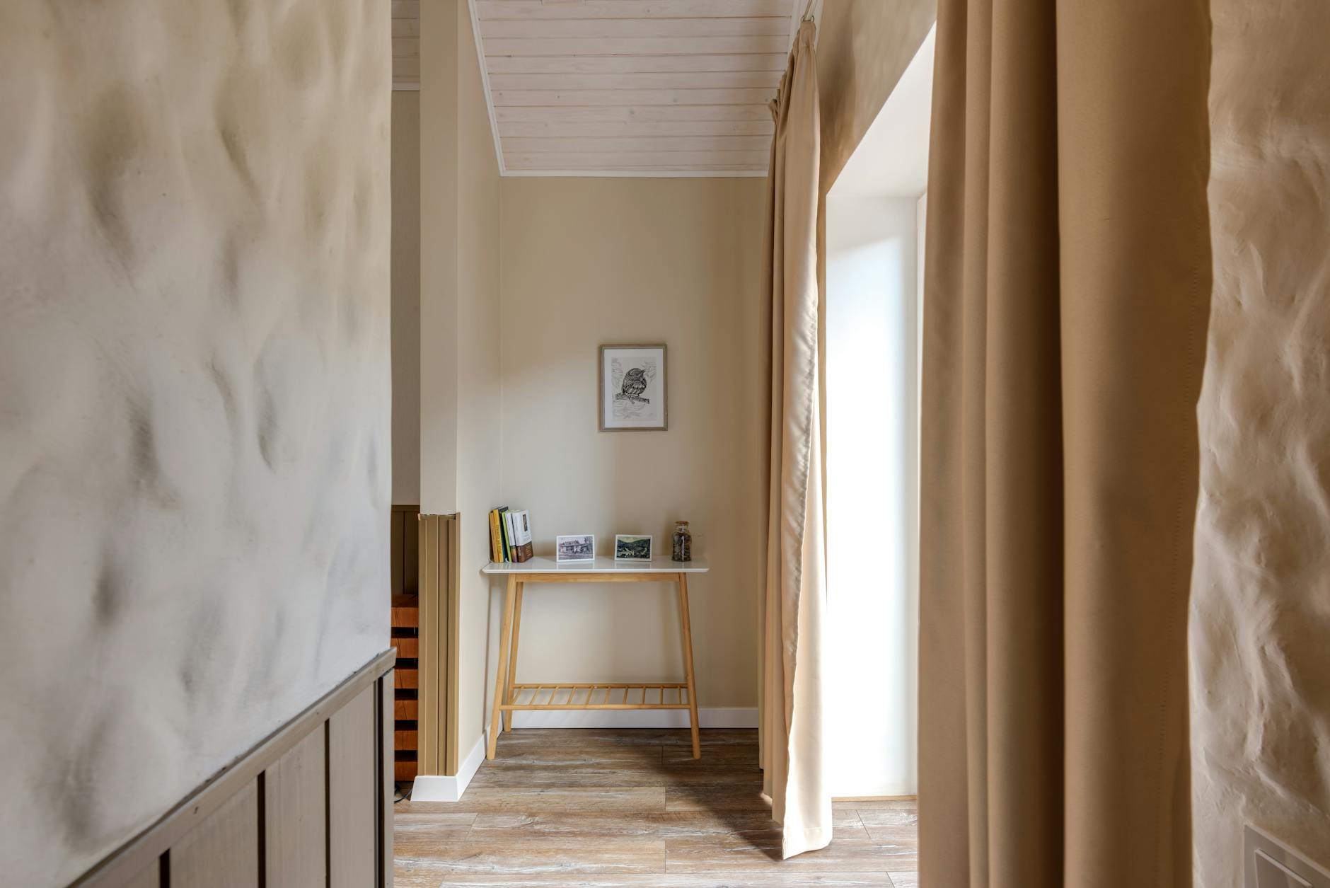
Entryway Wall Art That Sets the Tone for Your Home
You unlock the door, step inside, and exhale. Or you don't.
That moment at the threshold is doing something. Your nervous system is already reading the room before your bag hits the floor, before you've thought a single conscious thought about how your day was. What you see first, in those opening two or three seconds, begins to calibrate your mood for the next hour.
Most entryways are an afterthought. A hook rack, some shoes, a mirror or nothing at all. The wall is blank, or covered with something that was already there when you moved in. The blank entryway wall often belongs to people who care too much to settle for something generic and haven't yet found something worth putting up.
This post is about finding that something.
Why the First Wall You See Shapes Your Whole Home
The threshold effect refers to the psychological shift that happens at transition points, the moment your nervous system recalibrates as you move from one environment to another. Architects and environmental psychologists have studied entryways specifically because the entry point is where this calibration is most active. You are most impressionable to your surroundings in the seconds just before and after you cross a threshold.
A 2010 study published in Personality and Social Psychology Bulletin found that women who described their homes as cluttered or unfinished had elevated cortisol levels throughout the day, while women who described their homes as restorative showed cortisol that declined naturally from morning to evening. The physical environment you return to isn't just backdrop. It participates in how your body regulates.
What this means for an entryway wall is simple: the visual information you encounter first, every time you come home, becomes a kind of greeting. A motivational poster says one kind of thing. A cluttered gallery wall says another. A single, well-chosen piece of art says something else entirely.
Your entryway wall isn't just an aesthetic decision. It's about what you want to be reminded of the moment you walk through your own door.
The Blank Wall Problem (And Why You Keep Closing the Tab)
If you've scrolled Etsy for an hour looking for entryway art and closed the tab without buying anything, you're in good company. The problem isn't a shortage of options. It's that most options say something you don't actually want to hear.
The motivational prints feel hollow when you're carrying the weight of a real day. The generic landscape prints feel like hotel art. The trendy typography prints age in two seasons. You close the tab because your wall deserves better, and you know it.
What tends to work, in a space that gets seen dozens of times daily, is art that holds rather than performs. Something quiet enough to live with but grounded enough to mean something. A piece that doesn't demand your attention but rewards it when you pause.
The entryway wall is worth being particular about. You're going to see it every morning when you leave and every evening when you come home. That's a lot of moments to fill with something that doesn't fit.
If you want a place to start, The One-Wall Reset walks you through it, one wall at a time.
What Actually Works on an Entryway Wall
Design guidance for entryway art tends to focus on three things: scale (bigger reads better than you expect), simplicity (a visually busy entryway wall competes with everything you're already carrying through the door), and intention (choose something that speaks to the home you want to come back to, not just the style of the moment).
But there's a consideration that gets less attention: the emotional register of what you hang.
Research on environmental aesthetics suggests that spaces with intentional, curated art support what psychologists call attention restoration, a process by which overstimulated minds decompress when given something aesthetically coherent to rest on. A 2019 review in Environment and Behavior found that residential environments with aesthetic qualities were consistently associated with lower perceived stress and higher self-reported wellbeing across multiple populations. The effect was particularly pronounced in transitional spaces like hallways and entryways, where visual information is processed quickly and emotionally before it's processed cognitively.
For art that holds the right tone in an entryway, look for:
Minimal composition. A single subject, generous negative space, and a limited palette all create the quiet register that serves an entryway well. Art with high visual complexity activates the nervous system. Art with balanced simplicity lets it settle.
Grounded shapes. Stable geometric forms, horizontal lines, and low-center-of-gravity compositions create a physical sense of stillness. This is why triangles and horizon-like arrangements have held symbolic weight across so many cultures. They read as safe.
Words that hold rather than direct. If the art includes a phrase or quote, the question to ask isn't "is this inspiring?" It's "does this feel like something my home would say?" A phrase that tells you how to feel ("stay positive," "be grateful") belongs to a different category than a phrase that names the space itself ("sanctuary," "you are held here"). The first performs. The second simply is.
Sizing Your Entryway Art
Entryway art is frequently undersized. The instinct is to start small, but a piece that's too small for the wall reads as tentative rather than intentional. Here are the ranges that work in most spaces:
Standard entryway or foyer (8-10 feet wide): A single focal piece at 18x24 or 24x36 creates a clear visual anchor. The art should occupy roughly 60-75% of the available wall width. Anything smaller risks disappearing into the space.
Narrow hallway (under 5 feet wide): 16x20 or 11x14, hung at eye level (center of the piece at roughly 57-60 inches from the floor). In tight spaces, scale down but keep the composition minimal. One well-chosen piece in a narrow hallway reads as intentional. Two or three competing pieces read as crowded.
Tall foyer with high ceilings: Resist the urge to fill vertical space with a stacked arrangement. A single large piece (24x36 or larger) hung at standard eye level will draw the eye naturally. Gallery walls in tall, narrow spaces often feel chaotic. One centered statement piece holds more.
Framing note: A framed piece reads as more considered in an entryway than an unframed print, partly because the frame signals permanence. Frame finishes in natural, black, and white work across most entryway palettes. If your entryway has warm wood tones, a natural frame extends that warmth. If your entryway is lighter or more minimal, white or black frames give the piece clarity without competing.
The Words You Want to See First
For spaces that hold as much symbolic weight as an entryway, grounded language lands differently than motivational language. This is worth thinking about.
Prints from the Grounding Collection are designed around the emotional territory of stability, safety, and rootedness. The geometric signatures in this collection, stable triangular forms and horizon-like compositions, are built for the feeling of having solid ground beneath you. The prints read as declarations of the space rather than directions for the person in it.
"Within these walls" hung in an entryway doesn't instruct you. It names what the space already holds. That's a different relationship with a piece of art than most people are used to, and it's the difference between a print that you stop seeing after a week and one that keeps giving you something every time you come home.
The same is true of "Sanctuary" and "You are held here." These aren't motivation. They're a kind of architecture, emotional language that shapes how the space feels to be in.
If you're uncertain which collection fits where you are right now, the Haven & Hold quiz can help you find the right emotional territory.
Single Piece or Small Gallery: What to Know Before You Commit
The entryway gallery wall is popular for good reason: a curated grouping of small prints can create warmth and personality in a space that would otherwise feel sparse. But gallery walls in entryways carry a real risk of visual noise in a space where quiet is the goal.
Before committing to a gallery arrangement, consider:
The size of the wall and the width of the hallway. In a narrow hallway, a gallery wall can feel claustrophobic. In a wider foyer, it works well if kept to three or four pieces with intentional spacing (at least 3-4 inches between frames) and a shared visual language.
What else is happening at eye level. If your entryway already has visual information, a patterned rug, a console table with objects, coat hooks, adding a gallery wall tips the space toward overwhelm. A single strong piece often does more.
Whether you want layers or clarity. A gallery wall says "this home has layers, history, and personality." A single focal piece says "this home knows what it values." Neither is wrong. Know which one you're building toward.
If you do want multiple prints, pieces within a single collection share a color language and geometric sensibility that reads as cohesive without looking like a matched set. Two or three prints from the Grounding Collection, for instance, coordinate naturally without requiring exact matching.
Frequently Asked Questions
What size art is best for an entryway wall?
For most entryway walls, a single piece between 18x24 and 24x36 inches creates a strong visual anchor without overwhelming the space. The art should occupy roughly 60-75% of the available wall width. In narrower hallways, 16x20 or 11x14 works at eye level, with the center of the piece at roughly 57-60 inches from the floor. Err on the side of larger: undersized art in an entryway reads as uncertain rather than restrained.
Should entryway art match the rest of the house?
It doesn't need to match exactly, but it should feel like an introduction. Your entryway art sets a tone for what comes next, and choosing art within the same color family or emotional register as the rest of your home creates a sense of coherence as people move through the space. Art that feels like a completely different aesthetic from the rest of your home signals disruption rather than welcome.
What kind of art creates a calming entryway?
Art with minimal composition, a limited color palette, and simple geometric or organic forms tends to create calm. High-contrast or visually busy art activates the nervous system. For a space that you pass through multiple times daily, calm serves you better than stimulation. Muted tones, stable shapes, and short phrases over dense text all contribute to a quieter visual register.
How do I hang art in a small entryway with limited wall space?
In tight spaces, work vertically and consider scale carefully. A single portrait-oriented print (taller than wide) makes efficient use of a narrow wall. Hang it at eye level and resist the urge to add more. One well-chosen piece in a small entryway reads as intentional. Two or three competing pieces in the same tight space read as crowded, regardless of how carefully they're arranged.
Can quote prints work in an entryway, or do they feel too obvious?
This depends entirely on which quote. Generic affirmations can feel performative in an entry, especially for people who have been in therapy long enough to distrust easy encouragement. Quieter, more grounded phrases are different. A print that says "You are held here" or "Sanctuary" functions more as a declaration of the space than a directive to the person in it. The entryway becomes the statement, and the language holds the room rather than instructing whoever walks through it.
How do I style the rest of the entryway around the art?
Let the art lead. If you have a console table or bench below the wall, keep what's on it minimal: one or two objects at most, nothing competing with the print. A small plant, a ceramic bowl, a lamp with a warm bulb. The art should be the focal point, and anything on the surface below it should quietly support that focal point rather than interrupt it.

Written by Haven & Hold


