Black and White Wall Art: When Simplicity Says Everything
You have had the same blank wall for two years, and it has nothing to do with forgetting. It has everything to do with caring too much for the wrong thing to feel acceptable. Everything you've found has been either too loud or too empty or too clearly made for someone else's idea of what a wall should say.
That is the specific ache of a blank wall. It isn't emptiness. It is standards.
Part of why black and white keeps pulling you back when you scroll is this: the absence of color reads as a decision rather than a default. A monochromatic piece says something before you even finish looking at it. It says that whoever chose this knew exactly what they wanted, and they chose it on purpose.
This post is about what black and white actually does in a room, what the research shows about visual simplicity and the nervous system, and what separates a print worth keeping from one that will be in a donation box by next spring.
What Black and White Actually Does in a Room
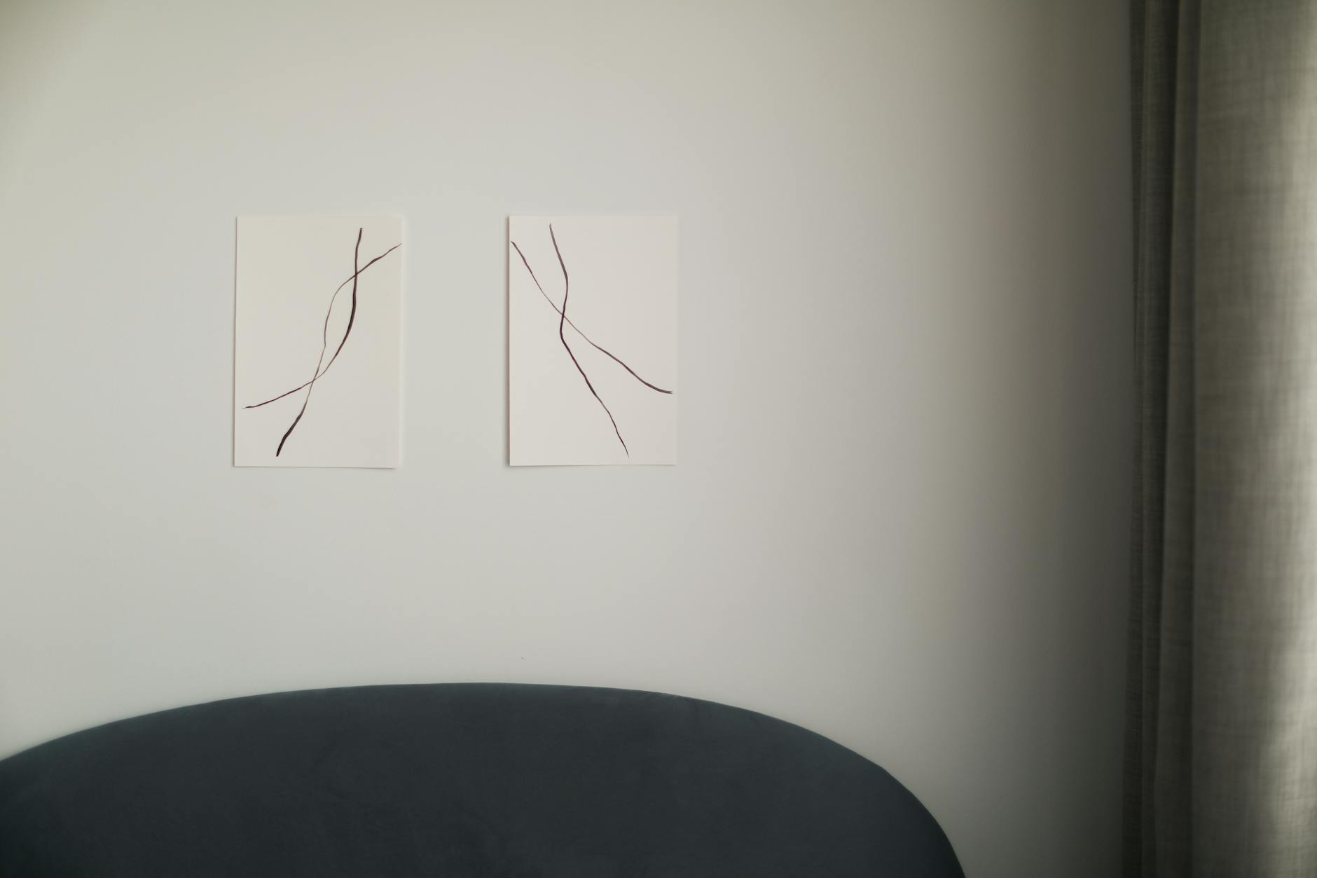
When color is removed from a piece of art, what remains is form, line, weight, and intention. Your eye moves differently across a monochromatic image. Without competing hues pulling your attention in separate directions, the composition carries the full weight of the piece. The shape of letters. The space between them. The way a dark mark sits against a pale ground.
This is why a black and white print can feel both quieter and more present than a colorful one. The quiet comes from asking less of your visual attention. The presence comes from everything that remains being exactly deliberate.
Rooms with black and white art tend to feel anchored rather than merely decorated. The wall holds something specific, and the rest of the room gets to breathe around it. Color art can bring warmth, layering, and vibrancy. But when what you need is a place to land, visual simplicity does something that colorful art, for all its richness, rarely does: it stills the space.
The Quiet Logic of Visual Restraint
Visual quiet is the quality of an environment that asks less of your eyes and, by extension, less of your nervous system.
Research suggests this matters more than aesthetics alone would explain. A 2010 study by Saxbe and Repetti, published in the Personality and Social Psychology Bulletin, found that women who described their homes as cluttered or unfinished showed higher cortisol levels throughout the day compared to women who described their homes as restful. The walls were not neutral. They were participating in how the body felt, hour by hour, across the entire day.
A 2011 study at Princeton University's Neuroscience Institute, published in Current Biology, found that when multiple stimuli compete for visual attention simultaneously, they literally suppress each other's neural representation. The brain, when visually overloaded, reduces its own capacity to process what it's seeing. Fewer things competing means more capacity to be present.
Black and white art is not a solution to a hard season. But it is a considered response to the question of what a wall asks of the person who lives with it.
If you want a place to start thinking through your own space, The One-Wall Reset walks you through it, one wall at a time.
Why "Cold" Is a Concern Worth Understanding
The most common hesitation about black and white art is that it will make a room feel cold. Clinical. Like a space designed to be photographed rather than lived in.
This concern points to something real, and it is worth taking seriously: black and white art executed without warmth in its materials or composition can feel that way. But the coldness almost never lives in the palette itself. It lives in the frame, the paper, and the breathing room inside the piece.
A slim black metal frame on a stark abstract line drawing will read as severe. The same artwork in a natural oak frame reads entirely differently. The oak pulls warmth into the room in a way that the palette alone cannot. Paper color matters too: a cool white is crisper and more contemporary, while a warm white is softer and more intimate.
The composition inside the frame carries equal weight. Typography with open space around it feels considered and held. Letterforms pressed tight against the edges of the paper feel anxious. A single phrase centered on open space reads like a held note, not a crowded wall.
The room itself does a great deal of this work. Black and white art in a space with warm wood furniture, linen textiles, and soft lamp light reads as calm. In an all-white room with no texture, the same art can tip toward cold. The art is not the problem in those cases. The context is.
If you have been hesitating because of the coldness concern, the frame is almost always where the answer lives.
What Makes a Black and White Print Worth Keeping
If you have spent time on Etsy recently, you know that black and white quote prints are everywhere. Most of them cost $5 and look like it. The question is not whether a piece is black and white. The question is whether what's inside the frame has been thought about enough to earn a place on a wall that matters to you.
A print worth keeping begins with the words. Not words that perform, but words that hold. There is a difference between a quote that sounds good on a phone screen and one that does something when you walk past it in the morning, tired or uncertain or simply arriving home. The best prints are the ones that meet you differently depending on the day.
The physical quality of the object is part of what the object says. Archival matte paper at 230gsm has a weight to it that signals intention before you've even framed it. When a print arrives and the paper holds flat, and the blacks are deep and the whites are clean, you understand something about how it was made. The material carries information.
This is the objection worth naming directly: is this just a quote on paper?
The answer is that the words matter, the material matters, and the act of choosing and placing it matters. A blank wall is not neutral. Neither is a wall that holds something you have genuinely seen.
You can browse the Grounding Collection to see how typography, paper color, and composition work together in pieces that are designed to hold rather than decorate.
Placing It Well: Room-by-Room Notes
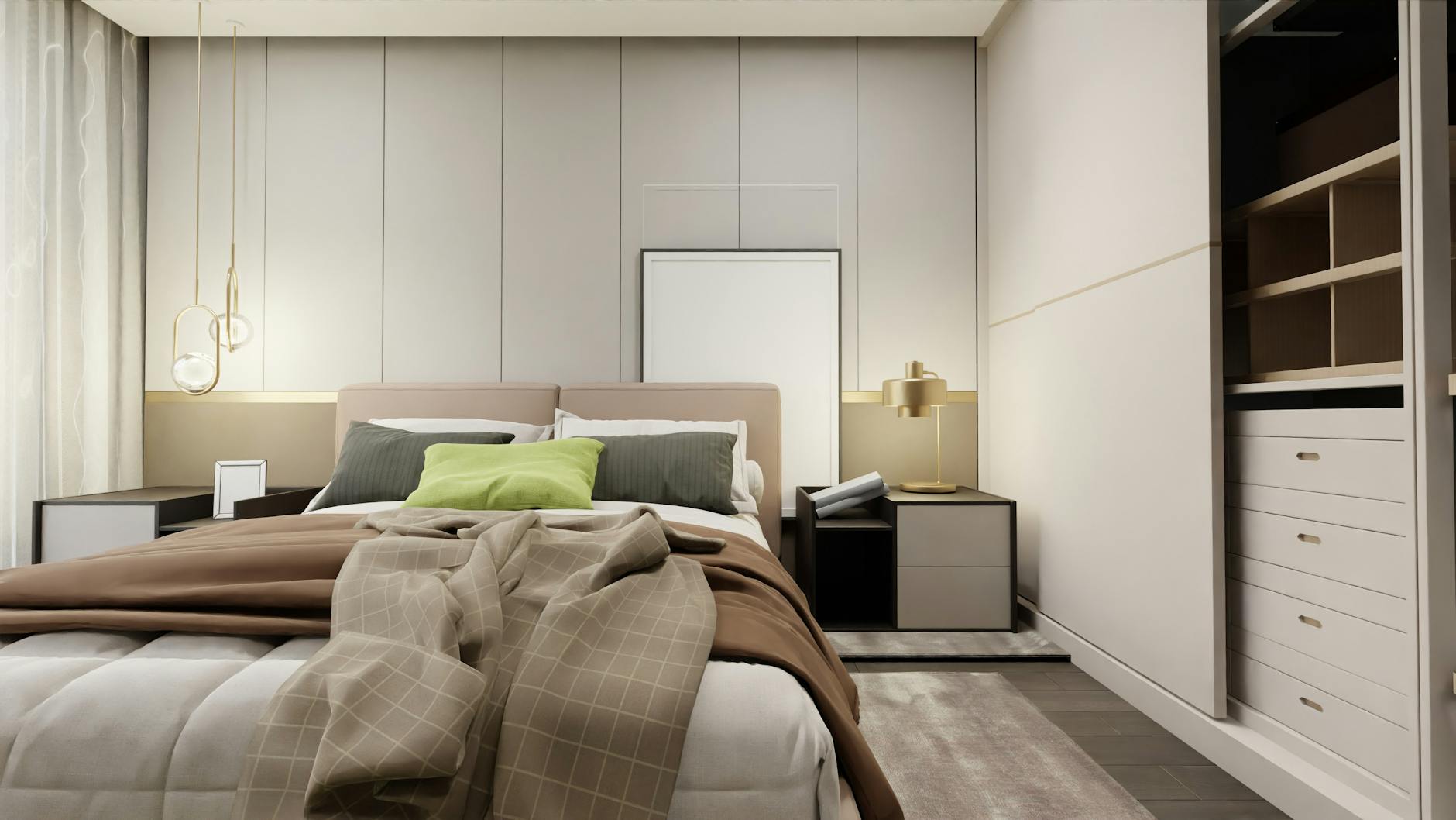
In the bedroom. The bedroom wall is the last thing your eyes rest on before sleep and the first thing they find in the morning. A single print above the headboard anchors the room more quietly than a gallery wall in this particular space. Scale matters here: something too small disappears, something too large feels like a declaration when you are tired. An 18x24 or 11x14 works well in most bedrooms. The words you choose here can be gentler than what belongs in an office. This is a space for rest, and what earns its place is something easy to be near.
In a reading nook or corner. Small spaces call for a single piece. A reading nook does not need to be covered. It needs one thing that makes sense with the light and the dimensions of the space. A small print, propped on a shelf or hung with a simple hook, can anchor a corner without crowding it. The goal is a resting point for the eye, not a destination.
In a home office. The home office earns something slightly more direct. The words you put here can carry a little more weight. Something about staying, about continuing, about the work being worth the effort. Black and white reads as focused in an office context. It does not distract. It steadies.
In a hallway. Hallways are consistently underused. A single vertical print on a narrow wall can turn a space that is usually just a passageway into a moment of pause. A quiet piece there becomes the last thing you see when you leave and the first thing that receives you when you return.
Frequently Asked Questions
Does black and white wall art work in a room that already has a lot of color?
Yes, and often it works better there than a colorful print would. Monochromatic art gives a room with color somewhere to settle and anchor visually. It acts as a quiet point, similar to how a neutral sofa reads well against a patterned rug or brightly painted wall. The contrast between the black and white piece and the surrounding color tends to make both feel more intentional rather than competing.
How big should a black and white print be for a wall that feels bare?
The most common mistake is going too small. A print that is too small on a large wall reads as an afterthought, floating on a surface that needed more. As a starting point, consider that the art should span at least half the width of any furniture below it. For a wall with no furniture beneath it, an 18x24 is usually the minimum that will hold the space. When in doubt, go slightly larger than your instinct suggests.
Is black and white art timeless, or does it cycle with decorating trends?
Black and white as a palette has been used in art and interior design across every era and every style tradition. It does not belong to a trend cycle the way a specific motif or color family does. The risk is not that the palette will date. It is that a poorly chosen piece in any palette will date. A print with intentional composition and words that carry weight will hold the wall for years, regardless of what is trending when you hang it.
Will black and white art make my room feel cold or too stark?
The coldness sometimes associated with black and white art almost always comes from the frame and paper rather than from the palette itself. A natural oak frame, warm white paper, and typography with open breathing room will read as calm rather than clinical. The room context carries a great deal of weight too. Soft textiles, warm-toned lighting, and wood furniture all soften a monochromatic print considerably, and together they do more to warm a room than the print color alone.
What is the difference between art that holds a wall and art that just fills one?
Art that fills a wall is noticed when you first hang it and then fades into the background within a week. Art that holds you does something when you walk past it on an ordinary Tuesday. The words carry enough weight to meet you differently on a hard morning and a quiet afternoon. That is a function of what was chosen and how carefully, not just how it looks in a photograph. The blank wall has stayed blank because the wrong choice feels worse than no choice at all. That discernment is worth trusting.
Your walls are already doing something. They are just not saying anything yet.
Black and white asks less of a room than almost any other choice, and it gives more clarity in return. A single print, chosen with care, can anchor a space more completely than a gallery wall assembled quickly. The right piece, on the right wall, in a frame that fits the room, is not decoration. It is an anchor.
Take your time. You have had a blank wall this long. You can afford to choose well.
If you are not sure where to begin, take the quiz to find the collection that fits where you are right now.
You might also enjoy
Which collection speaks to your season?
Take the 2-minute Sanctuary Style Quiz and find your starting point.
Take the QuizWritten by Haven & Hold